


Designing For TV: Principles, Patterns And Practical Guidance (Part 2)
Designing For TV: Principles, Patterns And Practical Guidance (Part 2) Designing For TV: Principles, Patterns And Practical Guidance (Part 2) Milan Balać 2025-09-04T10:00:00+00:00 2025-09-10T15:02:59+00:00 Having covered the developmental history and legacy of TV in Part 1, let’s now delve into more practical matters. As a […]
Accessibility
Prompting Is A Design Act: How To Brief, Guide And Iterate With AI
Prompting Is A Design Act: How To Brief, Guide And Iterate With AI Prompting Is A Design Act: How To Brief, Guide And Iterate With AI Lyndon Cerejo 2025-08-29T10:00:00+00:00 2025-09-03T15:02:57+00:00 In “A Week In The Life Of An AI-Augmented Designer”, we followed Kate’s weeklong journey […]
Accessibility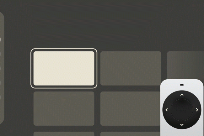
Designing For TV: The Evergreen Pattern That Shapes TV Experiences
Designing For TV: The Evergreen Pattern That Shapes TV Experiences Designing For TV: The Evergreen Pattern That Shapes TV Experiences Milan Balać 2025-08-27T13:00:00+00:00 2025-08-27T15:32:36+00:00 Television sets have been the staple of our living rooms for decades. We watch, we interact, and we control, but how […]
Accessibility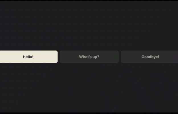

Designing For TV: Principles, Patterns And Practical Guidance (Part 2)
Designing For TV: Principles, Patterns And Practical Guidance (Part 2) Designing For TV: Principles, Patterns And Practical Guidance (Part 2) Milan Balać 2025-09-04T10:00:00+00:00 2025-09-10T15:02:59+00:00 Having covered the developmental history and legacy of TV in Part 1, let’s now delve into more practical matters. As a […]
Accessibility
Designing For TV: Principles, Patterns And Practical Guidance (Part 2)
Milan Balać 2025-09-04T10:00:00+00:00
2025-09-10T15:02:59+00:00
Having covered the developmental history and legacy of TV in Part 1, let’s now delve into more practical matters. As a quick reminder, the “10-foot experience” and its reliance on the six core buttons of any remote form the basis of our efforts, and as you’ll see, most principles outlined simply reinforce the unshakeable foundations.
In this article, we’ll sift through the systems, account for layout constraints, and distill the guidelines to understand the essence of TV interfaces. Once we’ve collected all the main ingredients, we’ll see what we can do to elevate these inherently simplistic experiences.
Let’s dig in, and let’s get practical!
The Systems
When it comes to hardware, TVs and set-top boxes are usually a few generations behind phones and computers. Their components are made to run lightweight systems optimised for viewing, energy efficiency, and longevity. Yet even within these constraints, different platforms offer varying performance profiles, conventions, and price points.
Some notable platforms/systems of today are:
- Roku, the most affordable and popular, but severely bottlenecked by weak hardware.
- WebOS, most common on LG devices, relies on web standards and runs well on modest hardware.
- Android TV, considered very flexible and customisable, but relatively demanding hardware-wise.
- Amazon Fire, based on Android but with a separate ecosystem. It offers great smooth performance, but is slightly more limited than stock Android.
- tvOS, by Apple, offering a high-end experience followed by a high-end price with extremely low customizability.
Despite their differences, all of the platforms above share something in common, and by now you’ve probably guessed that it has to do with the remote. Let’s take a closer look:

If these remotes were stripped down to just the D-pad, OK, and BACK buttons, they would still be capable of successfully navigating any TV interface. It is this shared control scheme that allows for the agnostic approach of this article with broadly applicable guidelines, regardless of the manufacturer.
Having already discussed the TV remote in detail in Part 1, let’s turn to the second part of the equation: the TV screen, its layout, and the fundamental building blocks of TV-bound experiences.
TV Design Fundamentals
The Screen
With almost one hundred years of legacy, TV has accumulated quite some baggage. One recurring topic in modern articles on TV design is the concept of “overscan” — a legacy concept from the era of cathode ray tube (CRT) screens. Back then, the lack of standards in production meant that television sets would often crop the projected image at its edges. To address this inconsistency, broadcasters created guidelines to keep important content from being cut off.

While overscan gets mentioned occasionally, we should call it what it really is — a thing of the past. Modern panels display content with greater precision, making thinking in terms of title and action safe areas rather archaic. Today, we can simply consider the margins and get the same results.

Google calls for a 5% margin layout and Apple advises a 60-point margin top and bottom, and 80 points on the sides in their Layout guidelines. The standard is not exactly clear, but the takeaway is simple: leave some breathing room between screen edge and content, like you would in any thoughtful layout.

Having left some baggage behind, we can start considering what to put within and outside the defined bounds.
The Layout
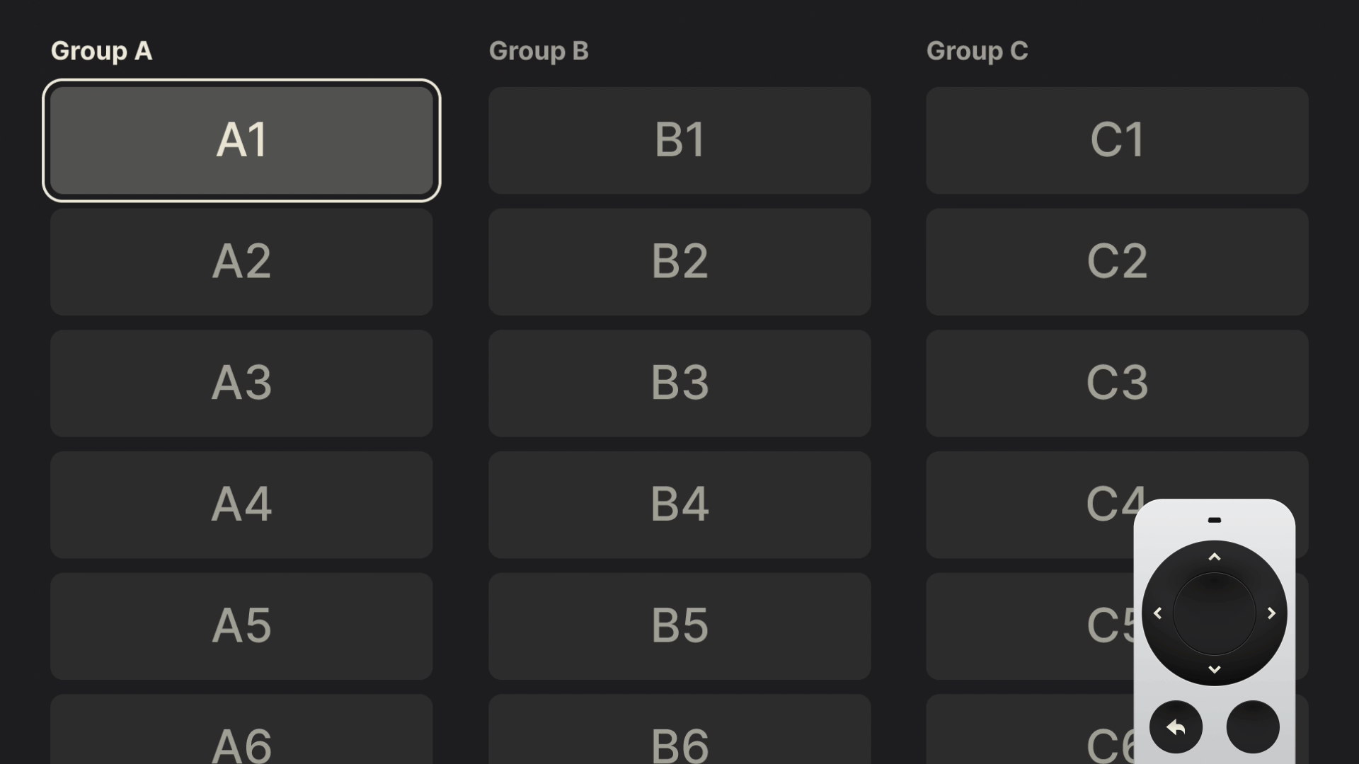
Considering the device is made for content consumption, streaming apps such as Netflix naturally come to mind. Broadly speaking, all these interfaces share a common layout structure where a vast collection of content is laid out in a simple grid.

These horizontally scrolling groups (sometimes referred to as “shelves”) resemble rows of a bookcase. Typically, they’ll contain dozens of items that don’t fit into the initial “fold”, so we’ll make sure the last visible item “peeks” from the edge, subtly indicating to the viewer there’s more content available if they continue scrolling.
If we were to define a standard 12-column layout grid, with a 2-column-wide item, we’d end up with something like this:

As you can see, the last item falls outside the “safe” zone.
Tip: A useful trick I discovered when designing TV interfaces was to utilise an odd number of columns. This allows the last item to fall within the defined margins and be more prominent while having little effect on the entire layout. We’ve concluded that overscan is not a prominent issue these days, yet an additional column in the layout helps completely circumvent it. Food for thought!

Typography
TV design requires us to practice restraint, and this becomes very apparent when working with type. All good typography practices apply to TV design too, but I’d like to point out two specific takeaways.
First, accounting for the distance, everything (including type) needs to scale up. Where 16–18px might suffice for web baseline text, 24px should be your starting point on TV, with the rest of the scale increasing proportionally.
“Typography can become especially tricky in 10-ft experiences. When in doubt, go larger.”
— Molly Lafferty (Marvel Blog)
With that in mind, the second piece of advice would be to start with a small 5–6 size scale and adjust if necessary. The simplicity of a TV experience can, and should, be reflected in the typography itself, and while small, such a scale will do all the “heavy lifting” if set correctly.

What you see in the example above is a scale I reduced from Google and Apple guidelines, with a few size adjustments. Simple as it is, this scale served me well for years, and I have no doubt it could do the same for you.
Freebie
If you’d like to use my basic reduced type scale Figma design file for kicking off your own TV project, feel free to do so!

Color
Imagine watching TV at night with the device being the only source of light in the room. You open up the app drawer and select a new streaming app; it loads into a pretty splash screen, and — bam! — a bright interface opens up, which, amplified by the dark surroundings, blinds you for a fraction of a second. That right there is our main consideration when using color on TV.
Built for cinematic experiences and often used in dimly lit environments, TVs lend themselves perfectly to darker and more subdued interfaces. Bright colours, especially pure white (#ffffff), will translate to maximum luminance and may be straining on the eyes. As a general principle, you should rely on a more muted color palette. Slightly tinting brighter elements with your brand color, or undertones of yellow to imitate natural light, will produce less visually unsettling results.
Finally, without a pointer or touch capabilities, it’s crucial to clearly highlight interactive elements. While using bright colors as backdrops may be overwhelming, using them sparingly to highlight element states in a highly contrasting way will work perfectly.
This highlighting of UI elements is what TV leans on heavily — and it is what we’ll discuss next.
Focus
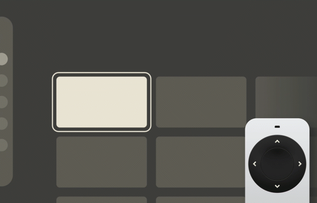
In Part 1, we have covered how interacting through a remote implies a certain detachment from the interface, mandating reliance on a focus state to carry the burden of TV interaction. This is done by visually accenting elements to anchor the user’s eyes and map any subsequent movement within the interface.
If you have ever written HTML/CSS, you might recall the use of the :focus CSS pseudo-class. While it’s primarily an accessibility feature on the web, it’s the core of interaction on TV, with more flexibility added in the form of two additional directions thanks to a dedicated D-pad.
Focus Styles
There are a few standard ways to style a focus state. Firstly, there’s scaling — enlarging the focused element, which creates the illusion of depth by moving it closer to the viewer.
Another common approach is to invert background and text colors.
Finally, a border may be added around the highlighted element.
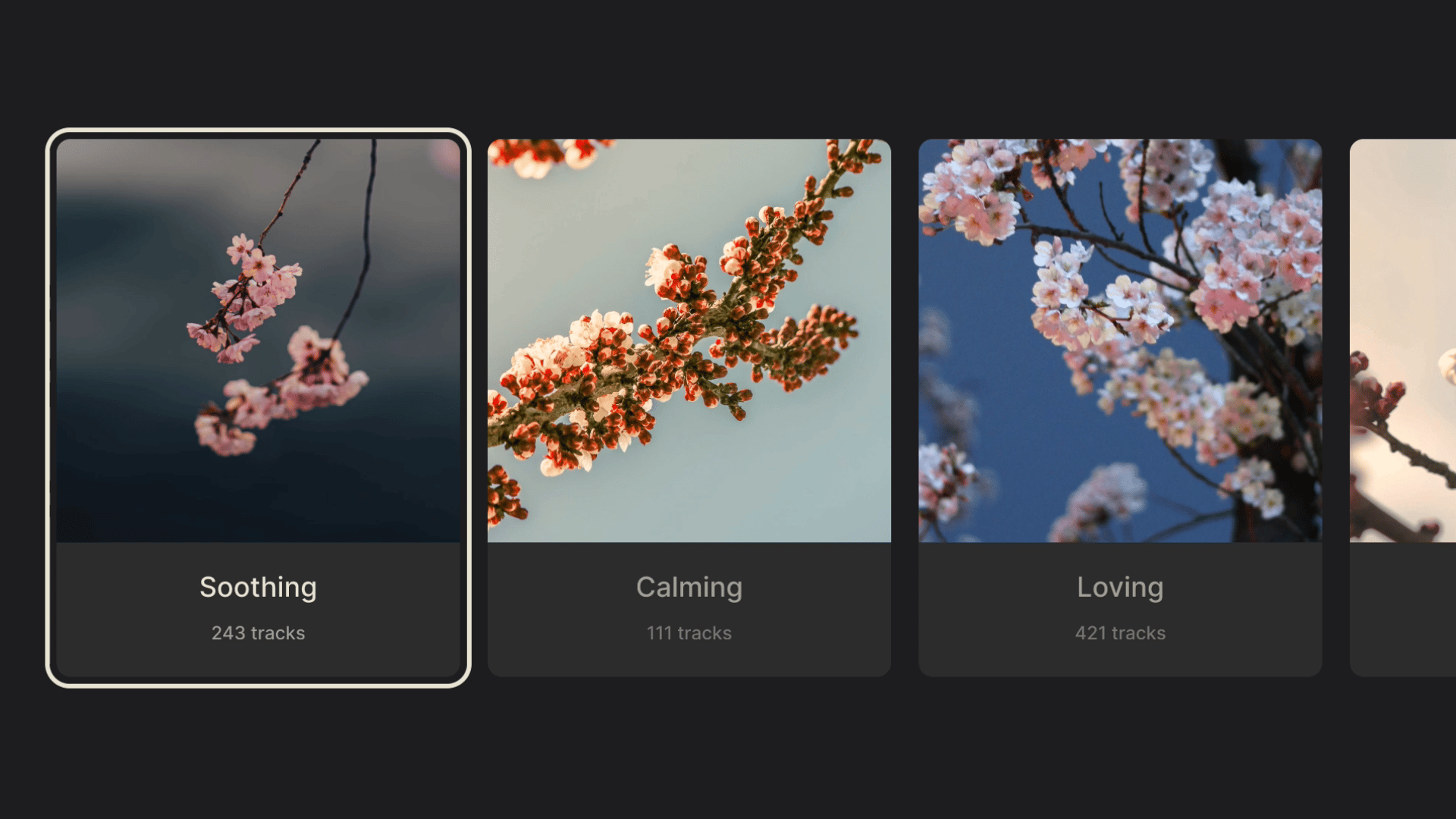
These styles, used independently or in various combinations, appear in all TV interfaces. While execution may be constrained by the specific system, the purpose remains the same: clear and intuitive feedback, even from across the room.
Having set the foundations of interaction, layout, and movement, we can start building on top of them. The next chapter will cover the most common elements of a TV interface, their variations, and a few tips and tricks for button-bound navigation.
Common TV UI Components
Nowadays, the core user journey on television revolves around browsing (or searching through) a content library, selecting an item, and opening a dedicated screen to watch or listen.
This translates into a few fundamental screens:
- Library (or Home) for content browsing,
- Search for specific queries, and
- A player screen focused on content playback.
These screens are built with a handful of components optimized for the 10-foot experience, and while they are often found on other platforms too, it’s worth examining how they differ on TV.
Menus
Appearing as a horizontal bar along the top edge of the screen, or as a vertical sidebar, the menu helps move between the different screens of an app. While its orientation mostly depends on the specific system, it does seem TV favors the side menu a bit more.

Both menu types share a common issue: the farther the user navigates away from the menu (vertically, toward the bottom for top-bars; and horizontally, toward the right for sidebars), the more button presses are required to get back to it. Fortunately, usually a Back button shortcut is added to allow for immediate menu focus, which greatly improves usability.
That said, the problem will arise a lot sooner for top menus, which, paired with the issue of having to hide or fade the element, makes a persistent sidebar a more common pick in TV user interfaces, and allows for a more consistent experience.
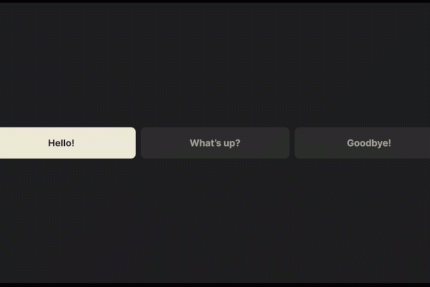
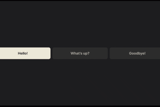
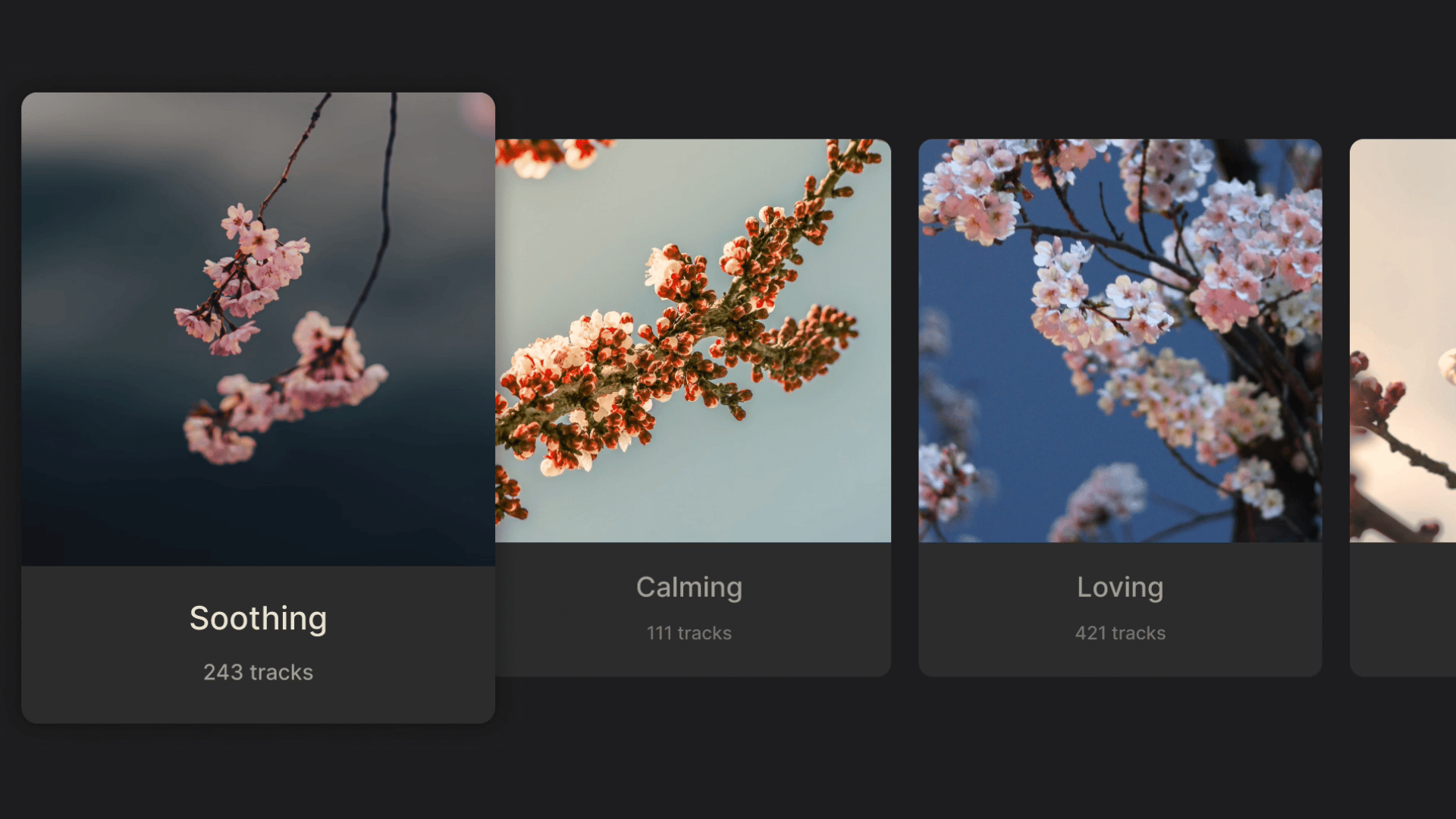
Shelves, Posters, And Cards
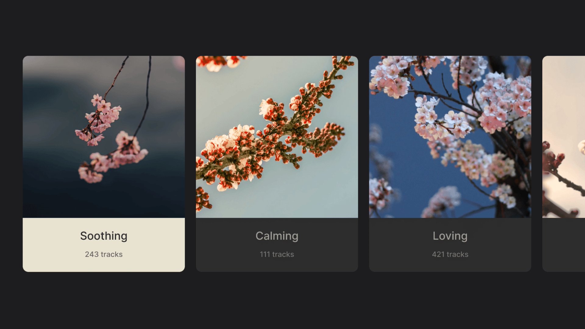
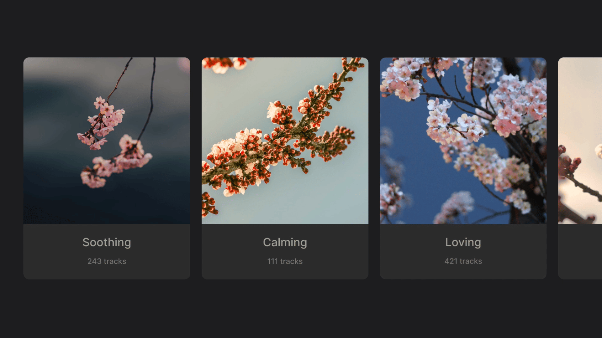
We’ve already mentioned shelves when covering layouts; now let’s shed some more light on this topic. The “shelves” (horizontally scrolling groups) form the basis of TV content browsing and are commonly populated with posters in three different aspect ratios: 2:3, 16:9, and 1:1.
2:3 posters are common in apps specializing in movies and shows. Their vertical orientation references traditional movie posters, harkening back to the cinematic experiences TVs are built for. Moreover, their narrow shape allows more items to be immediately visible in a row, and they rarely require any added text, with titles baked into the poster image.

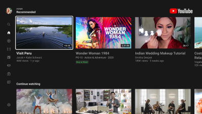
16:9 posters abide by the same principles but with a horizontal orientation. They are often paired with text labels, which effectively turn them into cards, commonly seen on platforms like YouTube. In the absence of dedicated poster art, they show stills or playback from the videos, matching the aspect ratio of the media itself.

1:1 posters are often found in music apps like Spotify, their shape reminiscent of album art and vinyl sleeves. These squares often get used in other instances, like representing channel links or profile tiles, giving more visual variety to the interface.

All of the above can co-exist within a single app, allowing for richer interfaces and breaking up otherwise uniform content libraries.
And speaking of breaking up content, let’s see what we can do with spotlights!
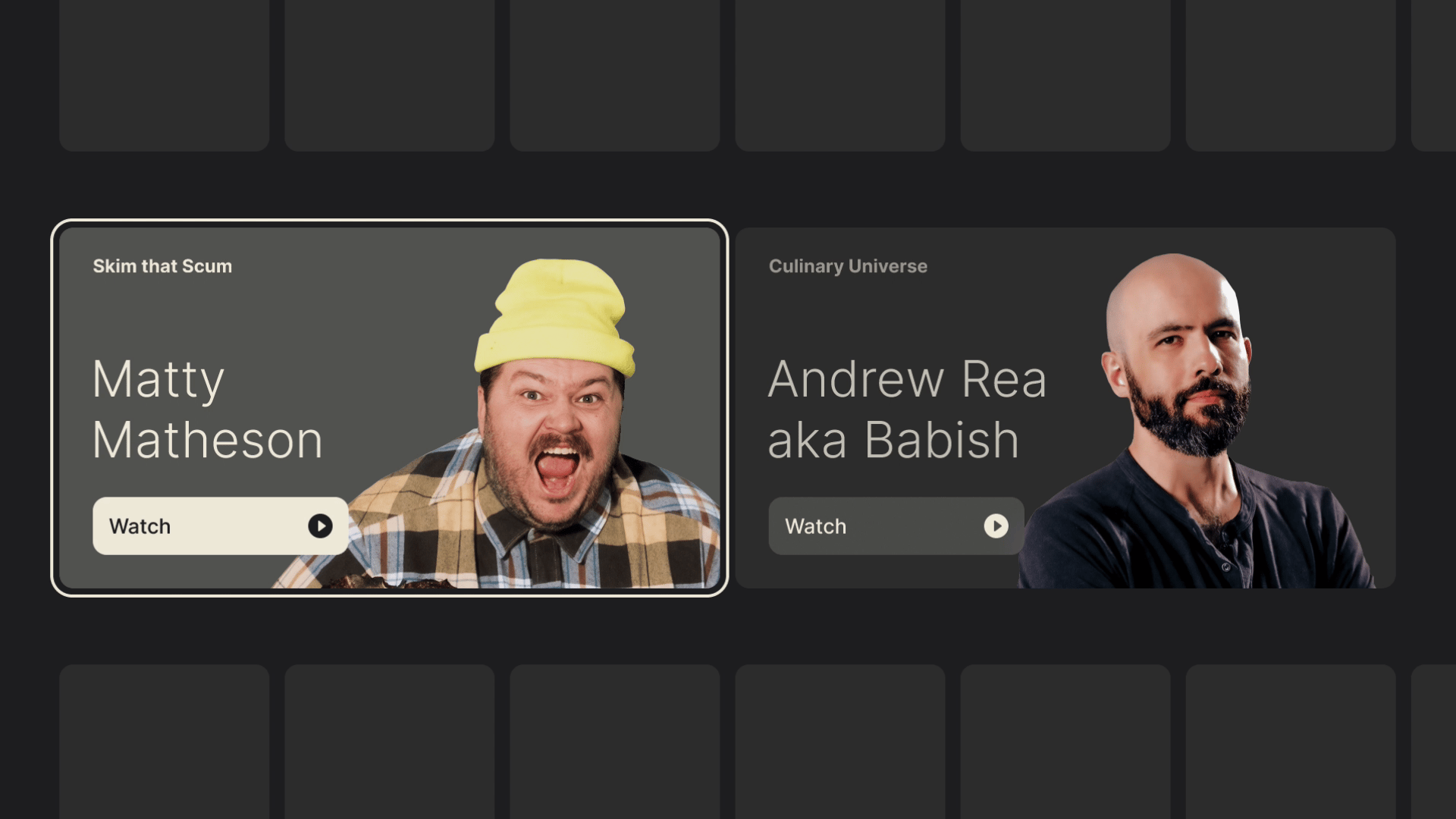
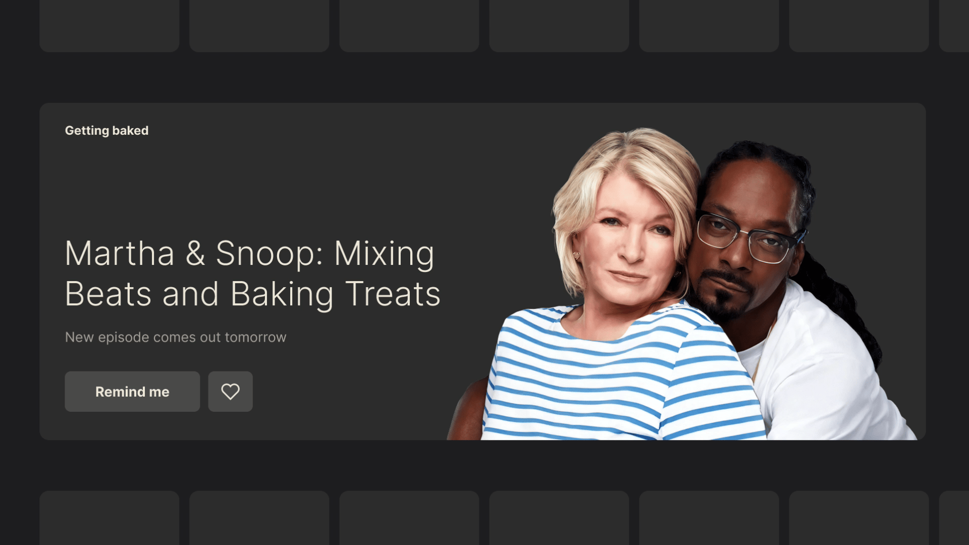
Spotlights
Typically taking up the entire width of the screen, these eye-catching components will highlight a new feature or a promoted piece of media. In a sea of uniform shelves, they can be placed strategically to introduce aesthetic diversity and disrupt the monotony.

A spotlight can be a focusable element by itself, or it could expose several actions thanks to its generous space. In my ventures into TV design, I relied on a few different spotlight sizes, which allowed me to place multiples into a single row, all with the purpose of highlighting different aspects of the app, without breaking the form to which viewers were used.


Posters, cards, and spotlights shape the bulk of the visual experience and content presentation, but viewers still need a way to find specific titles. Let’s see how search and input are handled on TV.
Search And Entering Text
Manually browsing through content libraries can yield results, but having the ability to search will speed things up — though not without some hiccups.
TVs allow for text input in the form of on-screen keyboards, similar to the ones found in modern smartphones. However, inputting text with a remote control is quite inefficient given the restrictiveness of its control scheme. For example, typing “hey there” on a mobile keyboard requires 9 keystrokes, but about 38 on a TV (!) due to the movement between characters and their selection.
Typing with a D-pad may be an arduous task, but at the same time, having the ability to search is unquestionably useful.

Luckily for us, keyboards are accounted for in all systems and usually come in two varieties. We’ve got the grid layouts used by most platforms and a horizontal layout in support of the touch-enabled and gesture-based controls on tvOS. Swiping between characters is significantly faster, but this is yet another pattern that can only be enhanced, not replaced.

Modernization has made things significantly easier, with search autocomplete suggestions, device pairing, voice controls, and remotes with physical keyboards, but on-screen keyboards will likely remain a necessary fallback for quite a while. And no matter how cumbersome this fallback may be, we as designers need to consider it when building for TV.
“
Players And Progress Bars
While all the different sections of a TV app serve a purpose, the Player takes center stage. It’s where all the roads eventually lead to, and where viewers will spend the most time. It’s also one of the rare instances where focus gets lost, allowing for the interface to get out of the way of enjoying a piece of content.
Arguably, players are the most complex features of TV apps, compacting all the different functionalities into a single screen. Take YouTube, for example, its player doesn’t just handle expected playback controls but also supports content browsing, searching, reading comments, reacting, and navigating to channels, all within a single screen.

Compared to YouTube, Netflix offers a very lightweight experience guided by the nature of the app.
Still, every player has a basic set of controls, the foundation of which is the progress bar.

The progress bar UI element serves as a visual indicator for content duration. During interaction, focus doesn’t get placed on the bar itself, but on a movable knob known as the “scrubber.” It is by moving the scrubber left and right, or stopping it in its tracks, that we can control playback.
Another indirect method of invoking the progress bar is with the good old Play and Pause buttons. Rooted in the mechanical era of tape players, the universally understood triangle and two vertical bars are as integral to the TV legacy as the D-pad. No matter how minimalist and sleek the modern player interface may be, these symbols remain a staple of the viewing experience.

The presence of a scrubber may also indicate the type of content. Video on demand allows for the full set of playback controls, while live streams (unless DVR is involved) will do away with the scrubber since viewers won’t be able to rewind or fast-forward.
Earlier iterations of progress bars often came bundled with a set of playback control buttons, but as viewers got used to the tools available, these controls often got consolidated into the progress bar and scrubber themselves.
Bringing It All Together
With the building blocks out of the box, we’ve got everything necessary for a basic but functional TV app. Just as the six core buttons make remote navigation possible, the components and principles outlined above help guide purposeful TV design. The more context you bring, the more you’ll be able to expand and combine these basic principles, creating an experience unique to your needs.
Before we wrap things up, I’d like to share a few tips and tricks I discovered along the way — tips and tricks which I wish I had known from the start. Regardless of how simple or complex your idea may be, these may serve you as useful tools to help add depth, polish, and finesse to any TV experience.
Thinking Beyond The Basics
Like any platform, TV has a set of constraints that we abide by when designing. But sometimes these norms are applied without question, making the already limited capabilities feel even more restraining. Below are a handful of less obvious ideas that can help you design more thoughtfully and flexibly for the big screen.
Long Press
Most modern remotes support press-and-hold gestures as a subtle way to enhance the functionality, especially on remotes with fewer buttons available.
For example, holding directional buttons when browsing content speeds up scrolling, while holding Left/Right during playback speeds up timeline seeking. In many apps, a single press of the OK button opens a video, but holding it for longer opens a contextual menu with additional actions.
While not immediately apparent, press-and-hold is often used in many instances of TV experiences, essentially doubling the capabilities of a single button. Depending on context, you can map certain buttons to have an additional action and give more depth to the interface without making it convoluted.
And speaking of mapping, let’s see how we can utilize it to our benefit.
Remapping Keys And The Importance Of Context
While not as flexible as long-press, button functions can be contextually remapped. For example, Amazon’s Prime Video maps the Up button to open its X-Ray feature during playback. Typically, all directional buttons open video controls, so repurposing one for a custom feature cleverly adds interactivity with little tradeoff.

With limited input, context becomes a powerful tool. It not only declutters the interface to allow for more focus on specific tasks, but also enables the same set of buttons to trigger different actions based on the viewer’s location within an app.
“
Another great example is YouTube’s scrubber interaction. Once the scrubber is moved, every other UI element fades. This cleans up the viewer’s working area, so to speak, narrowing the interface to a single task. In this state — and only in this state — pressing Up one more time moves away from scrubbing and into browsing by chapter.
This is such an elegant example of expanding restraint, and adding more only when necessary. I hope it inspires similar interactions in your TV app designs.
Efficient Movement On TV
At its best, every action on TV “costs” at least one click. There’s no such thing as aimless cursor movement — if you want to move, you must press a button. We’ve seen how cumbersome it can be inside a keyboard, but there’s also something we can learn about efficient movement in these restrained circumstances.
Going back to the Homescreen, we can note that vertical and horizontal movement serve two distinct roles. Vertical movement switches between groups, while horizontal movement switches items within these groups. No matter how far you’ve gone inside a group, a single vertical click will move you into another.
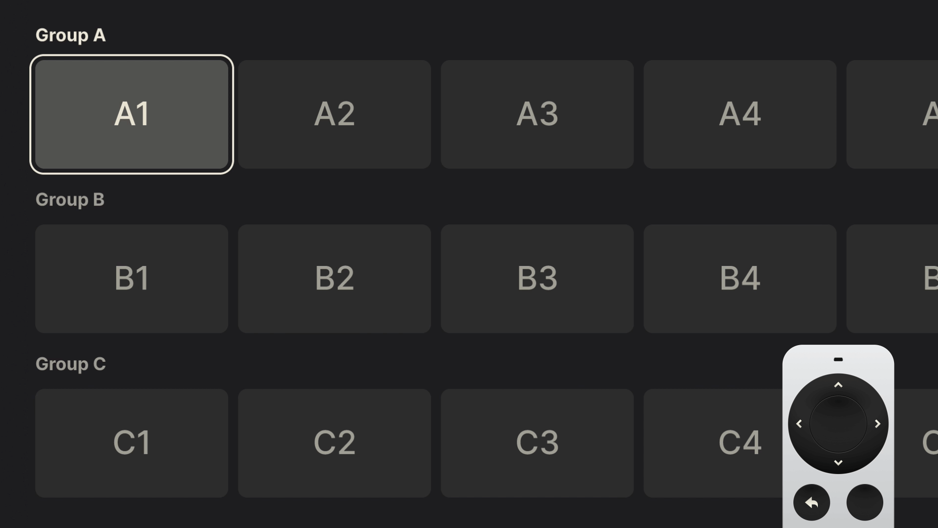
This subtle difference — two axes with separate roles — is the most efficient way of moving in a TV interface. Reversing the pattern: horizontal to switch groups, and vertical to drill down, will work like a charm as long as you keep the role of each axis well defined.
Quietly brilliant and easy to overlook, this pattern powers almost every step of the TV experience. Remember it, and use it well.
Thinking Beyond JPGs
After covering in detail many of the technicalities, let’s finish with some visual polish.
Most TV interfaces are driven by tightly packed rows of cover and poster art. While often beautifully designed, this type of content and layouts leave little room for visual flair. For years, the flat JPG, with its small file size, has been a go-to format, though contemporary alternatives like WebP are slowly taking its place.
Meanwhile, we can rely on the tried and tested PNG to give a bit more shine to our TV interfaces. The simple fact that it supports transparency can help the often-rigid UIs feel more sophisticated. Used strategically and paired with simple focus effects such as background color changes, PNGs can bring subtle moments of delight to the interface.
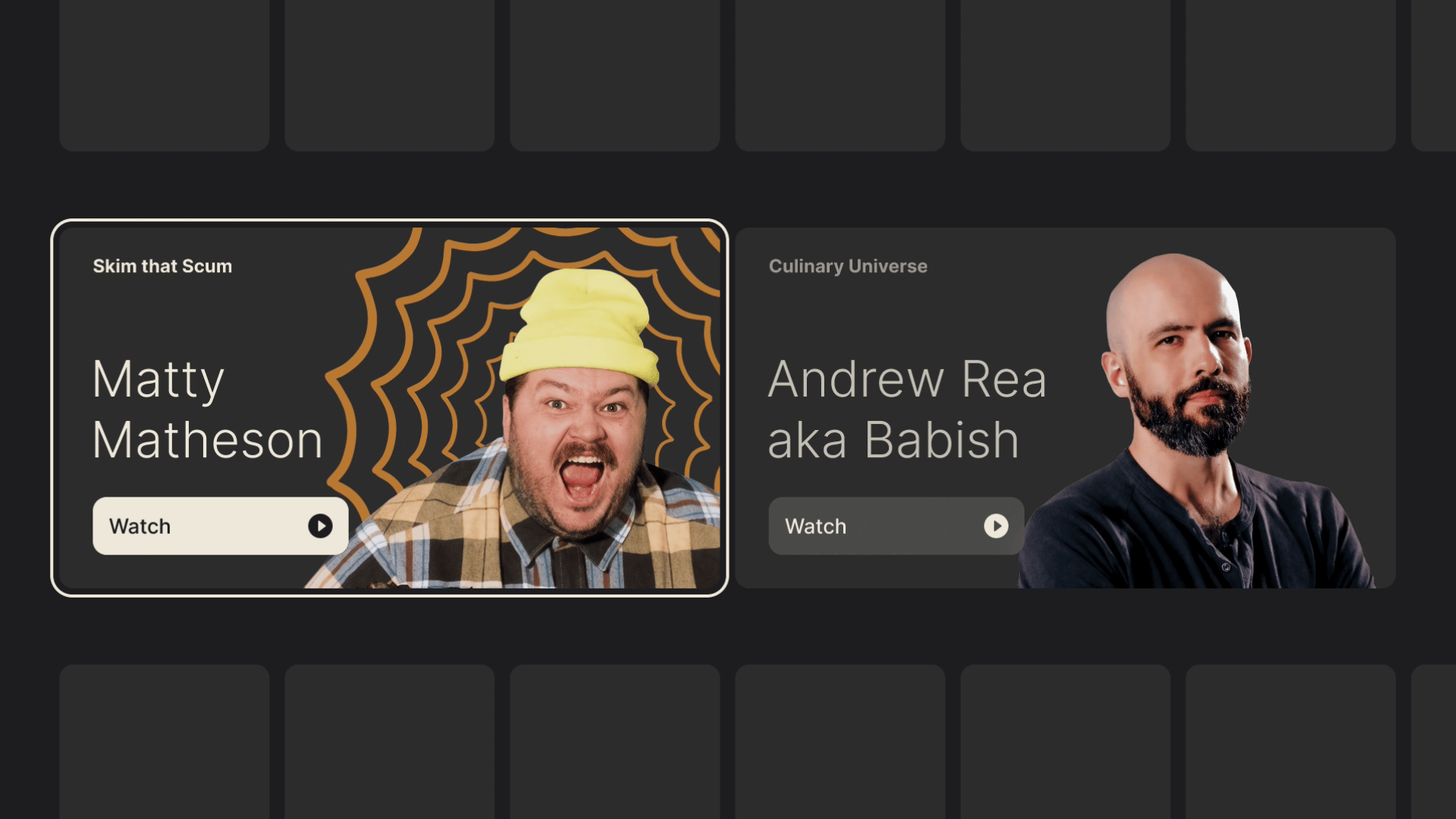
Moreover, if transformations like scaling and rotating are supported, you can really make those rectangular shapes come alive with layering multiple assets.
As you probably understand by now, these little touches of finesse don’t go out of bounds of possibility. They simply find more room to breathe within it. But with such limited capabilities, it’s best to learn all the different tricks that can help make your TV experiences stand out.
Closing Thoughts
Rooted in legacy, with a limited control scheme and a rather “shallow” interface, TV design reminds us to do the best with what we have at our disposal. The restraints I outlined are not meant to induce claustrophobia and make you feel limited in your design choices, but rather to serve you as guides. It is by accepting that fact that we can find freedom and new avenues to explore.
This two-part series of articles, just like my experience designing for TV, was not about reinventing the wheel with radical ideas. It was about understanding its nuances and contributing to what’s already there with my personal touch.
If you find yourself working in this design field, I hope my guide will serve as a warm welcome and will help you do your finest work. And if you have any questions, do leave a comment, and I will do my best to reply and help.
Good luck!
Further Reading
- “Design for TV,” by Android Developers
Great TV design is all about putting content front and center. It’s about creating an interface that’s easier to use and navigate, even from a distance. It’s about making it easier to find the content you love, and to enjoy it in the best possible quality. - “TV Guidelines: A quick kick-off on designing for Television Experiences,” by Andrea Pacheco
Just like designing a mobile app, designing a TV application can be a fun and complex thing to do, due to the numerous guidelines and best practices to follow. Below, I have listed the main best practices to keep in mind when designing an app for a 10-foot screen. - “Designing for Television – TV Ui design,” by Molly Lafferty
We’re no longer limited to a remote and cable box to control our TVs; we’re using Smart TVs, or streaming from set-top boxes like Roku and Apple TV, or using video game consoles like Xbox and PlayStation. And each of these devices allows a user interface that’s much more powerful than your old-fashioned on-screen guide. - “Rethinking User Interface Design for the TV Platform,” by Pascal Potvin
Designing for television has become part of the continuum of devices that require a rethink of how we approach user interfaces and user experiences. - “Typography for TV,” by Android Developers
As television screens are typically viewed from a distance, interfaces that use larger typography are more legible and comfortable for users. TV Design’s default type scale includes contrasting and flexible type styles to support a wide range of use cases. - “Typography,” by Apple Developer docs
Your typographic choices can help you display legible text, convey an information hierarchy, communicate important content, and express your brand or style. - “Color on TV,” by Android Developers
Color on TV design can inspire, set the mood, and even drive users to make decisions. It’s a powerful and tangible element that users notice first. As a rich way to connect with a wide audience, it’s no wonder color is an important step in crafting a high-quality TV interface. - “Designing for Television — TV UI Design,” by Molly Lafferty (Marvel Blog)
Today, we’re no longer limited to a remote and cable box to control our TVs; we’re using Smart TVs, or streaming from set-top boxes like Roku and Apple TV, or using video game consoles like Xbox and PlayStation. And each of these devices allows a user interface that’s much more powerful than your old-fashioned on-screen guide.
(mb, yk)

Prompting Is A Design Act: How To Brief, Guide And Iterate With AI
Prompting Is A Design Act: How To Brief, Guide And Iterate With AI Prompting Is A Design Act: How To Brief, Guide And Iterate With AI Lyndon Cerejo 2025-08-29T10:00:00+00:00 2025-09-03T15:02:57+00:00 In “A Week In The Life Of An AI-Augmented Designer”, we followed Kate’s weeklong journey […]
Accessibility
Prompting Is A Design Act: How To Brief, Guide And Iterate With AI
Lyndon Cerejo 2025-08-29T10:00:00+00:00
2025-09-03T15:02:57+00:00
In “A Week In The Life Of An AI-Augmented Designer”, we followed Kate’s weeklong journey of her first AI-augmented design sprint. She had three realizations through the process:
- AI isn’t a co-pilot (yet); it’s more like a smart, eager intern.
One with access to a lot of information, good recall, fast execution, but no context. That mindset defined how she approached every interaction with AI: not as magic, but as management. - Don’t trust; guide, coach, and always verify.
Like any intern, AI needs coaching and supervision, and that’s where her designerly skills kicked in. Kate relied on curiosity to explore, observation to spot bias, empathy to humanize the output, and critical thinking to challenge what didn’t feel right. Her learning mindset helped her keep up with advances, and experimentation helped her learn by doing. - Prompting is part creative brief, and part conversation design, just with an AI instead of a person.
When you prompt an AI, you’re not just giving instructions, but designing how it responds, behaves, and outputs information. If AI is like an intern, then the prompt is your creative brief that frames the task, sets the tone, and clarifies what good looks like. It’s also your conversation script that guides how it responds, how the interaction flows, and how ambiguity is handled.
As designers, we’re used to designing interactions for people. Prompting is us designing our own interactions with machines — it uses the same mindset with a new medium. It shapes an AI’s behavior the same way you’d guide a user with structure, clarity, and intent.
If you’ve bookmarked, downloaded, or saved prompts from others, you’re not alone. We’ve all done that during our AI journeys. But while someone else’s prompts are a good starting point, you will get better and more relevant results if you can write your own prompts tailored to your goals, context, and style. Using someone else’s prompt is like using a Figma template. It gets the job done, but mastery comes from understanding and applying the fundamentals of design, including layout, flow, and reasoning. Prompts have a structure too. And when you learn it, you stop guessing and start designing.
Note: All prompts in this article were tested using ChatGPT — not because it’s the only game in town, but because it’s friendly, flexible, and lets you talk like a person, yes, even after the recent GPT-5 “update”. That said, any LLM with a decent attention span will work. Results for the same prompt may vary based on the AI model you use, the AI’s training, mood, and how confidently it can hallucinate.
Privacy PSA: As always, don’t share anything you wouldn’t want leaked, logged, or accidentally included in the next AI-generated meme. Keep it safe, legal, and user-respecting.
With that out of the way, let’s dive into the mindset, anatomy, and methods of effective prompting as another tool in your design toolkit.
Mindset: Prompt Like A Designer
As designers, we storyboard journeys, wireframe interfaces to guide users, and write UX copy with intention. However, when prompting AI, we treat it differently: “Summarize these insights”, “Make this better”, “Write copy for this screen”, and then wonder why the output feels generic, off-brand, or just meh. It’s like expecting a creative team to deliver great work from a one-line Slack message. We wouldn’t brief a freelancer, much less an intern, with “Design a landing page,” so why brief AI that way?
Prompting Is A Creative Brief For A Machine
Think of a good prompt as a creative brief, just for a non-human collaborator. It needs similar elements, including a clear role, defined goal, relevant context, tone guidance, and output expectations. Just as a well-written creative brief unlocks alignment and quality from your team, a well-structured prompt helps the AI meet your expectations, even though it doesn’t have real instincts or opinions.
Prompting Is Also Conversation Design
A good prompt goes beyond defining the task and sets the tone for the exchange by designing a conversation: guiding how the AI interprets, sequences, and responds. You shape the flow of tasks, how ambiguity is handled, and how refinement happens — that’s conversation design.
Anatomy: Structure It Like A Designer
So how do you write a designer-quality prompt? That’s where the W.I.R.E.+F.R.A.M.E. prompt design framework comes in — a UX-inspired framework for writing intentional, structured, and reusable prompts. Each letter represents a key design direction, grounded in the way UX designers already think: Just as a wireframe doesn’t dictate final visuals, this WIRE+FRAME framework doesn’t constrain creativity, but guides the AI with structured information it needs.
“Why not just use a series of back-and-forth chats with AI?”
You can, and many people do. But without structure, AI fills in the gaps on its own, often with vague or generic results. A good prompt upfront saves time, reduces trial and error, and improves consistency. And whether you’re working on your own or across a team, a framework means you’re not reinventing a prompt every time but reusing what works to get better results faster.
Just as we build wireframes before adding layers of fidelity, the WIRE+FRAME framework has two parts:
- WIRE is the must-have skeleton. It gives the prompt its shape.
- FRAME is the set of enhancements that bring polish, logic, tone, and reusability — like building a high-fidelity interface from the wireframe.
Let’s improve Kate’s original research synthesis prompt (“Read this customer feedback and tell me how we can improve financial literacy for Gen Z in our app”). To better reflect how people actually prompt in practice, let’s tweak it to a more broadly applicable version: “Read this customer feedback and tell me how we can improve our app for Gen Z users.” This one-liner mirrors the kinds of prompts we often throw at AI tools: short, simple, and often lacking structure.
Now, we’ll take that prompt and rebuild it using the first four elements of the W.I.R.E. framework — the core building blocks that provide AI with the main information it needs to deliver useful results.
W: Who & What
Define who the AI should be, and what it’s being asked to deliver.
A creative brief starts with assigning the right hat. Are you briefing a copywriter? A strategist? A product designer? The same logic applies here. Give the AI a clear identity and task. Treat AI like a trusted freelancer or intern. Instead of saying “help me”, tell it who it should act as and what’s expected.
Example: “You are a senior UX researcher and customer insights analyst. You specialize in synthesizing qualitative data from diverse sources to identify patterns, surface user pain points, and map them across customer journey stages. Your outputs directly inform product, UX, and service priorities.”
I: Input Context
Provide background that frames the task.
Creative partners don’t work in a vacuum. They need context: the audience, goals, product, competitive landscape, and what’s been tried already. This is the “What you need to know before you start” section of the brief. Think: key insights, friction points, business objectives. The same goes for your prompt.
Example: “You are analyzing customer feedback for Fintech Brand’s app, targeting Gen Z users. Feedback will be uploaded from sources such as app store reviews, survey feedback, and usability test transcripts.”
R: Rules & Constraints
Clarify any limitations, boundaries, and exclusions.
Good creative briefs always include boundaries — what to avoid, what’s off-brand, or what’s non-negotiable. Things like brand voice guidelines, legal requirements, or time and word count limits. Constraints don’t limit creativity — they focus it. AI needs the same constraints to avoid going off the rails.
Example: “Only analyze the uploaded customer feedback data. Do not fabricate pain points, representative quotes, journey stages, or patterns. Do not supplement with prior knowledge or hypothetical examples. Use clear, neutral, stakeholder-facing language.”
E: Expected Output
Spell out what the deliverable should look like.
This is the deliverable spec: What does the finished product look like? What tone, format, or channel is it for? Even if the task is clear, the format often isn’t. Do you want bullet points or a story? A table or a headline? If you don’t say, the AI will guess, and probably guess wrong. Even better, include an example of the output you want, an effective way to help AI know what you’re expecting. If you’re using GPT-5, you can also mix examples across formats (text, images, tables) together.
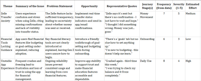
Example: “Return a structured list of themes. For each theme, include:
- Theme Title
- Summary of the Issue
- Problem Statement
- Opportunity
- Representative Quotes (from data only)
- Journey Stage(s)
- Frequency (count from data)
- Severity Score (1–5) where 1 = Minor inconvenience or annoyance; 3 = Frustrating but workaround exists; 5 = Blocking issue
- Estimated Effort (Low / Medium / High), where Low = Copy or content tweak; Medium = Logic/UX/UI change; High = Significant changes.”
WIRE gives you everything you need to stop guessing and start designing your prompts with purpose. When you start with WIRE, your prompting is like a briefing, treating AI like a collaborator.
Once you’ve mastered this core structure, you can layer in additional fidelity, like tone, step-by-step flow, or iterative feedback, using the FRAME elements. These five elements provide additional guidance and clarity to your prompt by layering clear deliverables, thoughtful tone, reusable structure, and space for creative iteration.
F: Flow of Tasks
Break complex prompts into clear, ordered steps.
This is your project plan or creative workflow that lays out the stages, dependencies, or sequence of execution. When the task has multiple parts, don’t just throw it all into one sentence. You are doing the thinking and guiding AI. Structure it like steps in a user journey or modules in a storyboard. In this example, it fits as the blueprint for the AI to use to generate the table described in “E: Expected Output”
Example: “Recommended flow of tasks:
Step 1: Parse the uploaded data and extract discrete pain points.
Step 2: Group them into themes based on pattern similarity.
Step 3: Score each theme by frequency (from data), severity (based on content), and estimated effort.
Step 4: Map each theme to the appropriate customer journey stage(s).
Step 5: For each theme, write a clear problem statement and opportunity based only on what’s in the data.”
R: Reference Voice or Style
Name the desired tone, mood, or reference brand.
This is the brand voice section or style mood board — reference points that shape the creative feel. Sometimes you want buttoned-up. Other times, you want conversational. Don’t assume the AI knows your tone, so spell it out.
Example: “Use the tone of a UX insights deck or product research report. Be concise, pattern-driven, and objective. Make summaries easy to scan by product managers and design leads.”
A: Ask for Clarification
Invite the AI to ask questions before generating, if anything is unclear.
This is your “Any questions before we begin?” moment — a key step in collaborative creative work. You wouldn’t want a freelancer to guess what you meant if the brief was fuzzy, so why expect AI to do better? Ask AI to reflect or clarify before jumping into output mode.
Example: “If the uploaded data is missing or unclear, ask for it before continuing. Also, ask for clarification if the feedback format is unstructured or inconsistent, or if the scoring criteria need refinement.”
M: Memory (Within The Conversation)
Reference earlier parts of the conversation and reuse what’s working.
This is similar to keeping visual tone or campaign language consistent across deliverables in a creative brief. Prompts are rarely one-shot tasks, so this reminds AI of the tone, audience, or structure already in play. GPT-5 got better with memory, but this still remains a useful element, especially if you switch topics or jump around.
Example: “Unless I say otherwise, keep using this process: analyze the data, group into themes, rank by importance, then suggest an action for each.”
E: Evaluate & Iterate
Invite the AI to critique, improve, or generate variations.
This is your revision loop — your way of prompting for creative direction, exploration, and refinement. Just like creatives expect feedback, your AI partner can handle review cycles if you ask for them. Build iteration into the brief to get closer to what you actually need. Sometimes, you may see ChatGPT test two versions of a response on its own by asking for your preference.
Example: “After listing all themes, identify the one with the highest combined priority score (based on frequency, severity, and effort).
For that top-priority theme:
- Critically evaluate its framing: Is the title clear? Are the quotes strong and representative? Is the journey mapping appropriate?
- Suggest one improvement (e.g., improved title, more actionable implication, clearer quote, tighter summary).
- Rewrite the theme entry with that improvement applied.
- Briefly explain why the revision is stronger and more useful for product or design teams.”
Here’s a quick recap of the WIRE+FRAME framework:
| Framework Component | Description |
|---|---|
| W: Who & What | Define the AI persona and the core deliverable. |
| I: Input Context | Provide background or data scope to frame the task. |
| R: Rules & Constraints | Set boundaries |
| E: Expected Output | Spell out the format and fields of the deliverable. |
| F: Flow of Tasks | Break the work into explicit, ordered sub-tasks. |
| R: Reference Voice/Style | Name the tone, mood, or reference brand to ensure consistency. |
| A: Ask for Clarification | Invite AI to pause and ask questions if any instructions or data are unclear before proceeding. |
| M: Memory | Leverage in-conversation memory to recall earlier definitions, examples, or phrasing without restating them. |
| E: Evaluate & Iterate | After generation, have the AI self-critique the top outputs and refine them. |
And here’s the full WIRE+FRAME prompt:
(W) You are a senior UX researcher and customer insights analyst. You specialize in synthesizing qualitative data from diverse sources to identify patterns, surface user pain points, and map them across customer journey stages. Your outputs directly inform product, UX, and service priorities.
(I) You are analyzing customer feedback for Fintech Brand’s app, targeting Gen Z users. Feedback will be uploaded from sources such as app store reviews, survey feedback, and usability test transcripts.
(R) Only analyze the uploaded customer feedback data. Do not fabricate pain points, representative quotes, journey stages, or patterns. Do not supplement with prior knowledge or hypothetical examples. Use clear, neutral, stakeholder-facing language.
(E) Return a structured list of themes. For each theme, include:
- Theme Title
- Summary of the Issue
- Problem Statement
- Opportunity
- Representative Quotes (from data only)
- Journey Stage(s)
- Frequency (count from data)
- Severity Score (1–5) where 1 = Minor inconvenience or annoyance; 3 = Frustrating but workaround exists; 5 = Blocking issue
- Estimated Effort (Low / Medium / High), where Low = Copy or content tweak; Medium = Logic/UX/UI change; High = Significant changes
(F) Recommended flow of tasks:
Step 1: Parse the uploaded data and extract discrete pain points.
Step 2: Group them into themes based on pattern similarity.
Step 3: Score each theme by frequency (from data), severity (based on content), and estimated effort.
Step 4: Map each theme to the appropriate customer journey stage(s).
Step 5: For each theme, write a clear problem statement and opportunity based only on what’s in the data.(R) Use the tone of a UX insights deck or product research report. Be concise, pattern-driven, and objective. Make summaries easy to scan by product managers and design leads.
(A) If the uploaded data is missing or unclear, ask for it before continuing. Also, ask for clarification if the feedback format is unstructured or inconsistent, or if the scoring criteria need refinement.
(M) Unless I say otherwise, keep using this process: analyze the data, group into themes, rank by importance, then suggest an action for each.
(E) After listing all themes, identify the one with the highest combined priority score (based on frequency, severity, and effort).
For that top-priority theme:
- Critically evaluate its framing: Is the title clear? Are the quotes strong and representative? Is the journey mapping appropriate?
- Suggest one improvement (e.g., improved title, more actionable implication, clearer quote, tighter summary).
- Rewrite the theme entry with that improvement applied.
- Briefly explain why the revision is stronger and more useful for product or design teams.
You could use “##” to label the sections (e.g., “##FLOW”) more for your readability than for AI. At over 400 words, this Insights Synthesis prompt example is a detailed, structured prompt, but it isn’t customized for you and your work. The intent wasn’t to give you a specific prompt (the proverbial fish), but to show how you can use a prompt framework like WIRE+FRAME to create a customized, relevant prompt that will help AI augment your work (teaching you to fish).
Keep in mind that prompt length isn’t a common concern, but rather a lack of quality and structure is. As of the time of writing, AI models can easily process prompts that are thousands of words long.
Not every prompt needs all the FRAME components; WIRE is often enough to get the job done. But when the work is strategic or highly contextual, pick components from FRAME — the extra details can make a difference. Together, WIRE+FRAME give you a detailed framework for creating a well-structured prompt, with the crucial components first, followed by optional components:
- WIRE builds a clear, focused prompt with role, input, rules, and expected output.
- FRAME adds refinement like tone, reusability, and iteration.
Here are some scenarios and recommendations for using WIRE or WIRE+FRAME:
| Scenarios | Description | Recommended |
|---|---|---|
| Simple, One-Off Analyses | Quick prompting with minimal setup and no need for detailed process transparency. | WIRE |
| Tight Sprints or Hackathons | Rapid turnarounds, and times you don’t need embedded review and iteration loops. | WIRE |
| Highly Iterative Exploratory Work | You expect to tweak results constantly and prefer manual control over each step. | WIRE |
| Complex Multi-Step Playbooks | Detailed workflows that benefit from a standardized, repeatable, visible sequence. | WIRE+FRAME |
| Shared or Hand-Off Projects | When different teams will rely on embedded clarification, memory, and consistent task flows for recurring analyses. | WIRE+FRAME |
| Built-In Quality Control | You want the AI to flag top issues, self-critique, and refine, minimizing manual QC steps. | WIRE+FRAME |
Prompting isn’t about getting it right the first time. It’s about designing the interaction and redesigning when needed. With WIRE+FRAME, you’re going beyond basic prompting and designing the interaction between you and AI.
From Gut Feel To Framework: A Prompt Makeover
Let’s compare the results of Kate’s first AI-augmented design sprint prompt (to synthesize customer feedback into design insights) with one based on the WIRE+FRAME prompt framework, with the same data and focusing on the top results:
Original prompt: Read this customer feedback and tell me how we can improve our app for Gen Z users.
Initial ChatGPT Results:
- Improve app reliability to reduce crashes and freezing.
- Provide better guidance or tutorials for financial tools like budgeting or goal setting.
- Enhance the transparency of Zelle transfers by showing confirmation messages.
- Speed up app loading and reduce lag on key actions.
With this version, you’d likely need to go back and forth with follow-up questions, rewrite the output for clarity, and add structure before sharing with your team.
WIRE+FRAME prompt above (with defined role, scope, rules, expected format, tone, flow, and evaluation loop).
Initial ChatGPT Results:
You can clearly see the very different results from the two prompts, both using the exact same data. While the first prompt returns a quick list of ideas, the detailed WIRE+FRAME version doesn’t just summarize feedback but structures it. Themes are clearly labeled, supported by user quotes, mapped to customer journey stages, and prioritized by frequency, severity, and effort.
The structured prompt results can be used as-is or shared without needing to reformat, rewrite, or explain them (see disclaimer below). The first prompt output needs massaging: it’s not detailed, lacks evidence, and would require several rounds of clarification to be actionable. The first prompt may work when the stakes are low and you are exploring. But when your prompt is feeding design, product, or strategy, structure comes to the rescue.
Disclaimer: Know Your Data
A well-structured prompt can make AI output more useful, but it shouldn’t be the final word, or your single source of truth. AI models are powerful pattern predictors, not fact-checkers. If your data is unclear or poorly referenced, even the best prompt may return confident nonsense. Don’t blindly trust what you see. Treat AI like a bright intern: fast, eager, and occasionally delusional. You should always be familiar with your data and validate what AI spits out. For example, in the WIRE+FRAME results above, AI rated the effort as low for financial tool onboarding. That could easily be a medium or high. Good prompting should be backed by good judgment.
Try This Now
Start by using the WIRE+FRAME framework to create a prompt that will help AI augment your work. You could also rewrite the last prompt you were not satisfied with, using the WIRE+FRAME, and compare the output.
Feel free to use this simple tool to guide you through the framework.
Methods: From Lone Prompts to a Prompt System
Just as design systems have reusable components, your prompts can too. You can use the WIRE+FRAME framework to write detailed prompts, but you can also use the structure to create reusable components that are pre-tested, plug-and-play pieces you can assemble to build high-quality prompts faster. Each part of WIRE+FRAME can be transformed into a prompt component: small, reusable modules that reflect your team’s standards, voice, and strategy.
For instance, if you find yourself repeatedly using the same content for different parts of the WIRE+FRAME framework, you could save them as reusable components for you and your team. In the example below, we have two different reusable components for “W: Who & What” — an insights analyst and an information architect.
W: Who & What
- You are a senior UX researcher and customer insights analyst. You specialize in synthesizing qualitative data from diverse sources to identify patterns, surface user pain points, and map them across customer journey stages. Your outputs directly inform product, UX, and service priorities.
- You are an experienced information architect specializing in organizing enterprise content on intranets. Your task is to reorganize the content and features into categories that reflect user goals, reduce cognitive load, and increase findability.
Create and save prompt components and variations for each part of the WIRE+FRAME framework, allowing your team to quickly assemble new prompts by combining components when available, rather than starting from scratch each time.
Behind The Prompts: Questions About Prompting
Q: If I use a prompt framework like WIRE+FRAME every time, will the results be predictable?
A: Yes and no. Yes, your outputs will be guided by a consistent set of instructions (e.g., Rules, Examples, Reference Voice / Style) that will guide the AI to give you a predictable format and style of results. And no, while the framework provides structure, it doesn’t flatten the generative nature of AI, but focuses it on what’s important to you. In the next article, we will look at how you can use this to your advantage to quickly reuse your best repeatable prompts as we build your AI assistant.
Q: Could changes to AI models break the WIRE+FRAME framework?
A: AI models are evolving more rapidly than any other technology we’ve seen before — in fact, ChatGPT was recently updated to GPT-5 to mixed reviews. The update didn’t change the core principles of prompting or the WIRE+FRAME prompt framework. With future releases, some elements of how we write prompts today may change, but the need to communicate clearly with AI won’t. Think of how you delegate work to an intern vs. someone with a few years’ experience: you still need detailed instructions the first time either is doing a task, but the level of detail may change. WIRE+FRAME isn’t built only for today’s models; the components help you clarify your intent, share relevant context, define constraints, and guide tone and format — all timeless elements, no matter how smart the model becomes. The skill of shaping clear, structured interactions with non-human AI systems will remain valuable.
Q: Can prompts be more than text? What about images or sketches?
A: Absolutely. With tools like GPT-5 and other multimodal models, you can upload screenshots, pictures, whiteboard sketches, or wireframes. These visuals become part of your Input Context or help define the Expected Output. The same WIRE+FRAME principles still apply: you’re setting context, tone, and format, just using images and text together. Whether your input is a paragraph or an image and text, you’re still designing the interaction.
Have a prompt-related question of your own? Share it in the comments, and I’ll either respond there or explore it further in the next article in this series.
From Designerly Prompting To Custom Assistants
Good prompts and results don’t come from using others’ prompts, but from writing prompts that are customized for you and your context. The WIRE+FRAME framework helps with that and makes prompting a tool you can use to guide AI models like a creative partner instead of hoping for magic from a one-line request.
Prompting uses the designerly skills you already use every day to collaborate with AI:
- Curiosity to explore what the AI can do and frame better prompts.
- Observation to detect bias or blind spots.
- Empathy to make machine outputs human.
- Critical thinking to verify and refine.
- Experiment & Iteration to learn by doing and improve the interaction over time.
- Growth Mindset to keep up with new technology like AI and prompting.
Once you create and refine prompt components and prompts that work for you, make them reusable by documenting them. But wait, there’s more — what if your best prompts, or the elements of your prompts, could live inside your own AI assistant, available on demand, fluent in your voice, and trained on your context? That’s where we’re headed next.
In the next article, “Design Your Own Design Assistant”, we’ll take what you’ve learned so far and turn it into a Custom AI assistant (aka Custom GPT), a design-savvy, context-aware assistant that works like you do. We’ll walk through that exact build, from defining the assistant’s job description to uploading knowledge, testing, and sharing it with others.
Resources
- GPT-5 Prompting Guide
- GPT-4.1 Prompting Guide
- Anthropic Prompt Engineering
- Prompt Engineering by Google
- Perplexity
- Webapp to guide you through the WIRE+FRAME framework
(yk)
Designing For TV: The Evergreen Pattern That Shapes TV Experiences
Designing For TV: The Evergreen Pattern That Shapes TV Experiences Designing For TV: The Evergreen Pattern That Shapes TV Experiences Milan Balać 2025-08-27T13:00:00+00:00 2025-08-27T15:32:36+00:00 Television sets have been the staple of our living rooms for decades. We watch, we interact, and we control, but how […]
Accessibility
Designing For TV: The Evergreen Pattern That Shapes TV Experiences
Milan Balać 2025-08-27T13:00:00+00:00
2025-08-27T15:32:36+00:00
Television sets have been the staple of our living rooms for decades. We watch, we interact, and we control, but how often do we design for them? TV design flew under my “radar” for years, until one day I found myself in the deep, designing TV-specific user interfaces. Now, after gathering quite a bit of experience in the area, I would like to share my knowledge on this rather rare topic. If you’re interested in learning more about the user experience and user interfaces of television, this article should be a good starting point.
Just like any other device or use case, TV has its quirks, specifics, and guiding principles. Before getting started, it will be beneficial to understand the core ins and outs. In Part 1, we’ll start with a bit of history, take a close look at the fundamentals, and review the evolution of television. In Part 2, we’ll dive into the depths of practical aspects of designing for TV, including its key principles and patterns.
Let’s start with the two key paradigms that dictate the process of designing TV interfaces.
Mind The Gap, Or The 10-foot-experience
Firstly, we have the so-called “10-foot experience,” referring to the fact that interaction and consumption on TV happens from a distance of roughly three or more meters. This is significantly different than interacting with a phone or a computer and implies having some specific approaches in the TV user interface design. For example, we’ll need to make text and user interface (UI) elements larger on TV to account for the bigger distance to the screen.
Furthermore, we’ll take extra care to adhere to contrast standards, primarily relying on dark interfaces, as light ones may be too blinding in darker surroundings. And finally, considering the laid-back nature of the device, we’ll simplify the interactions.

But the 10-foot experience is only one part of the equation. There wouldn’t be a “10-foot experience” in the first place if there were no mediator between the user and the device, and if we didn’t have something to interact through from a distance.
There would be no 10-foot experience if there were no remote controllers.
The Mediator
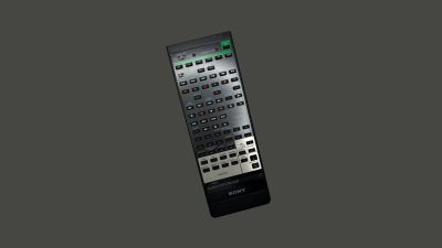
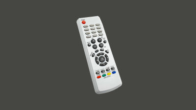
The remote, the second half of the equation, is what allows us to interact with the TV from the comfort of the couch. Slower and more deliberate, this conglomerate of buttons lacks the fluid motion of a mouse, or the dexterity of fingers against a touchscreen — yet the capabilities of the remote should not be underestimated.
Rudimentary as it is and with a limited set of functions, the remote allows for some interesting design approaches and can carry the weight of the modern TV along with its ever-growing requirements for interactivity. It underwent a handful of overhauls during the seventy years since its inception and was refined and made more ergonomic; however, there is a 40-year-old pattern so deeply ingrained in its foundation that nothing can change it.
What if I told you that you could navigate TV interfaces and apps with a basic controller from the 1980s just as well as with the latest remote from Apple? Not only that, but any experience built around the six core buttons of a remote will be system-agnostic and will easily translate across platforms.
This is the main point I will focus on for the rest of this article.
Birth Of A Pattern
As television sets were taking over people’s living rooms in the 1950s, manufacturers sought to upgrade and improve the user experience. The effort of walking up to the device to manually adjust some settings was eventually identified as an area for improvement, and as a result, the first television remote controllers were introduced to the market.
Early Developments
Preliminary iterations of the remotes were rather unique, and it took some divergence before we finally settled on a rectangular shape and sprinkled buttons on top.
Take a look at the Zenith Flash-Matic, for example. Designed in the mid-1950s, this standout device featured a single button that triggered a directional lamp; by pointing it at specific corners of the TV set, viewers could control various functions, such as changing channels or adjusting the volume.

While they were a far cry compared to their modern counterparts, devices like the Flash-Matic set the scene for further developments, and we were off to the races!
As the designs evolved, the core functionality of the remote solidified. Gradually, remote controls became more than just simple channel changers, evolving into command centers for the expanding territory of home entertainment.
Note: I will not go too much into history here — aside from some specific points that are of importance to the matter at hand — but if you have some time to spare, do look into the developmental history of television sets and remotes, it’s quite a fascinating topic.

However, practical as they may have been, they were still considered a luxury, significantly increasing the prices of TV sets. As the 1970s were coming to a close, only around 17% of United States households had a remote controller for their TVs. Yet, things would change as the new decade rolled in.
Button Mania Of The 1980s
The eighties brought with them the Apple Macintosh, MTV, and Star Wars. It was a time of cultural shifts and technological innovation. Videocassette recorders (VCRs) and a multitude of other consumer electronics found their place in the living rooms of the world, along with TVs.
These new devices, while enriching our media experiences, also introduced a few new design problems. Where there was once a single remote, now there were multiple remotes, and things were getting slowly out of hand.
This marked the advent of universal remotes.
Trying to hit many targets with one stone, the unwieldy universal remotes were humanity’s best solution for controlling a wider array of devices. And they did solve some of these problems, albeit in an awkward way. The complexity of universal remotes was a trade-off for versatility, allowing them to be programmed and used as a command center for controlling multiple devices. This meant transforming the relatively simple design of their predecessors into a beehive of buttons, prioritizing broader compatibility over elegance.
On the other hand, almost as a response to the inconvenience of the universal remote, a different type of controller was conceived in the 1980s — one with a very basic layout and set of buttons, and which would leave its mark in both how we interact with the TV, and how our remotes are laid out. A device that would, knowingly or not, give birth to a navigational pattern that is yet to be broken — the NES controller.
D-pad Dominance
Released in 1985, the Nintendo Entertainment System (NES) was an instant hit. Having sold sixty million units around the world, it left an undeniable mark on the gaming console industry.
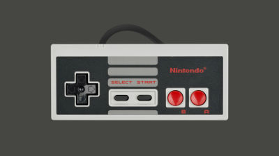
The NES controller (which was not truly remote, as it ran a cable to the central unit) introduced the world to a deceptively simple control scheme. Consisting of six primary actions, it gave us the directional pad (the D-pad), along with two action buttons (A and B). Made in response to the bulky joystick, the cross-shaped cluster allowed for easy movement along two axes (up, down, left, and right).
Charmingly intuitive, this navigational pattern would produce countless hours of gaming fun, but more importantly, its elementary design would “seep over” into the wider industry — the D-pad, along with the two action buttons, would become the very basis on which future remotes would be constructed.
The world continued spinning madly on, and what was once a luxury became commonplace. By the end of the decade, TV remotes were more integral to the standard television experience, and more than two-thirds of American TV owners had some sort of a remote.
The nineties rolled in with further technological advancements. TV sets became more robust, allowing for finer tuning of their settings. This meant creating interfaces through which such tasks could be accomplished, and along with their master sets, remotes got updated as well.
Gone were the bulky rectangular behemoths of the eighties. As ergonomics took precedence, they got replaced by comfortably contoured devices that better fit their users’ hands. Once conglomerations of dozens of uniform buttons, these contemporary remotes introduced different shapes and sizes, allowing for recognition simply through touch. Commands were being clustered into sensible groups along the body of the remote, and within those button groups, a familiar shape started to emerge.

Gradually, the D-pad found its spot on our TV remotes. As the evolution of these devices progressed, it became even more deeply embedded at the core of their interactivity.
Set-top boxes and smart features emerged in the 2000s and 2010s, and TV technology continued to advance. Along the way, many bells and whistles were introduced. TVs got bigger, brighter, thinner, yet their essence remained unchanged.
In the years since their inception, remotes were innovated upon, but all the undertakings circle back to the core principles of the NES controller. Future endeavours never managed to replace, but only to augment and reinforce the pattern.
The Evergreen Pattern
In 2013, LG introduced their Magic remote (“So magically simple, the kids will be showing you how to use it!”). This uniquely shaped device enabled motion controls on LG TV sets, allowing users to point and click similar to a computer mouse. Having a pointer on the screen allowed for much more flexibility and speed within the system, and the remote was well-received and praised as one of the best smart TV remotes.
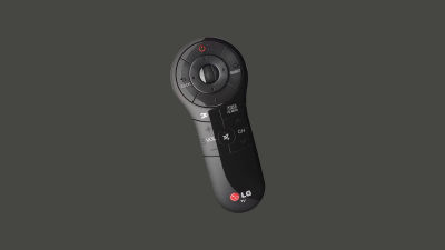
Innovating on tradition, this device introduced new features and fresh perspectives to the world of TV. But if we look at the device itself, we’ll see that, despite its differences, it still retains the D-pad as a means of interaction. It may be argued that LG never set out to replace the directional pad, and as it stands, regardless of their intent, they only managed to augment it.
For an even better example, let’s examine Apple TV’s second-generation remotes (the first-generation Siri remote). Being the industry disruptors, Apple introduced a touchpad to the top half of the remote. The glass surface provided briskness and precision to the experience, enabling multi-touch gestures, swipe navigation, and quick scrolling. This quality of life upgrade was most noticeable when typing with the horizontal on-screen keyboards, as it allowed for smoother and quicker scrolling from A to Z, making for a more refined experience.
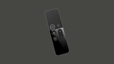
While at first glance it may seem Apple removed the directional buttons, the fact is that the touchpad is simply a modernised take on the pattern, still abiding by the same four directions a classic D-pad does. You could say it’s a D-pad with an extra layer of gimmick.
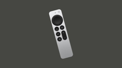
Furthermore, the touchpad didn’t really sit well with the user base, along with the fact that the remote’s ergonomics were a bit iffy. So instead of pushing the boundaries even further with their third generation of remotes, Apple did a complete 180, re-introducing the classic D-pad cluster while keeping the touch capabilities from the previous generation (the touch-enabled clickpad lets you select titles, swipe through playlists, and use a circular gesture on the outer ring to find just the scene you’re looking for).
Now, why can’t we figure out a better way to navigate TVs? Does that mean we shouldn’t try to innovate?
We can argue that using motion controls and gestures is an obvious upgrade to interacting with a TV. And we’d be right… in principle. These added features are more complex and costly to produce, but more importantly, while it has been upgraded with bits and bobs, the TV is essentially a legacy system. And it’s not only that.
While touch controls are a staple of interaction these days, adding them without thorough consideration can reduce the usability of a remote.
“
Pitfalls Of Touch Controls
Modern car dashboards are increasingly being dominated by touchscreens. While they may impress at auto shows, their real-world usability is often compromised.
Driving demands constant focus and the ability to adapt and respond to ever-changing conditions. Any interface that requires taking your eyes off the road for more than a moment increases the risk of accidents. That’s exactly where touch controls fall short. While they may be more practical (and likely cheaper) for manufacturers to implement, they’re often the opposite for the end user.
Unlike physical buttons, knobs, and levers, which offer tactile landmarks and feedback, touch interfaces lack the ability to be used by feeling alone. Even simple tasks like adjusting the volume of the radio or the climate controls often involve gestures and nested menus, all performed on a smooth glass surface that demands visual attention, especially when fine-tuning.
Fortunately, the upcoming 2026 Euro NCAP regulations will encourage car manufacturers to reintroduce physical controls for core functions, reducing driver distraction and promoting safer interaction.
Similarly (though far less critically), sleek, buttonless TV remote controls may feel modern, but they introduce unnecessary abstraction to a familiar set of controls.
Physical buttons with distinct shapes and positioning allow users to navigate by memory and touch, even in the dark. That’s not outdated — it’s a deeper layer of usability that modern design should respect, not discard.
“
And this is precisely why Apple reworked the Apple TV third-generation remote the way it is now, where the touch area at the top disappeared. Instead, the D-pad again had clearly defined buttons, and at the same time, the D-pad could also be extended (not replaced) to accept some touch gestures.
The Legacy Of TV
Let’s take a look at an old on-screen keyboard.

The Legend of Zelda, released in 1986, allowed players to register their names in-game. There are even older games with the same feature, but that’s beside the point. Using the NES controller, the players would move around the keyboard, entering their moniker character by character. Now let’s take a look at a modern iteration of the on-screen keyboard.
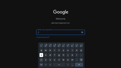
Notice the difference? Or, to phrase it better: do you notice the similarities? Throughout the years, we’ve introduced quality of life improvements, but the core is exactly the same as it was forty years ago. And it is not the lack of innovation or bad remotes that keep TV deeply ingrained in its beginnings. It’s simply that it’s the most optimal way to interact given the circumstances.
Laying It All Out
Just like phones and computers, TV layouts are based on a grid system. However, this system is a lot more apparent and rudimentary on TV. Taking a look at a standard TV interface, we’ll see that it consists mainly of horizontal and vertical lists, also known as shelves.
These grids may be populated with cards, characters of the alphabet, or anything else, essentially, and upon closer examination, we’ll notice that our movement is restricted by a few factors:
- There is no pointer for our eyes to follow, like there would be on a computer.
- There is no way to interact directly with the display like we would with a touchscreen.
For the purposes of navigating with a remote, a focus state is introduced. This means that an element will always be highlighted for our eyes to anchor, and it will be the starting point for any subsequent movement within the interface.

Moreover, starting from the focused element, we can notice that the movement is restricted to one item at a time, almost like skipping stones. Navigating linearly in such a manner, if we wanted to move within a list of elements from element #1 to element #5, we’d have to press a directional button four times.

To successfully navigate such an interface, we need the ability to move left, right, up, and down — we need a D-pad. And once we’ve landed on our desired item, there needs to be a way to select it or make a confirmation, and in the case of a mistake, we need to be able to go back. For the purposes of those two additional interactions, we’d need two more buttons, OK and back, or to make it more abstract, we’d need buttons A and B.
So, to successfully navigate a TV interface, we need only a NES controller.
Yes, we can enhance it with touchpads and motion gestures, augment it with voice controls, but this unshakeable foundation of interaction will remain as the very basic level of inherent complexity in a TV interface. Reducing it any further would significantly impair the experience, so all we’ve managed to do throughout the years is to only build upon it.
The D-pad and buttons A and B survived decades of innovation and technological shifts, and chances are they’ll survive many more. By understanding and respecting this principle, you can design intuitive, system-agnostic experiences and easily translate them across platforms. Knowing you can’t go simpler than these six buttons, you’ll easily build from the ground up and attach any additional framework-bound functionality to the time-tested core.
And once you get the grip of these paradigms, you’ll get into mapping and re-mapping buttons depending on context, and understand just how far you can go when designing for TV. You’ll be able to invent new experiences, conduct experiments, and challenge the patterns. But that is a topic for a different article.
Closing Thoughts
While designing for TV almost exclusively during the past few years, I was also often educating the stakeholders on the very principles outlined in this article. Trying to address their concerns about different remotes working slightly differently, I found respite in the simplicity of the NES controller and how it got the point across in an understandable way. Eventually, I expanded my knowledge by looking into the developmental history of the remote and was surprised that my analogy had backing in history. This is a fascinating niche, and there’s a lot more to share on the topic. I’m glad we started!
It’s vital to understand the fundamental “ins” and “outs” of any venture before getting practical, and TV is no different. Now that you understand the basics, go, dig in, and break some ground.
Having covered the underlying interaction patterns of TV experiences in detail, it’s time to get practical.
In Part 2, we’ll explore the building blocks of the 10-foot experience and how to best utilize them in your designs. We’ll review the TV design fundamentals (the screen, layout, typography, color, and focus/focus styles), and the common TV UI components (menus, “shelves,” spotlights, search, and more). I will also show you how to start thinking beyond the basics and to work with — and around — the constraints which we abide by when designing for TV. Stay tuned!
Further Reading
- “The 10 Foot Experience,” by Robert Stulle (Edenspiekermann)
Every user interface should offer effortless navigation and control. For the 10-foot experience, this is twice as important; with only up, down, left, right, OK and back as your input vocabulary, things had better be crystal clear. You want to sit back and enjoy without having to look at your remote — your thumb should fly over the buttons to navigate, select, and activate. - “Introduction to the 10-Foot Experience for Windows Game Developers” (Microsoft Learn)
A growing number of people are using their personal computers in a completely new way. When you think of typical interaction with a Windows-based computer, you probably envision sitting at a desk with a monitor, and using a mouse and keyboard (or perhaps a joystick device); this is referred to as the 2-foot experience. But there’s another trend which you’ll probably start hearing more about: the 10-foot experience, which describes using your computer as an entertainment device with output to a TV. This article introduces the 10-foot experience and explores the list of things that you should consider first about this new interaction pattern, even if you aren’t expecting your game to be played this way. - “10-foot user interface” (Wikipedia)
In computing, a 10-foot user interface, or 3-meter UI, is a graphical user interface designed for televisions (TV). Compared to desktop computer and smartphone user interfaces, it uses text and other interface elements that are much larger in order to accommodate a typical television viewing distance of 10 feet (3.0 meters); in reality, this distance varies greatly between households, and additionally, the limitations of a television’s remote control necessitate extra user experience considerations to minimize user effort. - “The Television Remote Control: A Brief History,” by Mary Bellis (ThoughtCo)
The first TV remote, the Lazy Bone, was made in 1950 and used a cable. In 1955, the Flash-matic was the first wireless remote, but it had issues with sunlight. Zenith’s Space Command in 1956 used ultrasound and became the popular choice for over 25 years. - “The History of The TV Remote,” by Remy Millisky (Grunge)
The first person to create and patent the remote control was none other than Nikola Tesla, inventor of the Tesla coil and numerous electronic systems. He patented the idea in 1893 to drive boats remotely, far before televisions were invented. Since then, remotes have come a long way, especially for the television, changing from small boxes with long wires to the wireless universal remotes that many people have today. How has the remote evolved over time? - “Nintendo Entertainment System controller” (Nintendo Wiki)
The Nintendo Entertainment System controller is the main controller for the NES. While previous systems had used joysticks, the NES controller provided a directional pad (the D-pad was introduced in the Game & Watch version of Donkey Kong). - “Why Touchscreens In Cars Don’t Work,” by Jacky Li (published in June 2018)
Observing the behaviour of 21 drivers has made me realize what’s wrong with automotive UX. […] While I was excited to learn more about the Tesla Model X, it slowly became apparent to me that the driver’s eyes were more glued to the screen than the road. Something about interacting with a touchscreen when driving made me curious to know: just how distracting are they? - “Europe Is Requiring Physical Buttons For Cars To Get Top Safety Marks,” by Jason Torchinsky (published in March 2024)
The overuse of touchscreens is an industry-wide problem, with almost every vehicle-maker moving key controls onto central touchscreens, obliging drivers to take their eyes off the road and raising the risk of distraction crashes. New Euro NCAP tests due in 2026 will encourage manufacturers to use separate, physical controls for basic functions in an intuitive manner, limiting eyes-off-road time and therefore promoting safer driving.
(mb, yk)
A Week In The Life Of An AI-Augmented Designer
A Week In The Life Of An AI-Augmented Designer A Week In The Life Of An AI-Augmented Designer Lyndon Cerejo 2025-08-22T08:00:00+00:00 2025-08-27T15:32:36+00:00 Artificial Intelligence isn’t new, but in November 2022, something changed. The launch of ChatGPT brought AI out of the background and into everyday […]
Accessibility
A Week In The Life Of An AI-Augmented Designer
Lyndon Cerejo 2025-08-22T08:00:00+00:00
2025-08-27T15:32:36+00:00
Artificial Intelligence isn’t new, but in November 2022, something changed. The launch of ChatGPT brought AI out of the background and into everyday life. Suddenly, interacting with a machine didn’t feel technical — it felt conversational.
Just this March, ChatGPT overtook Instagram and TikTok as the most downloaded app in the world. That level of adoption shows that millions of everyday users, not just developers or early adopters, are comfortable using AI in casual, conversational ways. People are using AI not just to get answers, but to think, create, plan, and even to help with mental health and loneliness.
In the past two and a half years, people have moved through the Kübler-Ross Change Curve — only instead of grief, it’s AI-induced uncertainty. UX designers, like Kate (who you’ll meet shortly), have experienced something like this:
- Denial: “AI can’t design like a human; it won’t affect my workflow.”
- Anger: “AI will ruin creativity. It’s a threat to our craft.”
- Bargaining: “Okay, maybe just for the boring tasks.”
- Depression: “I can’t keep up. What’s the future of my skills?”
- Acceptance: “Alright, AI can free me up for more strategic, human work.”
As designers move into experimentation, they’re not asking, Can I use AI? but How might I use it well?.
Using AI isn’t about chasing the latest shiny object but about learning how to stay human in a world of machines, and use AI not as a shortcut, but as a creative collaborator.
“
It isn’t about finding, bookmarking, downloading, or hoarding prompts, but experimenting and writing your own prompts.
To bring this to life, we’ll follow Kate, a mid-level designer at a FinTech company, navigating her first AI-augmented design sprint. You’ll see her ups and downs as she experiments with AI, tries to balance human-centered skills with AI tools, when she relies on intuition over automation, and how she reflects critically on the role of AI at each stage of the sprint.
The next two planned articles in this series will explore how to design prompts (Part 2) and guide you through building your own AI assistant (aka CustomGPT; Part 3). Along the way, we’ll spotlight the designerly skills AI can’t replicate like curiosity, empathy, critical thinking, and experimentation that will set you apart in a world where automation is easy, but people and human-centered design matter even more.
Note: This article was written by a human (with feelings, snacks, and deadlines). The prompts are real, the AI replies are straight from the source, and no language models were overworked — just politely bossed around. All em dashes are the handiwork of MS Word’s autocorrect — not AI. Kate is fictional, but her week is stitched together from real tools, real prompts, real design activities, and real challenges designers everywhere are navigating right now. She will primarily be using ChatGPT, reflecting the popularity of this jack-of-all-trades AI as the place many start their AI journeys before branching out. If you stick around to the end, you’ll find other AI tools that may be better suited for different design sprint activities. Due to the pace of AI advances, your outputs may vary (YOMV), possibly by the time you finish reading this sentence.
Cautionary Note: AI is helpful, but not always private or secure. Never share sensitive, confidential, or personal information with AI tools — even the helpful-sounding ones. When in doubt, treat it like a coworker who remembers everything and may not be particularly good at keeping secrets.
Prologue: Meet Kate (As She Preps For The Upcoming Week)
Kate stared at the digital mountain of feedback on her screen: transcripts, app reviews, survey snippets, all waiting to be synthesized. Deadlines loomed. Her calendar was a nightmare. Meanwhile, LinkedIn was ablaze with AI hot takes and success stories. Everyone seemed to have found their “AI groove” — except her. She wasn’t anti-AI. She just hadn’t figured out how it actually fit into her work. She had tried some of the prompts she saw online, played with some AI plugins and extensions, but it felt like an add-on, not a core part of her design workflow.
Her team was focusing on improving financial confidence for Gen Z users of their FinTech app, and Kate planned to use one of her favorite frameworks: the Design Sprint, a five-day, high-focus process that condenses months of product thinking into a single week. Each day tackles a distinct phase: Understand, Sketch, Decide, Prototype, and Test. All designed to move fast, make ideas tangible, and learn from real users before making big bets.
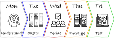
This time, she planned to experiment with a very lightweight version of the design sprint, almost “solo-ish” since her PM and engineer were available for check-ins and decisions, but not present every day. That gave her both space and a constraint, and made it the perfect opportunity to explore how AI could augment each phase of the sprint.
She decided to lean on her designerly behavior of experimentation and learning and integrate AI intentionally into her sprint prep, using it as both a creative partner and a thinking aid. Not with a rigid plan, but with a working hypothesis that AI would at the very least speed her up, if nothing else.
She wouldn’t just be designing and testing a prototype, but prototyping and testing what it means to design with AI, while still staying in the driver’s seat.
Follow Kate along her journey through her first AI-powered design sprint: from curiosity to friction and from skepticism to insight.
Monday: Understanding the Problem (aka: Kate Vs. Digital Pile Of Notes)
The first day of a design sprint is spent understanding the user, their problems, business priorities, and technical constraints, and narrowing down the problem to solve that week.
This morning, Kate had transcripts from recent user interviews and customer feedback from the past year from app stores, surveys, and their customer support center. Typically, she would set aside a few days to process everything, coming out with glazed eyes and a few new insights. This time, she decided to use ChatGPT to summarize that data: “Read this customer feedback and tell me how we can improve financial literacy for Gen Z in our app.”
ChatGPT’s outputs were underwhelming to say the least. Disappointed, she was about to give up when she remembered an infographic about good prompting that she had emailed herself. She updated her prompt based on those recommendations:
- Defined a role for the AI (“product strategist”),
- Provided context (user group and design sprint objectives), and
- Clearly outlined what she was looking for (financial literacy related patterns in pain points, blockers, confusion, lack of confidence; synthesis to identify top opportunity areas).
By the time she Aero-pressed her next cup of coffee, ChatGPT had completed its analysis, highlighting blockers like jargon, lack of control, fear of making the wrong choice, and need for blockchain wallets. Wait, what? That last one felt off.
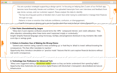
Kate searched her sources and confirmed her hunch: AI hallucination! Despite the best of prompts, AI sometimes makes things up based on trendy concepts from its training data rather than actual data. Kate updated her prompt with constraints to make ChatGPT only use data she had uploaded, and to cite examples from that data in its results. 18 seconds later, the updated results did not mention blockchain or other unexpected results.
By lunch, Kate had the makings of a research summary that would have taken much, much longer, and a whole lot of caffeine.
That afternoon, Kate and her product partner plotted the pain points on the Gen Z app journey. The emotional mapping highlighted the most critical moment: the first step of a financial decision, like setting a savings goal or choosing an investment option. That was when fear, confusion, and lack of confidence held people back.
AI synthesis combined with human insight helped them define the problem statement as: “How might we help Gen Z users confidently take their first financial action in our app, in a way that feels simple, safe, and puts them in control?”
Kate’s Reflection
As she wrapped up for the day, Kate jotted down her reflections on her first day as an AI-augmented designer:
There’s nothing like learning by doing. I’ve been reading about AI and tinkering around, but took the plunge today. Turns out AI is much more than a tool, but I wouldn’t call it a co-pilot. Yet. I think it’s like a sharp intern: it has a lot of information, is fast, eager to help, but it lacks context, needs supervision, and can surprise you. You have to give it clear instructions, double-check its work, and guide and supervise it. Oh, and maintain boundaries by not sharing anything I wouldn’t want others to know.
Today was about listening — to users, to patterns, to my own instincts. AI helped me sift through interviews fast, but I had to stay curious to catch what it missed. Some quotes felt too clean, like the edges had been smoothed over. That’s where observation and empathy kicked in. I had to ask myself: what’s underneath this summary?
Critical thinking was the designerly skill I had to exercise most today. It was tempting to take the AI’s synthesis at face value, but I had to push back by re-reading transcripts, questioning assumptions, and making sure I wasn’t outsourcing my judgment. Turns out, the thinking part still belongs to me.
Tuesday: Sketching (aka: Kate And The Sea of OKish Ideas)
Day 2 of a design sprint focuses on solutions, starting by remixing and improving existing ideas, followed by people sketching potential solutions.
Optimistic, yet cautious after her experience yesterday, Kate started thinking about ways she could use AI today, while brewing her first cup of coffee. By cup two, she was wondering if AI could be a creative teammate. Or a creative intern at least. She decided to ask AI for a list of relevant UX patterns across industries. Unlike yesterday’s complex analysis, Kate was asking for inspiration, not insight, which meant she could use a simpler prompt: “Give me 10 unique examples of how top-rated apps reduce decision anxiety for first-time users — from FinTech, health, learning, or ecommerce.”
She received her results in a few seconds, but there were only 6, not the 10 she asked for. She expanded her prompt for examples from a wider range of industries. While reviewing the AI examples, Kate realized that one had accessibility issues. To be fair, the results met Kate’s ask since she had not specified accessibility considerations. She then went pre-AI and brainstormed examples with her product partner, coming up with a few unique local examples.
Later that afternoon, Kate went full human during Crazy 8s by putting a marker to paper and sketching 8 ideas in 8 minutes to rapidly explore different directions. Wondering if AI could live up to its generative nature, she uploaded pictures of her top 3 sketches and prompted AI to act as “a product design strategist experienced in Gen Z behavior, digital UX, and behavioral science”, gave it context about the problem statement, stage in the design sprint, and explicitly asked AI the following:
- Analyze the 3 sketch concepts and identify core elements or features that resonated with the goal.
- Generate 5 new concept directions, each of which should:
- Address the original design sprint challenge.
- Reflect Gen Z design language, tone, and digital behaviors.
- Introduce a unique twist, remix, or conceptual inversion of the ideas in the sketches.
- For each concept, provide:
- Name (e.g., “Monopoly Mode,” “Smart Start”);
- 1–2 sentence concept summary;
- Key differentiator from the original sketches;
- Design tone and/or behavioral psychology technique used.
The results included ideas that Kate and her product partner hadn’t considered, including a progress bar that started at 20% (to build confidence), and a sports-like “stock bracket” for first-time investors.
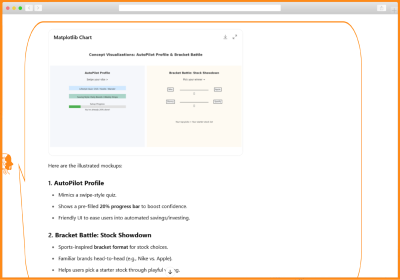
Not bad, thought Kate, as she cherry-picked elements, combined and built on these ideas in her next round of sketches. By the end of the day, they had a diverse set of sketched solutions — some original, some AI-augmented, but all exploring how to reduce fear, simplify choices, and build confidence for Gen Z users taking their first financial step. With five concept variations and a few rough storyboards, Kate was ready to start converging on day 3.
Kate’s Reflection
Today was creatively energizing yet a little overwhelming! I leaned hard on AI to act as a creative teammate. It delivered a few unexpected ideas and remixed my Crazy 8s into variations I never would’ve thought of!
It also reinforced the need to stay grounded in the human side of design. AI was fast — too fast, sometimes. It spit out polished-sounding ideas that sounded right, but I had to slow down, observe carefully, and ask: Does this feel right for our users? Would a first-time user feel safe or intimidated here?
Critical thinking helped me separate what mattered from what didn’t. Empathy pulled me back to what Gen Z users actually said, and kept their voices in mind as I sketched. Curiosity and experimentation were my fuel. I kept tweaking prompts, remixing inputs, and seeing how far I could stretch a concept before it broke. Visual communication helped translate fuzzy AI ideas into something I could react to — and more importantly, test.
Wednesday: Deciding (aka Kate Tries to Get AI to Pick a Side)
Design sprint teams spend Day 3 critiquing each of their potential solutions to shortlist those that have the best chance of achieving their long-term goal. The winning scenes from the sketches are then woven into a prototype storyboard.
Design sprint Wednesdays were Kate’s least favorite day. After all the generative energy during Sketching Tuesday, today, she would have to decide on one clear solution to prototype and test. She was unsure if AI would be much help with judging tradeoffs or narrowing down options, and it wouldn’t be able to critique like a team. Or could it?
Kate reviewed each of the five concepts, noting strengths, open questions, and potential risks. Curious about how AI would respond, she uploaded images of three different design concepts and prompted ChatGPT for strengths and weaknesses. AI’s critique was helpful in summarizing the pros and cons of different concepts, including a few points she had not considered — like potential privacy concerns.
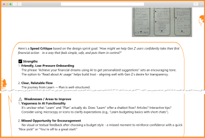
She asked a few follow-up questions to confirm the actual reasoning. Wondering if she could simulate a team critique by prompting ChatGPT differently, Kate asked it to use the 6 thinking hats technique. The results came back dense, overwhelming, and unfocused. The AI couldn’t prioritize, and it couldn’t see the gaps Kate instinctively noticed: friction in onboarding, misaligned tone, unclear next steps.
In that moment, the promise of AI felt overhyped. Kate stood up, stretched, and seriously considered ending her experiments with the AI-driven process. But she paused. Maybe the problem wasn’t the tool. Maybe it was how she was using it. She made a note to experiment when she wasn’t on a design sprint clock.
She returned to her sketches, this time laying them out on the wall. No screens, no prompts. Just markers, sticky notes, and Sharpie scribbles. Human judgment took over. Kate worked with her product partner to finalize the solution to test on Friday and spent the next hour storyboarding the experience in Figma.
Kate re-engaged with AI as a reviewer, not a decider. She prompted it for feedback on the storyboard and was surprised to see it spit out detailed design, content, and micro-interaction suggestions for each of the steps of the storyboarded experience. A lot of food for thought, but she’d have to judge what mattered when she created her prototype. But that wasn’t until tomorrow!
Kate’s Reflection
AI exposed a few of my blind spots in the critique, which was good, but it basically pointed out that multiple options “could work”. I had to rely on my critical thinking and instincts to weigh options logically, emotionally, and contextually in order to choose a direction that was the most testable and aligned with the user feedback from Day 1.
I was also surprised by the suggestions it came up with while reviewing my final storyboard, but I will need a fresh pair of eyes and all the human judgement I can muster tomorrow.
Empathy helped me walk through the flow like I was a new user. Visual communication helped pull it all together by turning abstract steps into a real storyboard for the team to see instead of imagining.
TO DO: Experiment prompting around the 6 Thinking Hats for different perspectives.
Thursday: Prototype (aka Kate And Faking It)
On Day 4, the team usually turns the storyboard from the previous day into a prototype that can be tested with users on Day 5. The prototype doesn’t need to be fully functional; a simulated experience is sufficient to gather user feedback.
Kate’s prototype day often consisted of marathon Figma Design sessions and late-night pizza dinners. She was hoping AI would change that today. She fed yesterday’s storyboard to ChatGPT and asked it for screens. It took a while to generate, but she was excited to see a screen flow gradually appear on her screen, except that it had 3 ¾ screens, instead of the 6 frames from her storyboard, as you can see in the image below.
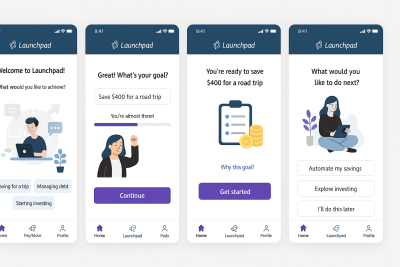
She tried different prompts but couldn’t get a complete flow. She was excited when it offered to create a Figma file. She waited. And waited. And reminded it that she was right there waiting. It finally gave her a link — a link that didn’t work. That made her question why she needed prototype screens in Figma at all. Could one of those no-code tools do the job? Kate remembered that she had just received beta access to Figma Make (Figma’s AI prompt-to-prototype tool) and decided to put it to the test.
She shared her storyboard, added context about the prototype for a design sprint, the problem, and a brief description of the audience. In a few seconds, she saw code being generated and a running description on the left. It seemed like it would take some time, so she headed to the cafeteria for lunch.

When Kate returned, she was surprised to see Figma Make had created an app along with a detailed explanation:
“I’ve created a complete finance app prototype with five key screens that guide users through setting financial goals in a friendly, low-pressure way. The app features smooth animations with Framer Motion, a progress indicator to show users where they are in the journey, and emotionally supportive visuals and copy throughout the experience. Each screen serves a specific purpose: welcoming users, helping them define relatable goals, building their plan with visual feedback, presenting a simple summary, and offering next steps without pressure.
You might want to:
- Add personalization options like user profiles or avatars.
- Implement a dark mode toggle for accessibility.
- Create additional goal templates and saving strategies.”
Since Figma Make had built the prototype, not her, Kate felt like she was User 0, and clicked her way through the interactive prototype, making a mental note of what worked, what didn’t. She was impressed to see that she could not only select a common goal (buy a home, save for education, and so on) but she could also create her own goal (hello De’Longhi Coffee Maker) and it carried over for the rest of the experience. This was something she had never been able to do in Figma Design!
Despite some obvious misses like a missing header and navigation, and some buttons not working, she was impressed! Kate tried the option to ‘Publish’ and it gave her a link that she immediately shared with her product and engineering partners. A few minutes later, they joined her in the conference room, exploring it together. The engineer scanned the code, didn’t seem impressed, but said it would work as a disposable prototype.
Kate prompted Figma Make to add an orange header and app navigation, and this time the trio kept their eyes peeled as they saw the progress in code and in English. The results were pretty good. They spent the next hour making changes to get it ready for testing. Even though he didn’t admit it, the engineer seemed impressed with the result, if not the code.
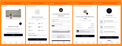
By late afternoon, they had a functioning interactive prototype. Kate fed ChatGPT the prototype link and asked it to create a usability testing script. It came up with a basic, but complete test script, including a checklist for observers to take notes.
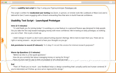
Kate went through the script carefully and updated it to add probing questions about AI transparency, emotional check-ins, more specific task scenarios, and a post-test debrief that looped back to the sprint goal.
Kate did a dry run with her product partner, who teased her: “Did you really need me? Couldn’t your AI do it?” It hadn’t occurred to her, but she was now curious!
“Act as a Gen Z user seeing this interactive prototype for the first time. How would you react to the language, steps, and tone? What would make you feel more confident or in control?”
It worked! ChatGPT simulated user feedback for the first screen and asked if she wanted it to continue. “Yes, please,” she typed. A few seconds later, she was reading what could have very well been a screen-by-screen transcript from a test.
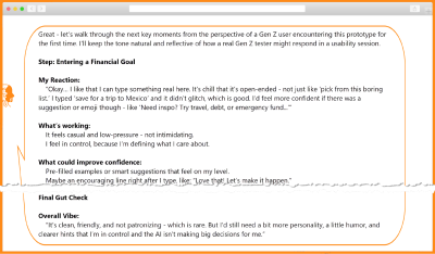
Kate was still processing what she had seen as she drove home, happy she didn’t have to stay late. The simulated test using AI appeared impressive at first glance. But the more she thought about it, the more disturbing it became. The output didn’t mention what the simulated user clicked, and if she had asked, she probably would have received an answer. But how useful would that be? After almost missing her exit, she forced herself to think about eating a relaxed meal at home instead of her usual Prototype-Thursday-Multitasking-Pizza-Dinner.
Kate’s Reflection
Today was the most meta I’ve felt all week: building a prototype about AI, with AI, while being coached by AI. And it didn’t all go the way I expected.
While ChatGPT didn’t deliver prototype screens, Figma Make coded a working, interactive prototype with interactions I couldn’t have built in Figma Design. I used curiosity and experimentation today, by asking: What if I reworded this? What if I flipped that flow?
AI moved fast, but I had to keep steering. But I have to admit that tweaking the prototype by changing the words, not code, felt like magic!
Critical thinking isn’t optional anymore — it is table stakes.
My impromptu ask of ChatGPT to simulate a Gen Z user testing my flow? That part both impressed and unsettled me. I’m going to need time to process this. But that can wait until next week. Tomorrow, I test with 5 Gen Zs — real people.
Friday: Test (aka Prototype Meets User)
Day 5 in a design sprint is a culmination of the week’s work from understanding the problem, exploring solutions, choosing the best, and building a prototype. It’s when teams interview users and learn by watching them react to the prototype and seeing if it really matters to them.
As Kate prepped for the tests, she grounded herself in the sprint problem statement and the users: “How might we help Gen Z users confidently take their first financial action in our app — in a way that feels simple, safe, and puts them in control?”
She clicked through the prototype one last time — the link still worked! And just in case, she also had screenshots saved.
Kate moderated the five tests while her product and engineering partners observed. The prototype may have been AI-generated, but the reactions were human. She observed where people hesitated, what made them feel safe and in control. Based on the participant, she would pivot, go off-script, and ask clarifying questions, getting deeper insights.
After each session, she dropped the transcripts and their notes into ChatGPT, asking it to summarize that user’s feedback into pain points, positive signals, and any relevant quotes. At the end of the five rounds, Kate prompted them for recurring themes to use as input for their reflection and synthesis.
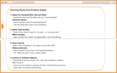
The trio combed through the results, with an eye out for any suspicious AI-generated results. They ran into one: “Users Trust AI”. Not one user mentioned or clicked the ‘Why this?’ link, but AI possibly assumed transparency features worked because they were available in the prototype.
They agreed that the prototype resonated with users, allowing all to easily set their financial goals, and identified a couple of opportunities for improvement: better explaining AI-generated plans and celebrating “win” moments after creating a plan. Both were fairly easy to address during their product build process.
That was a nice end to the week: another design sprint wrapped, and Kate’s first AI-augmented design sprint! She started Monday anxious about falling behind, overwhelmed by options. She closed Friday confident in a validated concept, grounded in real user needs, and empowered by tools she now knew how to steer.
Kate’s Reflection
Test driving my prototype with AI yesterday left me impressed and unsettled. But today’s tests with people reminded me why we test with real users, not proxies or people who interact with users, but actual end users. And GenAI is not the user. Five tests put my designerly skill of observation to the test.
GenAI helped summarize the test transcripts quickly but snuck in one last hallucination this week — about AI! With AI, don’t trust — always verify! Critical thinking is not going anywhere.
AI can move fast with words, but only people can use empathy to move beyond words to truly understand human emotions.
My next goal is to learn to talk to AI better, so I can get better results.
Conclusion
Over the course of five days, Kate explored how AI could fit into her UX work, not by reading articles or LinkedIn posts, but by doing. Through daily experiments, iterations, and missteps, she got comfortable with AI as a collaborator to support a design sprint. It accelerated every stage: synthesizing user feedback, generating divergent ideas, giving feedback, and even spinning up a working prototype, as shown below.
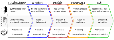
What was clear by Friday was that speed isn’t insight. While AI produced outputs fast, it was Kate’s designerly skills — curiosity, empathy, observation, visual communication, experimentation, and most importantly, critical thinking and a growth mindset — that turned data and patterns into meaningful insights. She stayed in the driver’s seat, verifying claims, adjusting prompts, and applying judgment where automation fell short.
She started the week on Monday, overwhelmed, her confidence dimmed by uncertainty and the noise of AI hype. She questioned her relevance in a rapidly shifting landscape. By Friday, she not only had a validated concept but had also reshaped her entire approach to design. She had evolved: from AI-curious to AI-confident, from reactive to proactive, from unsure to empowered. Her mindset had shifted: AI was no longer a threat or trend; it was like a smart intern she could direct, critique, and collaborate with. She didn’t just adapt to AI. She redefined what it meant to be a designer in the age of AI.
The experience raised deeper questions: How do we make sure AI-augmented outputs are not made up? How should we treat AI-generated user feedback? Where do ethics and human responsibility intersect?
Besides a validated solution to their design sprint problem, Kate had prototyped a new way of working as an AI-augmented designer.
The question now isn’t just “Should designers use AI?”. It’s “How do we work with AI responsibly, creatively, and consciously?”. That’s what the next article will explore: designing your interactions with AI using a repeatable framework.
Poll: If you could design your own AI assistant, what would it do?
- Assist with ideation?
- Research synthesis?
- Identify customer pain points?
- Or something else entirely?
Share your idea, and in the spirit of learning by doing, we’ll build one together from scratch in the third article of this series: Building your own CustomGPT.
Resources
- Sprint: How to Solve Big Problems and Test New Ideas in Just Five Days, by Jake Knapp
- The Design Sprint
- Figma Make
- “OpenAI Appeals ‘Sweeping, Unprecedented Order’ Requiring It Maintain All ChatGPT Logs”, Vanessa Taylor
Tools
As mentioned earlier, ChatGPT was the general-purpose LLM Kate leaned on, but you could swap it out for Claude, Gemini, Copilot, or other competitors and likely get similar results (or at least similarly weird surprises). Here are some alternate AI tools that might suit each sprint stage even better. Note that with dozens of new AI tools popping up every week, this list is far from exhaustive.
| Stage | Tools | Capability |
|---|---|---|
| Understand | Dovetail, UserTesting’s Insights Hub, Marvin | Summarize & Synthesize data |
| Sketch | Any LLM, Musely | Brainstorm concepts and ideas |
| Decide | Any LLM | Critique/provide feedback |
| Prototype | UIzard, UXPilot, Visily, Krisspy, Figma Make, Lovable, Bolt | Create wireframes and prototypes |
| Test | UserTesting, UserInterviews, PlaybookUX, Maze, plus tools from the Understand stage | Moderated and unmoderated user tests/synthesis |
(yk)
The Double-Edged Sustainability Sword Of AI In Web Design
The Double-Edged Sustainability Sword Of AI In Web Design The Double-Edged Sustainability Sword Of AI In Web Design Alex Williams 2025-08-20T10:00:00+00:00 2025-08-21T11:03:55+00:00 Artificial intelligence is increasingly automating large parts of design and development workflows — tasks once reserved for skilled designers and developers. This streamlining […]
Accessibility
The Double-Edged Sustainability Sword Of AI In Web Design
Alex Williams 2025-08-20T10:00:00+00:00
2025-08-21T11:03:55+00:00
Artificial intelligence is increasingly automating large parts of design and development workflows — tasks once reserved for skilled designers and developers. This streamlining can dramatically speed up project delivery. Even back in 2023, AI-assisted developers were found to complete tasks twice as fast as those without. And AI tools have advanced massively since then.
Yet this surge in capability raises a pressing dilemma:
Does the environmental toll of powering AI infrastructure eclipse the efficiency gains?
We can create websites faster that are optimized and more efficient to run, but the global consumption of energy by AI continues to climb.
As awareness grows around the digital sector’s hidden ecological footprint, web designers and businesses must grapple with this double-edged sword, weighing the grid-level impacts of AI against the cleaner, leaner code it can produce.
The Good: How AI Can Enhance Sustainability In Web Design
There’s no disputing that AI-driven automation has introduced higher speeds and efficiencies to many of the mundane aspects of web design. Tools that automatically generate responsive layouts, optimize image sizes, and refactor bloated scripts should free designers to focus on completing the creative side of design and development.
By some interpretations, these accelerated project timelines could represent a reduction in the required energy for development, and speedier production should mean less energy used.
Beyond automation, AI excels at identifying inefficiencies in code and design, as it can take a much more holistic view and assess things as a whole. Advanced algorithms can parse through stylesheets and JavaScript files to detect unused selectors or redundant logic, producing leaner, faster-loading pages. For example, AI-driven caching can increase cache hit rates by 15% by improving data availability and reducing latency. This means more user requests are served directly from the cache, reducing the need for data retrieval from the main server, which reduces energy expenditure.
AI tools can utilize next-generation image formats like AVIF or WebP, as they’re basically designed to be understood by AI and automation, and selectively compress assets based on content sensitivity. This slashes media payloads without perceptible quality loss, as the AI can use Generative Adversarial Networks (GANs) that can learn compact representations of data.
AI’s impact also brings sustainability benefits via user experience (UX). AI-driven personalization engines can dynamically serve only the content a visitor needs, which eliminates superfluous scripts or images that they don’t care about. This not only enhances perceived performance but reduces the number of server requests and data transferred, cutting downstream energy use in network infrastructure.
With the right prompts, generative AI can be an accessibility tool and ensure sites meet inclusive design standards by checking against accessibility standards, reducing the need for redesigns that can be costly in terms of time, money, and energy.
So, if you can take things in isolation, AI can and already acts as an important tool to make web design more efficient and sustainable. But do these gains outweigh the cost of the resources required in building and maintaining these tools?
The Bad: The Environmental Footprint Of AI Infrastructure
Yet the carbon savings engineered at the page level must be balanced against the prodigious resource demands of AI infrastructure. Large-scale AI hinges on data centers that already account for roughly 2% of global electricity consumption, a figure projected to swell as AI workloads grow.
The International Energy Agency warns that electricity consumption from data centers could more than double by 2030 due to the increasing demand for AI tools, reaching nearly the current consumption of Japan. Training state-of-the-art language models generates carbon emissions on par with hundreds of transatlantic flights, and inference workloads, serving billions of requests daily, can rival or exceed training emissions over a model’s lifetime.
Image generation tasks represent an even steeper energy hill to climb. Producing a single AI-generated image can consume energy equivalent to charging a smartphone.
As generative design and AI-based prototyping become more common in web development, the cumulative energy footprint of these operations can quickly undermine the carbon savings achieved through optimized code.
“
Water consumption forms another hidden cost. Data centers rely heavily on evaporative cooling systems that can draw between one and five million gallons of water per day, depending on size and location, placing stress on local supplies, especially in drought-prone regions. Studies estimate a single ChatGPT query may consume up to half a liter of water when accounting for direct cooling requirements, with broader AI use potentially demanding billions of liters annually by 2027.
Resource depletion and electronic waste are further concerns. High-performance components underpinning AI services, like GPUs, can have very small lifespans due to both wear and tear and being superseded by more powerful hardware. AI alone could add between 1.2 and 5 million metric tons of e-waste by 2030, due to the continuous demand for new hardware, amplifying one of the world’s fastest-growing waste streams.
Mining for the critical minerals in these devices often proceeds under unsustainable conditions due to a lack of regulations in many of the environments where rare metals can be sourced, and the resulting e-waste, rich in toxic metals like lead and mercury, poses another form of environmental damage if not properly recycled.
Compounding these physical impacts is a lack of transparency in corporate reporting. Energy and water consumption figures for AI workloads are often aggregated under general data center operations, which obscures the specific toll of AI training and inference among other operations.
And the energy consumption reporting of the data centres themselves has been found to have been obfuscated.
Reports estimate that the emissions of data centers are up to 662% higher than initially reported due to misaligned metrics, and ‘creative’ interpretations of what constitutes an emission. This makes it hard to grasp the true scale of AI’s environmental footprint, leaving designers and decision-makers unable to make informed, environmentally conscious decisions.
Do The Gains From AI Outweigh The Costs?
Some industry advocates argue that AI’s energy consumption isn’t as catastrophic as headlines suggest. Some groups have challenged ‘alarmist’ projections, claiming that AI’s current contribution of ‘just’ 0.02% of global energy consumption isn’t a cause for concern.
Proponents also highlight AI’s supposed environmental benefits. There are claims that AI could reduce economy-wide greenhouse gas emissions by 0.1% to 1.1% through efficiency improvements. Google reported that five AI-powered solutions removed 26 million metric tons of emissions in 2024. The optimistic view holds that AI’s capacity to optimize everything from energy grids to transportation systems will more than compensate for its data center demands.
However, recent scientific analysis reveals these arguments underestimate AI’s true impact. MIT found that data centers already consume 4.4% of all US electricity, with projections showing AI alone could use as much power as 22% of US households by 2028. Research indicates AI-specific electricity use could triple from current levels annually by 2028. Moreover, Harvard research revealed that data centers use electricity with 48% higher carbon intensity than the US average.
Advice For Sustainable AI Use In Web Design
Despite the environmental costs, AI’s use in business, particularly web design, isn’t going away anytime soon, with 70% of large businesses looking to increase their AI investments to increase efficiencies. AI’s immense impact on productivity means those not using it are likely to be left behind. This means that environmentally conscious businesses and designers must find the right balance between AI’s environmental cost and the efficiency gains it brings.
Make Sure You Have A Strong Foundation Of Sustainable Web Design Principles
Before you plug in any AI magic, start by making sure the bones of your site are sustainable. Lean web fundamentals, like system fonts instead of hefty custom files, minimal JavaScript, and judicious image use, can slash a page’s carbon footprint by stripping out redundancies that increase energy consumption. For instance, the global average web page emits about 0.8g of CO₂ per view, whereas sustainably crafted sites can see a roughly 70% reduction.
Once that lean baseline is in place, AI-driven optimizations (image format selection, code pruning, responsive layout generation) aren’t adding to bloat but building on efficiency, ensuring every joule spent on AI actually yields downstream energy savings in delivery and user experience.
Choosing The Right Tools And Vendors
In order to make sustainable tool choices, transparency and awareness are the first steps. Many AI vendors have pledged to work towards sustainability, but independent audits are necessary, along with clear, cohesive metrics. Standardized reporting on energy and water footprints will help us understand the true cost of AI tools, allowing for informed choices.
You can look for providers that publish detailed environmental reports and hold third-party renewable energy certifications. Many major providers now offer PUE (Power Usage Effectiveness) metrics alongside renewable energy matching to demonstrate real-world commitments to clean power.
When integrating AI into your build pipeline, choosing lightweight, specialized models for tasks like image compression or code linting can be more sustainable than full-scale generative engines. Task-specific tools often use considerably less energy than general AI models, as general models must process what task you want them to complete.
There are a variety of guides and collectives out there that can guide you on choosing the ‘green’ web hosts that are best for your business. When choosing AI-model vendors, you should look at options that prioritize ‘efficiency by design’: smaller, pruned models and edge-compute deployments can cut energy use by up to 50% compared to monolithic cloud-only models. They’re trained for specific tasks, so they don’t have to expend energy computing what the task is and how to go about it.
Using AI Tools Sustainably
Once you’ve chosen conscientious vendors, optimize how you actually use AI. You can take steps like batching non-urgent inference tasks to reduce idle GPU time, an approach shown to lower energy consumption overall compared to requesting ad-hoc, as you don’t have to keep running the GPU constantly, only when you need to use it.
Smarter prompts can also help make AI usage slightly more sustainable. Sam Altman of ChatGPT revealed early in 2025 that people’s propensity for saying ‘please’ and ‘thank you’ to LLMs is costing millions of dollars and wasting energy as the Generative AI has to deal with extra phrases to compute that aren’t relevant to its task. You need to ensure that your prompts are direct and to the point, and deliver the context required to complete the task to reduce the need to reprompt.
Additional Strategies To Balance AI’s Environmental Cost
On top of being responsible with your AI tool choice and usage, there are other steps you can take to offset the carbon cost of AI usage and enjoy the efficiency benefits it brings. Organizations can reduce their own emissions and use carbon offsetting to reduce their own carbon footprint as much as possible. Combined with the apparent sustainability benefits of AI use, this approach can help mitigate the harmful impacts of energy-hungry AI.
You can ensure that you’re using green server hosting (servers run on sustainable energy) for your own site and cloud needs beyond AI, and refine your content delivery network (CDN) to ensure your sites and apps are serving compressed, optimized assets from edge locations, cutting the distance data must travel, which should reduce the associated energy use.
Organizations and individuals, particularly those with thought leadership status, can be advocates pushing for transparent sustainability specifications. This involves both lobbying politicians and regulatory bodies to introduce and enforce sustainability standards and ensuring that other members of the public are kept aware of the environmental costs of AI use.
It’s only through collective action that we’re likely to see strict enforcement of both sustainable AI data centers and the standardization of emissions reporting.
Regardless, it remains a tricky path to walk, along the double-edged sword of AI’s use in web design.
Use AI too much, and you’re contributing to its massive carbon footprint. Use it too little, and you’re likely to be left behind by rivals that are able to work more efficiently and deliver projects much faster.
“
The best environmentally conscious designers and organizations can currently do is attempt to navigate it as best they can and stay informed on best practices.
Conclusion
We can’t dispute that AI use in web design delivers on its promise of agility, personalization, and resource savings at the page-level. Yet without a holistic view that accounts for the environmental demands of AI infrastructure, these gains risk being overshadowed by an expanding energy and water footprint.
Achieving the balance between enjoying AI’s efficiency gains and managing its carbon footprint requires transparency, targeted deployment, human oversight, and a steadfast commitment to core sustainable web practices.
(yk)
Beyond The Hype: What AI Can Really Do For Product Design
Beyond The Hype: What AI Can Really Do For Product Design Beyond The Hype: What AI Can Really Do For Product Design Nikita Samutin 2025-08-18T13:00:00+00:00 2025-08-21T11:03:55+00:00 These days, it’s easy to find curated lists of AI tools for designers, galleries of generated illustrations, and countless […]
Accessibility
Beyond The Hype: What AI Can Really Do For Product Design
Nikita Samutin 2025-08-18T13:00:00+00:00
2025-08-21T11:03:55+00:00
These days, it’s easy to find curated lists of AI tools for designers, galleries of generated illustrations, and countless prompt libraries. What’s much harder to find is a clear view of how AI is actually integrated into the everyday workflow of a product designer — not for experimentation, but for real, meaningful outcomes.
I’ve gone through that journey myself: testing AI across every major stage of the design process, from ideation and prototyping to visual design and user research. Along the way, I’ve built a simple, repeatable workflow that significantly boosts my productivity.
In this article, I’ll share what’s already working and break down some of the most common objections I’ve encountered — many of which I’ve faced personally.
Stage 1: Idea Generation Without The Clichés
Pushback: “Whenever I ask AI to suggest ideas, I just get a list of clichés. It can’t produce the kind of creative thinking expected from a product designer.”
That’s a fair point. AI doesn’t know the specifics of your product, the full context of your task, or many other critical nuances. The most obvious fix is to “feed it” all the documentation you have. But that’s a common mistake as it often leads to even worse results: the context gets flooded with irrelevant information, and the AI’s answers become vague and unfocused.
Current-gen models can technically process thousands of words, but the longer the input, the higher the risk of missing something important, especially content buried in the middle. This is known as the “lost in the middle” problem.
To get meaningful results, AI doesn’t just need more information — it needs the right information, delivered in the right way. That’s where the RAG approach comes in.
How RAG Works
Think of RAG as a smart assistant working with your personal library of documents. You upload your files, and the assistant reads each one, creating a short summary — a set of bookmarks (semantic tags) that capture the key topics, terms, scenarios, and concepts. These summaries are stored in a kind of “card catalog,” called a vector database.
When you ask a question, the assistant doesn’t reread every document from cover to cover. Instead, it compares your query to the bookmarks, retrieves only the most relevant excerpts (chunks), and sends those to the language model to generate a final answer.
How Is This Different from Just Dumping a Doc into the Chat?
Let’s break it down:
Typical chat interaction
It’s like asking your assistant to read a 100-page book from start to finish every time you have a question. Technically, all the information is “in front of them,” but it’s easy to miss something, especially if it’s in the middle. This is exactly what the “lost in the middle” issue refers to.
RAG approach
You ask your smart assistant a question, and it retrieves only the relevant pages (chunks) from different documents. It’s faster and more accurate, but it introduces a few new risks:
- Ambiguous question
You ask, “How can we make the project safer?” and the assistant brings you documents about cybersecurity, not finance. - Mixed chunks
A single chunk might contain a mix of marketing, design, and engineering notes. That blurs the meaning so the assistant can’t tell what the core topic is. - Semantic gap
You ask, “How can we speed up the app?” but the document says, “Optimize API response time.” For a human, that’s obviously related. For a machine, not always.

These aren’t reasons to avoid RAG or AI altogether. Most of them can be avoided with better preparation of your knowledge base and more precise prompts. So, where do you start?
Start With Three Short, Focused Documents
These three short documents will give your AI assistant just enough context to be genuinely helpful:
- Product Overview & Scenarios
A brief summary of what your product does and the core user scenarios. - Target Audience
Your main user segments and their key needs or goals. - Research & Experiments
Key insights from interviews, surveys, user testing, or product analytics.
Each document should focus on a single topic and ideally stay within 300–500 words. This makes it easier to search and helps ensure that each retrieved chunk is semantically clean and highly relevant.
Language Matters
In practice, RAG works best when both the query and the knowledge base are in English. I ran a small experiment to test this assumption, trying a few different combinations:
- English prompt + English documents: Consistently accurate and relevant results.
- Non-English prompt + English documents: Quality dropped sharply. The AI struggled to match the query with the right content.
- Non-English prompt + non-English documents: The weakest performance. Even though large language models technically support multiple languages, their internal semantic maps are mostly trained in English. Vector search in other languages tends to be far less reliable.
Takeaway: If you want your AI assistant to deliver precise, meaningful responses, do your RAG work entirely in English, both the data and the queries. This advice applies specifically to RAG setups. For regular chat interactions, you’re free to use other languages. A challenge also highlighted in this 2024 study on multilingual retrieval.
From Outsider to Teammate: Giving AI the Context It Needs
Once your AI assistant has proper context, it stops acting like an outsider and starts behaving more like someone who truly understands your product. With well-structured input, it can help you spot blind spots in your thinking, challenge assumptions, and strengthen your ideas — the way a mid-level or senior designer would.
Here’s an example of a prompt that works well for me:
Your task is to perform a comparative analysis of two features: “Group gift contributions” (described in group_goals.txt) and “Personal savings goals” (described in personal_goals.txt).
The goal is to identify potential conflicts in logic, architecture, and user scenarios and suggest visual and conceptual ways to clearly separate these two features in the UI so users can easily understand the difference during actual use.
Please include:
- Possible overlaps in user goals, actions, or scenarios;
- Potential confusion if both features are launched at the same time;
- Any architectural or business-level conflicts (e.g. roles, notifications, access rights, financial logic);
- Suggestions for visual and conceptual separation: naming, color coding, separate sections, or other UI/UX techniques;
- Onboarding screens or explanatory elements that might help users understand both features.
If helpful, include a comparison table with key parameters like purpose, initiator, audience, contribution method, timing, access rights, and so on.
AI Needs Context, Not Just Prompts
If you want AI to go beyond surface-level suggestions and become a real design partner, it needs the right context. Not just more information, but better, more structured information.
Building a usable knowledge base isn’t difficult. And you don’t need a full-blown RAG system to get started. Many of these principles work even in a regular chat: well-organized content and a clear question can dramatically improve how helpful and relevant the AI’s responses are. That’s your first step in turning AI from a novelty into a practical tool in your product design workflow.
Stage 2: Prototyping and Visual Experiments
Pushback: “AI only generates obvious solutions and can’t even build a proper user flow. It’s faster to do it manually.”
That’s a fair concern. AI still performs poorly when it comes to building complete, usable screen flows. But for individual elements, especially when exploring new interaction patterns or visual ideas, it can be surprisingly effective.
For example, I needed to prototype a gamified element for a limited-time promotion. The idea is to give users a lottery ticket they can “flip” to reveal a prize. I couldn’t recreate the 3D animation I had in mind in Figma, either manually or using any available plugins. So I described the idea to Claude 4 in Figma Make and within a few minutes, without writing a single line of code, I had exactly what I needed.
At the prototyping stage, AI can be a strong creative partner in two areas:
- UI element ideation
It can generate dozens of interactive patterns, including ones you might not think of yourself. - Micro-animation generation
It can quickly produce polished animations that make a concept feel real, which is great for stakeholder presentations or as a handoff reference for engineers.
AI can also be applied to multi-screen prototypes, but it’s not as simple as dropping in a set of mockups and getting a fully usable flow. The bigger and more complex the project, the more fine-tuning and manual fixes are required. Where AI already works brilliantly is in focused tasks — individual screens, elements, or animations — where it can kick off the thinking process and save hours of trial and error.
A quick UI prototype of a gamified promo banner created with Claude 4 in Figma Make. No code or plugins needed.
Here’s another valuable way to use AI in design — as a stress-testing tool. Back in 2023, Google Research introduced PromptInfuser, an internal Figma plugin that allowed designers to attach prompts directly to UI elements and simulate semi-functional interactions within real mockups. Their goal wasn’t to generate new UI, but to check how well AI could operate inside existing layouts — placing content into specific containers, handling edge-case inputs, and exposing logic gaps early.
The results were striking: designers using PromptInfuser were up to 40% more effective at catching UI issues and aligning the interface with real-world input — a clear gain in design accuracy, not just speed.
That closely reflects my experience with Claude 4 and Figma Make: when AI operates within a real interface structure, rather than starting from a blank canvas, it becomes a much more reliable partner. It helps test your ideas, not just generate them.
Stage 3: Finalizing The Interface And Visual Style
Pushback: “AI can’t match our visual style. It’s easier to just do it by hand.”
This is one of the most common frustrations when using AI in design. Even if you upload your color palette, fonts, and components, the results often don’t feel like they belong in your product. They tend to be either overly decorative or overly simplified.
And this is a real limitation. In my experience, today’s models still struggle to reliably apply a design system, even if you provide a component structure or JSON files with your styles. I tried several approaches:
- Direct integration with a component library.
I used Figma Make (powered by Claude) and connected our library. This was the least effective method: although the AI attempted to use components, the layouts were often broken, and the visuals were overly conservative. Other designers have run into similar issues, noting that library support in Figma Make is still limited and often unstable. - Uploading styles as JSON.
Instead of a full component library, I tried uploading only the exported styles — colors, fonts — in a JSON format. The results improved: layouts looked more modern, but the AI still made mistakes in how styles were applied. - Two-step approach: structure first, style second.
What worked best was separating the process. First, I asked the AI to generate a layout and composition without any styling. Once I had a solid structure, I followed up with a request to apply the correct styles from the same JSON file. This produced the most usable result — though still far from pixel-perfect.

So yes, AI still can’t help you finalize your UI. It doesn’t replace hand-crafted design work. But it’s very useful in other ways:
- Quickly creating a visual concept for discussion.
- Generating “what if” alternatives to existing mockups.
- Exploring how your interface might look in a different style or direction.
- Acting as a second pair of eyes by giving feedback, pointing out inconsistencies or overlooked issues you might miss when tired or too deep in the work.
AI won’t save you five hours of high-fidelity design time, since you’ll probably spend that long fixing its output. But as a visual sparring partner, it’s already strong. If you treat it like a source of alternatives and fresh perspectives, it becomes a valuable creative collaborator.
“
Stage 4: Product Feedback And Analytics: AI As A Thinking Exosuit
Product designers have come a long way. We used to create interfaces in Photoshop based on predefined specs. Then we delved deeper into UX with mapping user flows, conducting interviews, and understanding user behavior. Now, with AI, we gain access to yet another level: data analysis, which used to be the exclusive domain of product managers and analysts.
As Vitaly Friedman rightly pointed out in one of his columns, trying to replace real UX interviews with AI can lead to false conclusions as models tend to generate an average experience, not a real one. The strength of AI isn’t in inventing data but in processing it at scale.
Let me give a real example. We launched an exit survey for users who were leaving our service. Within a week, we collected over 30,000 responses across seven languages.
Simply counting the percentages for each of the five predefined reasons wasn’t enough. I wanted to know:
- Are there specific times of day when users churn more?
- Do the reasons differ by region?
- Is there a correlation between user exits and system load?
The real challenge was… figuring out what cuts and angles were even worth exploring. The entire technical process, from analysis to visualizations, was done “for me” by Gemini, working inside Google Sheets. This task took me about two hours in total. Without AI, not only would it have taken much longer, but I probably wouldn’t have been able to reach that level of insight on my own at all.

AI enables near real-time work with large data sets. But most importantly, it frees up your time and energy for what’s truly valuable: asking the right questions.
“
A few practical notes: Working with large data sets is still challenging for models without strong reasoning capabilities. In my experiments, I used Gemini embedded in Google Sheets and cross-checked the results using ChatGPT o3. Other models, including the standalone Gemini 2.5 Pro, often produced incorrect outputs or simply refused to complete the task.
AI Is Not An Autopilot But A Co-Pilot
AI in design is only as good as the questions you ask it. It doesn’t do the work for you. It doesn’t replace your thinking. But it helps you move faster, explore more options, validate ideas, and focus on the hard parts instead of burning time on repetitive ones. Sometimes it’s still faster to design things by hand. Sometimes it makes more sense to delegate to a junior designer.
But increasingly, AI is becoming the one who suggests, sharpens, and accelerates. Don’t wait to build the perfect AI workflow. Start small. And that might be the first real step in turning AI from a curiosity into a trusted tool in your product design process.
Let’s Summarize
- If you just paste a full doc into chat, the model often misses important points, especially things buried in the middle. That’s the “lost in the middle” problem.
- The RAG approach helps by pulling only the most relevant pieces from your documents. So responses are faster, more accurate, and grounded in real context.
- Clear, focused prompts work better. Narrow the scope, define the output, and use familiar terms to help the model stay on track.
- A well-structured knowledge bas makes a big difference. Organizing your content into short, topic-specific docs helps reduce noise and keep answers sharp.
- Use English for both your prompts and your documents. Even multilingual models are most reliable when working in English, especially for retrieval.
- Most importantly: treat AI as a creative partner. It won’t replace your skills, but it can spark ideas, catch issues, and speed up the tedious parts.
Further Reading
- “AI-assisted Design Workflows: How UX Teams Move Faster Without Sacrificing Quality”, Cindy Brummer
This piece is a perfect prequel to my article. It explains how to start integrating AI into your design process, how to structure your workflow, and which tasks AI can reasonably take on — before you dive into RAG or idea generation. - “8 essential tips for using Figma Make”, Alexia Danton
While this article focuses on Figma Make, the recommendations are broadly applicable. It offers practical advice that will make your work with AI smoother, especially if you’re experimenting with visual tools and structured prompting. - “What Is Retrieval-Augmented Generation aka RAG”, Rick Merritt
If you want to go deeper into how RAG actually works, this is a great starting point. It breaks down key concepts like vector search and retrieval in plain terms and explains why these methods often outperform long prompts alone.
(yk)
The Power Of The Intl API: A Definitive Guide To Browser-Native Internationalization
The Power Of The <code>Intl</code> API: A Definitive Guide To Browser-Native Internationalization The Power Of The <code>Intl</code> API: A Definitive Guide To Browser-Native Internationalization Fuqiao Xue 2025-08-08T10:00:00+00:00 2025-08-13T15:04:28+00:00 It’s a common misconception that internationalization (i18n) is simply about translating text. While crucial, translation is merely […]
Accessibility
The Power Of The <code>Intl</code> API: A Definitive Guide To Browser-Native Internationalization
Fuqiao Xue 2025-08-08T10:00:00+00:00
2025-08-13T15:04:28+00:00
It’s a common misconception that internationalization (i18n) is simply about translating text. While crucial, translation is merely one facet. One of the complexities lies in adapting information for diverse cultural expectations: How do you display a date in Japan versus Germany? What’s the correct way to pluralize an item in Arabic versus English? How do you sort a list of names in various languages?
Many developers have relied on weighty third-party libraries or, worse, custom-built formatting functions to tackle these challenges. These solutions, while functional, often come with significant overhead: increased bundle size, potential performance bottlenecks, and the constant struggle to keep up with evolving linguistic rules and locale data.
Enter the ECMAScript Internationalization API, more commonly known as the Intl object. This silent powerhouse, built directly into modern JavaScript environments, is an often-underestimated, yet incredibly potent, native, performant, and standards-compliant solution for handling data internationalization. It’s a testament to the web’s commitment to being worldwide, providing a unified and efficient way to format numbers, dates, lists, and more, according to specific locales.
Intl And Locales: More Than Just Language Codes
At the heart of Intl lies the concept of a locale. A locale is far more than just a two-letter language code (like en for English or es for Spanish). It encapsulates the complete context needed to present information appropriately for a specific cultural group. This includes:
- Language: The primary linguistic medium (e.g.,
en,es,fr). - Script: The script (e.g.,
Latnfor Latin,Cyrlfor Cyrillic). For example,zh-Hansfor Simplified Chinese, vs.zh-Hantfor Traditional Chinese. - Region: The geographic area (e.g.,
USfor United States,GBfor Great Britain,DEfor Germany). This is crucial for variations within the same language, such asen-USvs.en-GB, which differ in date, time, and number formatting. - Preferences/Variants: Further specific cultural or linguistic preferences. See “Choosing a Language Tag” from W3C for more information.
Typically, you’ll want to choose the locale according to the language of the web page. This can be determined from the lang attribute:
// Get the page's language from the HTML lang attribute
const pageLocale = document.documentElement.lang || 'en-US'; // Fallback to 'en-US'
Occasionally, you may want to override the page locale with a specific locale, such as when displaying content in multiple languages:
// Force a specific locale regardless of page language
const tutorialFormatter = new Intl.NumberFormat('zh-CN', { style: 'currency', currency: 'CNY' });

console.log(`Chinese example: ${tutorialFormatter.format(199.99)}`); // Output: ¥199.99
In some cases, you might want to use the user’s preferred language:
// Use the user's preferred language
const browserLocale = navigator.language || 'ja-JP';

const formatter = new Intl.NumberFormat(browserLocale, { style: 'currency', currency: 'JPY' });
When you instantiate an Intl formatter, you can optionally pass one or more locale strings. The API will then select the most appropriate locale based on availability and preference.
Core Formatting Powerhouses
The Intl object exposes several constructors, each for a specific formatting task. Let’s delve into the most frequently used ones, along with some powerful, often-overlooked gems.
1. Intl.DateTimeFormat: Dates and Times, Globally
Formatting dates and times is a classic i18n problem. Should it be MM/DD/YYYY or DD.MM.YYYY? Should the month be a number or a full word? Intl.DateTimeFormat handles all this with ease.
const date = new Date(2025, 6, 27, 14, 30, 0); // June 27, 2025, 2:30 PM

// Specific locale and options (e.g., long date, short time)
const options = {
  weekday: 'long',
  year: 'numeric',
  month: 'long',
  day: 'numeric',
  hour: 'numeric',
  minute: 'numeric',
  timeZoneName: 'shortOffset' // e.g., "GMT+8"
};

console.log(new Intl.DateTimeFormat('en-US', options).format(date));

// "Friday, June 27, 2025 at 2:30 PM GMT+8"
console.log(new Intl.DateTimeFormat('de-DE', options).format(date));

// "Freitag, 27. Juni 2025 um 14:30 GMT+8"

// Using dateStyle and timeStyle for common patterns
console.log(new Intl.DateTimeFormat('en-GB', { dateStyle: 'full', timeStyle: 'short' }).format(date));

// "Friday 27 June 2025 at 14:30"

console.log(new Intl.DateTimeFormat('ja-JP', { dateStyle: 'long', timeStyle: 'short' }).format(date));

// "2025年6月27日 14:30"
The flexibility of options for DateTimeFormat is vast, allowing control over year, month, day, weekday, hour, minute, second, time zone, and more.
2. Intl.NumberFormat: Numbers With Cultural Nuance
Beyond simple decimal places, numbers require careful handling: thousands separators, decimal markers, currency symbols, and percentage signs vary wildly across locales.
const price = 123456.789;

// Currency formatting
console.log(new Intl.NumberFormat('en-US', { style: 'currency', currency: 'USD' }).format(price));

// "$123,456.79" (auto-rounds)

console.log(new Intl.NumberFormat('de-DE', { style: 'currency', currency: 'EUR' }).format(price));

// "123.456,79 €"

// Units
console.log(new Intl.NumberFormat('en-US', { style: 'unit', unit: 'meter', unitDisplay: 'long' }).format(100));

// "100 meters"

console.log(new Intl.NumberFormat('fr-FR', { style: 'unit', unit: 'kilogram', unitDisplay: 'short' }).format(5.5));

// "5,5 kg"
Options like minimumFractionDigits, maximumFractionDigits, and notation (e.g., scientific, compact) provide even finer control.
3. Intl.ListFormat: Natural Language Lists
Presenting lists of items is surprisingly tricky. English uses “and” for conjunction and “or” for disjunction. Many languages have different conjunctions, and some require specific punctuation.
This API simplifies a task that would otherwise require complex conditional logic:
const items = ['apples', 'oranges', 'bananas'];

// Conjunction ("and") list
console.log(new Intl.ListFormat('en-US', { type: 'conjunction' }).format(items));

// "apples, oranges, and bananas"

console.log(new Intl.ListFormat('de-DE', { type: 'conjunction' }).format(items));

// "Äpfel, Orangen und Bananen"

// Disjunction ("or") list
console.log(new Intl.ListFormat('en-US', { type: 'disjunction' }).format(items));

// "apples, oranges, or bananas"

console.log(new Intl.ListFormat('fr-FR', { type: 'disjunction' }).format(items));

// "apples, oranges ou bananas"
4. Intl.RelativeTimeFormat: Human-Friendly Timestamps
Displaying “2 days ago” or “in 3 months” is common in UI, but localizing these phrases accurately requires extensive data. Intl.RelativeTimeFormat automates this.
const rtf = new Intl.RelativeTimeFormat('en-US', { numeric: 'auto' });

console.log(rtf.format(-1, 'day'));    // "yesterday"
console.log(rtf.format(1, 'day'));     // "tomorrow"
console.log(rtf.format(-7, 'day'));    // "7 days ago"
console.log(rtf.format(3, 'month'));   // "in 3 months"
console.log(rtf.format(-2, 'year'));   // "2 years ago"

// French example:
const frRtf = new Intl.RelativeTimeFormat('fr-FR', { numeric: 'auto', style: 'long' });

console.log(frRtf.format(-1, 'day'));    // "hier"
console.log(frRtf.format(1, 'day'));     // "demain"
console.log(frRtf.format(-7, 'day'));    // "il y a 7 jours"
console.log(frRtf.format(3, 'month'));   // "dans 3 mois"
The numeric: 'always' option would force “1 day ago” instead of “yesterday”.
5. Intl.PluralRules: Mastering Pluralization
This is arguably one of the most critical aspects of i18n. Different languages have vastly different pluralization rules (e.g., English has singular/plural, Arabic has zero, one, two, many…). Intl.PluralRules allows you to determine the “plural category” for a given number in a specific locale.
const prEn = new Intl.PluralRules('en-US');

console.log(prEn.select(0));    // "other" (for "0 items")
console.log(prEn.select(1));    // "one"   (for "1 item")
console.log(prEn.select(2));    // "other" (for "2 items")

const prAr = new Intl.PluralRules('ar-EG');

console.log(prAr.select(0));    // "zero"
console.log(prAr.select(1));    // "one"
console.log(prAr.select(2));    // "two"
console.log(prAr.select(10));   // "few"
console.log(prAr.select(100));  // "other"
This API doesn’t pluralize text directly, but it provides the essential classification needed to select the correct translation string from your message bundles. For example, if you have message keys like item.one, item.other, you’d use pr.select(count) to pick the right one.
6. Intl.DisplayNames: Localized Names For Everything
Need to display the name of a language, a region, or a script in the user’s preferred language? Intl.DisplayNames is your comprehensive solution.
// Display language names in English
const langNamesEn = new Intl.DisplayNames(['en'], { type: 'language' });

console.log(langNamesEn.of('fr'));      // "French"
console.log(langNamesEn.of('es-MX'));   // "Mexican Spanish"

// Display language names in French
const langNamesFr = new Intl.DisplayNames(['fr'], { type: 'language' });

console.log(langNamesFr.of('en'));      // "anglais"
console.log(langNamesFr.of('zh-Hans')); // "chinois (simplifié)"

// Display region names
const regionNamesEn = new Intl.DisplayNames(['en'], { type: 'region' });

console.log(regionNamesEn.of('US'));    // "United States"
console.log(regionNamesEn.of('DE'));    // "Germany"

// Display script names
const scriptNamesEn = new Intl.DisplayNames(['en'], { type: 'script' });

console.log(scriptNamesEn.of('Latn'));  // "Latin"
console.log(scriptNamesEn.of('Arab'));  // "Arabic"
With Intl.DisplayNames, you avoid hardcoding countless mappings for language names, regions, or scripts, keeping your application robust and lean.
Browser Support
You might be wondering about browser compatibility. The good news is that Intl has excellent support across modern browsers. All major browsers (Chrome, Firefox, Safari, Edge) fully support the core functionality discussed (DateTimeFormat, NumberFormat, ListFormat, RelativeTimeFormat, PluralRules, DisplayNames). You can confidently use these APIs without polyfills for the majority of your user base.
Conclusion: Embrace The Global Web With Intl
The Intl API is a cornerstone of modern web development for a global audience. It empowers front-end developers to deliver highly localized user experiences with minimal effort, leveraging the browser’s built-in, optimized capabilities.
By adopting Intl, you reduce dependencies, shrink bundle sizes, and improve performance, all while ensuring your application respects and adapts to the diverse linguistic and cultural expectations of users worldwide. Stop wrestling with custom formatting logic and embrace this standards-compliant tool!
It’s important to remember that Intl handles the formatting of data. While incredibly powerful, it doesn’t solve every aspect of internationalization. Content translation, bidirectional text (RTL/LTR), locale-specific typography, and deep cultural nuances beyond data formatting still require careful consideration. (I may write about these in the future!) However, for presenting dynamic data accurately and intuitively, Intl is the browser-native answer.
Further Reading & Resources
- MDN Web Docs:
- ECMAScript Internationalization API Specification: The official ECMA-402 Standard
- Choosing a Language Tag
(gg, yk)
Automating Design Systems: Tips And Resources For Getting Started
Automating Design Systems: Tips And Resources For Getting Started Automating Design Systems: Tips And Resources For Getting Started Joas Pambou 2025-08-06T10:00:00+00:00 2025-08-07T14:02:50+00:00 A design system is more than just a set of colors and buttons. It’s a shared language that helps designers and developers build […]
Accessibility
Automating Design Systems: Tips And Resources For Getting Started
Joas Pambou 2025-08-06T10:00:00+00:00
2025-08-07T14:02:50+00:00
A design system is more than just a set of colors and buttons. It’s a shared language that helps designers and developers build good products together. At its core, a design system includes tokens (like colors, spacing, fonts), components (such as buttons, forms, navigation), plus the rules and documentation that tie all together across projects.
If you’ve ever used systems like Google Material Design or Shopify Polaris, for example, then you’ve seen how design systems set clear expectations for structure and behavior, making teamwork smoother and faster. But while design systems promote consistency, keeping everything in sync is the hard part. Update a token in Figma, like a color or spacing value, and that change has to show up in the code, the documentation, and everywhere else it’s used.
The same thing goes for components: when a button’s behavior changes, it needs to update across the whole system. That’s where the right tools and a bit of automation can make the difference. They help reduce repetitive work and keep the system easier to manage as it grows.
In this article, we’ll cover a variety of tools and techniques for syncing tokens, updating components, and keeping docs up to date, showing how automation can make all of it easier.
The Building Blocks Of Automation
Let’s start with the basics. Color, typography, spacing, radii, shadows, and all the tiny values that make up your visual language are known as design tokens, and they’re meant to be the single source of truth for the UI. You’ll see them in design software like Figma, in code, in style guides, and in documentation. Smashing Magazine has covered them before in great detail.
The problem is that they often go out of sync, such as when a color or component changes in design but doesn’t get updated in the code. The more your team grows or changes, the more these mismatches show up; not because people aren’t paying attention, but because manual syncing just doesn’t scale. That’s why automating tokens is usually the first thing teams should consider doing when they start building a design system. That way, instead of writing the same color value in Figma and then again in a configuration file, you pull from a shared token source and let that drive both design and development.
There are a few tools that are designed to help make this easier.
Token Studio
Token Studio is a Figma plugin that lets you manage design tokens directly in your file, export them to different formats, and sync them to code.

Specify
Specify lets you collect tokens from Figma and push them to different targets, including GitHub repositories, continuous integration pipelines, documentation, and more.
Design-tokens.dev
Design-tokens.dev is a helpful reference if you want tips for things like how to structure tokens, format them (e.g., JSON, YAML, and so on), and think about token types.

NameDesignTokens.guide
NamedDesignTokens.guide helps with naming conventions, which is honestly a common pain point, especially when you’re working with a large number of tokens.

Once your tokens are set and connected, you’ll spend way less time fixing inconsistencies. It also gives you a solid base to scale, whether that’s adding themes, switching brands, or even building systems for multiple products.
That’s also when naming really starts to count. If your tokens or components aren’t clearly named, things can get confusing quickly.
Note: Vitaly Friedman’s “How to Name Things” is worth checking out if you’re working with larger systems.
From there, it’s all about components. Tokens define the values, but components are what people actually use, e.g., buttons, inputs, cards, dropdowns — you name it. In a perfect setup, you build a component once and reuse it everywhere. But without structure, it’s easy for things to “drift” out of scope. It’s easy to end up with five versions of the same button, and what’s in code doesn’t match what’s in Figma, for example.
Automation doesn’t replace design, but rather, it connects everything to one source.
The Figma component matches the one in production, the documentation updates when the component changes, and the whole team is pulling from the same library instead of rebuilding their own version. This is where real collaboration happens.
Here are a few tools that help make that happen:
| Tool | What It Does |
|---|---|
| UXPin Merge | Lets you design using real code components. What you prototype is what gets built. |
| Supernova | Helps you publish a design system, sync design and code sources, and keep documentation up-to-date. |
| Zeroheight | Turns your Figma components into a central, browsable, and documented system for your whole team. |
How Does Everything Connect?
A lot of the work starts right inside your design application. Once your tokens and components are in place, tools like Supernova help you take it further by extracting design data, syncing it across platforms, and generating production-ready code. You don’t need to write custom scripts or use the Figma API to get value from automation; these tools handle most of it for you.
But for teams that want full control, Figma does offer an API. It lets you do things like the following:
- Pull token values (like colors, spacing, typography) directly from Figma files,
- Track changes to components and variants,
- Tead metadata (like style names, structure, or usage patterns), and
- Map which components are used where in the design.
The Figma API is REST-based, so it works well with custom scripts and automations. You don’t need a huge setup, just the right pieces. On the development side, teams usually use Node.js or Python to handle automation. For example:
- Fetch styles from Figma.
- Convert them into JSON.
- Push the values to a design token repo or directly into the codebase.
You won’t need that level of setup for most use cases, but it’s helpful to know it’s there if your team outgrows no-code tools.
- Where do your tokens and components come from?
- How do updates happen?
- What tools keep everything connected?
The workflow becomes easier to manage once that’s clear, and you spend less time trying to fix changes or mismatches. When tokens, components, and documentation stay in sync, your team moves faster and spends less time fixing the same issues.
Extracting Design Data
Figma is a collaborative design tool used to create UIs: buttons, layouts, styles, components, everything that makes up the visual language of the product. It’s also where all your design data lives, which includes the tokens we talked about earlier. This data is what we’ll extract and eventually connect to your codebase. But first, you’ll need a setup.
To follow along:
- Go to figma.com and create a free account.
- Download the Figma desktop app if you prefer working locally, but keep an eye on system requirements if you’re on an older device.
Once you’re in, you’ll see a home screen that looks something like the following:

From here, it’s time to set up your design tokens. You can either create everything from scratch or use a template from the Figma community to save time. Templates are a great option if you don’t want to build everything yourself. But if you prefer full control, creating your setup totally works too.
There are other ways to get tokens as well. For example, a site like namedesigntokens.guide lets you generate and download tokens in formats like JSON. The only catch is that Figma doesn’t let you import JSON directly, so if you go that route, you’ll need to bring in a middle tool like Specify to bridge that gap. It helps sync tokens between Figma, GitHub, and other places.
For this article, though, we’ll keep it simple and stick with Figma. Pick any design system template from the Figma community to get started; there are plenty to choose from.

Depending on the template you choose, you’ll get a pre-defined set of tokens that includes colors, typography, spacing, components, and more. These templates come in all types: website, e-commerce, portfolio, app UI kits, you name it. For this article, we’ll be using the /Design-System-Template–Community because it includes most of the tokens you’ll need right out of the box. But feel free to pick a different one if you want to try something else.
Once you’ve picked your template, it’s time to download the tokens. We’ll use Supernova, a tool that connects directly to your Figma file and pulls out design tokens, styles, and components. It makes the design-to-code process a lot smoother.
Step 1: Sign Up on Supernova
Go to supernova.io and create an account. Once you’re in, you’ll land on a dashboard that looks like this:

Step 2: Connect Your Figma File
To pull in the tokens, head over to the Data Sources section in Supernova and choose Figma from the list of available sources. (You’ll also see other options like Storybook or Figma variables, but we’re focusing on Figma.) Next, click on Connect a new file, paste the link to your Figma template, and click Import.

Supernova will load the full design system from your template. From your dashboard, you’ll now be able to see all the tokens.

Turning Tokens Into Code
Design tokens are great inside Figma, but the real value shows when you turn them into code. That’s how the developers on your team actually get to use them.
Here’s the problem: Many teams default to copying values manually for things like color, spacing, and typography. But when you make a change to them in Figma, the code is instantly out of sync. That’s why automating this process is such a big win.
Instead of rewriting the same theme setup for every project, you generate it, constantly translating designs into dev-ready assets, and keep everything in sync from one source of truth.
Now that we’ve got all our tokens in Supernova, let’s turn them into code. First, go to the Code Automation tab, then click New Pipeline. You’ll see different options depending on what you want to generate: React Native, CSS-in-JS, Flutter, Godot, and a few others.
Let’s go with the CSS-in-JS option for the sake of demonstration:

After that, you’ll land on a setup screen with three sections: Data, Configuration, and Delivery.
Data
Here, you can pick a theme. At first, it might only give you “Black” as the option; you can select that or leave it empty. It really doesn’t matter for the time being.

Configuration
This is where you control how the code is structured. I picked PascalCase for how token names are formatted. You can also update how things like spacing, colors, or font styles are grouped and saved.

Delivery
This is where you choose how you want the output delivered. I chose “Build Only”, which builds the code for you to download.

Once you’re done, click Save. The pipeline is created, and you’ll see it listed in your dashboard. From here, you can download your token code, which is already generated.
Automating Documentation
So, what’s the point of documentation in a design system?
You can think of it as the instruction manual for your team. It explains what each token or component is, why it exists, and how to use it. Designers, developers, and anyone else on your team can stay on the same page — no guessing, no back-and-forth. Just clear context.
Let’s continue from where we stopped. Supernova is capable of handling your documentation. Head over to the Documentation tab. This is where you can start editing everything about your design system docs, all from the same place.
You can:
- Add descriptions to your tokens,
- Define what each base token is for (as well as what it’s not for),
- Organize sections by colors, typography, spacing, or components, and
- Drop in images, code snippets, or examples.
You’re building the documentation inside the same tool where your tokens live. In other words, there’s no jumping between tools and no additional setup. That’s where the automation kicks in. You edit once, and your docs stay synced with your design source. It all stays in one environment.

Once you’re done, click Publish and you will be presented with a new window asking you to sign in. After that, you’re able to access your live documentation site.
Practical Tips For Automations
Automation is great. It saves hours of manual work and keeps your design system tight across design and code. The trick is knowing when to automate and how to make sure it keeps working over time. You don’t need to automate everything right away. But if you’re doing the same thing over and over again, that’s a kind of red flag.
A few signs that it’s time to consider using automation:
- You’re using the same styles across multiple platforms (like web and mobile).
- You have a shared design system used by more than one team.
- Design tokens change often, and you want updates to flow into code automatically.
- You’re tired of manual updates every time the brand team tweaks a color.
There are three steps you need to consider. Let’s look at each one.
Step 1: Keep An Eye On Tools And API Updates
If your pipeline depends on design tools, like Figma, or platforms, like Supernova, you’ll want to know when changes are made and evaluate how they impact your work, because even small updates can quietly affect your exports.
It’s a good idea to check Figma’s API changelog now and then, especially if something feels off with your token syncing. They often update how variables and components are structured, and that can impact your pipeline. There’s also an RSS feed for product updates.
The same goes for Supernova’s product updates. They regularly roll out improvements that might tweak how your tokens are handled or exported. If you’re using open-source tools like Style Dictionary, keeping an eye on the GitHub repo (particularly the Issues tab) can save you from debugging weird token name changes later.
All of this isn’t about staying glued to release notes, but having a system to check if something suddenly stops working. That way, you’ll catch things before they reach production.
Step 2: Break Your Pipeline Into Smaller Steps
A common trap teams fall into is trying to automate everything in one big run: colors, spacing, themes, components, and docs, all processed in a single click. It sounds convenient, but it’s hard to maintain, and even harder to debug.
It’s much more manageable to split your automation into pieces. For example, having a single workflow that handles your core design tokens (e.g., colors, spacing, and font sizes), another for theme variations (e.g., light and dark themes), and one more for component mapping (e.g., buttons, inputs, and cards). This way, if your team changes how spacing tokens are named in Figma, you only need to update one part of the workflow, not the entire system. It’s also easier to test and reuse smaller steps.
Step 3: Test The Output Every Time
Even if everything runs fine, always take a moment to check the exported output. It doesn’t need to be complicated. A few key things:
- Are the token names clean and readable?
If you see something likePrimaryColorColorText, that’s a red flag. - Did anything disappear or get renamed unexpectedly?
It happens more often than you think, especially with typography or spacing tokens after design changes. - Does the UI still work?
If you’re using something like Tailwind, CSS variables, or custom themes, double-check that the new token values aren’t breaking anything in the design or build process.
To catch issues early, it helps to run tools like ESLint or Stylelint right after the pipeline completes. They’ll flag odd syntax or naming problems before things get shipped.
How AI Can Help
Once your automation is stable, there’s a next layer that can boost your workflow: AI. It’s not just for writing code or generating mockups, but for helping with the small, repetitive things that eat up time in design systems. When used right, AI can assist without replacing your control over the system.
Here’s where it might fit into your workflow:
Naming Suggestions
When you’re dealing with hundreds of tokens, naming them clearly and consistently is a real challenge. Some AI tools can help by suggesting clean, readable names for your tokens or components based on patterns in your design. It’s not perfect, but it’s a good way to kickstart naming, especially for large teams.
Pattern Recognition
AI can also spot repeated styles or usage patterns across your design files. If multiple buttons or cards share similar spacing, shadows, or typography, tools powered by AI can group or suggest components for systemization even before a human notices.
Automated Documentation
Instead of writing everything from scratch, AI can generate first drafts of documentation based on your tokens, styles, and usage. You still need to review and refine, but it takes away the blank-page problem and saves hours.
Here are a few tools that already bring AI into the design and development space in practical ways:
- Uizard: Uizard uses AI to turn wireframes into designs automatically. You can sketch something by hand, and it transforms that into a usable mockup.
- Anima: Anima can convert Figma designs into responsive React code. It also helps fill in real content or layout structures, making it a powerful bridge between design and development, with some AI assistance under the hood.
- Builder.io: Builder uses AI to help generate and edit components visually. It’s especially useful for marketers or non-developers who need to build pages fast. AI helps streamline layout, content blocks, and design rules.
Conclusion
This article is not about achieving complete automation in the technical sense, but more about using smart tools to streamline the menial and manual aspects of working with design systems. Exporting tokens, generating docs, and syncing design with code can be automated, making your process quicker and more reliable with the right setup.
Instead of rebuilding everything from scratch every time, you now have a way to keep things consistent, stay organized, and save time.
Further Reading
- “Design System Guide” by Romina Kavcic
- “Design System In 90 Days” by Vitaly Friedman
(gg, yk)
UX Job Interview Helpers
UX Job Interview Helpers UX Job Interview Helpers Vitaly Friedman 2025-08-05T13:00:00+00:00 2025-08-07T14:02:50+00:00 When talking about job interviews for a UX position, we often discuss how to leave an incredible impression and how to negotiate the right salary. But it’s only one part of the story. […]
Accessibility
UX Job Interview Helpers
Vitaly Friedman 2025-08-05T13:00:00+00:00
2025-08-07T14:02:50+00:00
When talking about job interviews for a UX position, we often discuss how to leave an incredible impression and how to negotiate the right salary. But it’s only one part of the story. The other part is to be prepared, to ask questions, and to listen carefully.
Below, I’ve put together a few useful resources on UX job interviews — from job boards to Notion templates and practical guides. I hope you or your colleagues will find it helpful.
The Design Interview Kit
As you are preparing for that interview, get ready with the Design Interview Kit (Figma), a helpful practical guide that covers how to craft case studies, solve design challenges, write cover letters, present your portfolio, and negotiate your offer. Kindly shared by Oliver Engel.

The Product Designer’s (Job) Interview Playbook (PDF)
The Product Designer’s (Job) Interview Playbook (PDF) is a practical little guide for designers through each interview phase, with helpful tips and strategies on things to keep in mind, talking points, questions to ask, red flags to watch out for and how to tell a compelling story about yourself and your work. Kindly put together by Meghan Logan.

From my side, I can only wholeheartedly recommend to not only speak about your design process. Tell stories about the impact that your design work has produced. Frame your design work as an enabler of business goals and user needs. And include insights about the impact you’ve produced — on business goals, processes, team culture, planning, estimates, and testing.
Also, be very clear about the position that you are applying for. In many companies, titles do matter. There are vast differences in responsibilities and salaries between various levels for designers, so if you see yourself as a senior, review whether it actually reflects in the position.
A Guide To Successful UX Job Interviews (+ Notion template)
Catt Small’s Guide To Successful UX Job Interviews, a wonderful practical series on how to build a referral pipeline, apply for an opening, prepare for screening and interviews, present your work, and manage salary expectations. You can also download a Notion template.

30 Useful Questions To Ask In UX Job Interviews
In her wonderful article, Nati Asher has suggested many useful questions to ask in a job interview when you are applying as a UX candidate. I’ve taken the liberty of revising some of them and added a few more questions that might be worth considering for your next job interview.

- What are the biggest challenges the team faces at the moment?
- What are the team’s main strengths and weaknesses?
- What are the traits and skills that will make me successful in this position?
- Where is the company going in the next 5 years?
- What are the achievements I should aim for over the first 90 days?
- What would make you think “I’m so happy we hired X!”?
- Do you have any doubts or concerns regarding my fit for this position?
- Does the team have any budget for education, research, etc.?
- What is the process of onboarding in the team?
- Who is in the team, and how long have they been in that team?
- Who are the main stakeholders I will work with on a day-to-day basis?
- Which options do you have for user research and accessing users or data?
- Are there analytics, recordings, or other data sources to review?
- How do you measure the impact of design work in your company?
- To what extent does management understand the ROI of good UX?
- How does UX contribute strategically to the company’s success?
- Who has the final say on design, and who decides what gets shipped?
- What part of the design process does the team spend most time on?
- How many projects do designers work on simultaneously?
- How has the organization overcome challenges with remote work?
- Do we have a design system, and in what state is it currently?
- Why does a company want to hire a UX designer?
- How would you describe the ideal candidate for this position?
- What does a career path look like for this role?
- How will my performance be evaluated in this role?
- How long do projects take to launch? Can you give me some examples?
- What are the most immediate projects that need to be addressed?
- How do you see the design team growing in the future?
- What traits make someone successful in this team?
- What’s the most challenging part of leading the design team?
- How does the company ensure it’s upholding its values?
Before a job interview, have your questions ready. Not only will they convey a message that you care about the process and the culture, but also that you understand what is required to be successful. And this fine detail might go a long way.
Don’t Forget About The STAR Method
Interviewers closer to business will expect you to present examples of your work using the STAR method (Situation — Task — Action — Result), and might be utterly confused if you delve into all the fine details of your ideation process or the choice of UX methods you’ve used.
- Situation: Set the scene and give necessary details.
- Task: Explain your responsibilities in that situation.
- Action: Explain what steps you took to address it.
- Result: Share the outcomes your actions achieved.
As Meghan suggests, the interview is all about how your skills add value to the problem the company is currently solving. So ask about the current problems and tasks. Interview the person who interviews you, too — but also explain who you are, your focus areas, your passion points, and how you and your expertise would fit in a product and in the organization.
Wrapping Up
A final note on my end: never take a rejection personally. Very often, the reasons you are given for rejection are only a small part of a much larger picture — and have almost nothing to do with you. It might be that a job description wasn’t quite accurate, or the company is undergoing restructuring, or the finances are too tight after all.
Don’t despair and keep going. Write down your expectations. Job titles matter: be deliberate about them and your level of seniority. Prepare good references. Have your questions ready for that job interview. As Catt Small says, “once you have a foot in the door, you’ve got to kick it wide open”.
You are a bright shining star — don’t you ever forget that.
Job Boards
- Remote + In-person
- IXDA
- Who Is Still Hiring?
- UXPA Job Bank
- Otta
- Boooom
- Black Creatives Job Board
- UX Research Jobs
- UX Content Jobs
- UX Content Collective Jobs
- UX Writing Jobs
Useful Resources
- “How To Be Prepared For UX Job Interviews,” by yours truly
- “UX Job Search Strategies and Templates,” by yours truly
- “How To Ace Your Next Job Interview,” by Startup.jobs
- “Cracking The UX Job Interview,” by Artiom Dashinsky
- “The Product Design Interview Process,” by Tanner Christensen
- “10 Questions To Ask in a UX Interview,” by Ryan Scott
- “Six questions to ask after a UX designer job interview,” by Nick Babich
Meet “Smart Interface Design Patterns”
You can find more details on design patterns and UX in Smart Interface Design Patterns, our 15h-video course with 100s of practical examples from real-life projects — with a live UX training later this year. Everything from mega-dropdowns to complex enterprise tables — with 5 new segments added every year. Jump to a free preview. Use code BIRDIE to save 15% off.

Video + UX Training
$ 495.00 $ 699.00
Get Video + UX Training
25 video lessons (15h) + Live UX Training.
100 days money-back-guarantee.
Video only
$ 300.00$ 395.00
40 video lessons (15h). Updated yearly.
Also available as a UX Bundle with 2 video courses.
(yk)
Designing Better UX For Left-Handed People
Designing Better UX For Left-Handed People Designing Better UX For Left-Handed People Vitaly Friedman 2025-07-25T15:00:00+00:00 2025-07-30T15:33:12+00:00 Many products — digital and physical — are focused on “average” users — a statistical representation of the user base, which often overlooks or dismisses anything that deviates from that average, […]
Accessibility
Designing Better UX For Left-Handed People
Vitaly Friedman 2025-07-25T15:00:00+00:00
2025-07-30T15:33:12+00:00
Many products — digital and physical — are focused on “average” users — a statistical representation of the user base, which often overlooks or dismisses anything that deviates from that average, or happens to be an edge case. But people are never edge cases, and “average” users don’t really exist. We must be deliberate and intentional to ensure that our products reflect that.
Today, roughly 10% of people are left-handed. Yet most products — digital and physical — aren’t designed with them in mind. And there is rarely a conversation about how a particular digital experience would work better for their needs. So how would it adapt, and what are the issues we should keep in mind? Well, let’s explore what it means for us.
.course-intro{–shadow-color:206deg 31% 60%;background-color:#eaf6ff;border:1px solid #ecf4ff;box-shadow:0 .5px .6px hsl(var(–shadow-color) / .36),0 1.7px 1.9px -.8px hsl(var(–shadow-color) / .36),0 4.2px 4.7px -1.7px hsl(var(–shadow-color) / .36),.1px 10.3px 11.6px -2.5px hsl(var(–shadow-color) / .36);border-radius:11px;padding:1.35rem 1.65rem}@media (prefers-color-scheme:dark){.course-intro{–shadow-color:199deg 63% 6%;border-color:var(–block-separator-color,#244654);background-color:var(–accent-box-color,#19313c)}}
This article is part of our ongoing series on UX. You can find more details on design patterns and UX strategy in Smart Interface Design Patterns 🍣 — with live UX training coming up soon. Jump to table of contents.
Left-Handedness ≠ “Left-Only”
It’s easy to assume that left-handed people are usually left-handed users. However, that’s not necessarily the case. Because most products are designed with right-handed use in mind, many left-handed people have to use their right hand to navigate the physical world.
From very early childhood, left-handed people have to rely on their right hand to use tools and appliances like scissors, openers, fridges, and so on. That’s why left-handed people tend to be ambidextrous, sometimes using different hands for different tasks, and sometimes using different hands for the same tasks interchangeably. However, only 1% of people use both hands equally well (ambidextrous).

In the same way, right-handed people aren’t necessarily right-handed users. It’s common to be using a mobile device in both left and right hands, or both, perhaps with a preference for one. But when it comes to writing, a preference is stronger.
Challenges For Left-Handed Users
Because left-handed users are in the minority, there is less demand for left-handed products, and so typically they are more expensive, and also more difficult to find. Troubles often emerge with seemingly simple tools — scissors, can openers, musical instruments, rulers, microwaves and bank pens.

For example, most scissors are designed with the top blade positioned for right-handed use, which makes cutting difficult and less precise. And in microwaves, buttons and interfaces are nearly always on the right, making left-handed use more difficult.
Now, with digital products, most left-handed people tend to adapt to right-handed tools, which they use daily. Unsurprisingly, many use their right hand to navigate the mouse. However, it’s often quite different on mobile where the left hand is often preferred.
- Don’t make design decisions based on left/right-handedness.
- Allow customizations based on the user’s personal preferences.
- Allow users to re-order columns (incl. the Actions column).
- In forms, place action buttons next to the last user’s interaction.
- Keyboard accessibility helps everyone move faster (Esc).
Usability Guidelines To Support Both Hands
As Ruben Babu writes, we shouldn’t design a fire extinguisher that can’t be used by both hands. Think pull up and pull down, rather than swipe left or right. Minimize the distance to travel with the mouse. And when in doubt, align to the center.
- Bottom left → better for lefties, bottom right → for righties.
- With magnifiers, users can’t spot right-aligned buttons.
- On desktop, align buttons to the left/middle, not right.
- On mobile, most people switch both hands when tapping.
- Key actions → put in middle half to two-thirds of the screen.

A simple way to test the mobile UI is by trying to use the opposite-handed UX test. For key flows, we try to complete them with your non-dominant hand and use the opposite hand to discover UX shortcomings.
For physical products, you might try the oil test. It might be more effective than you might think.
Good UX Works For Both
Our aim isn’t to degrade the UX of right-handed users by meeting the needs of left-handed users. The aim is to create an accessible experience for everyone. Providing a better experience for left-handed people also benefits right-handed people who have a temporary arm disability.
And that’s an often-repeated but also often-overlooked universal principle of usability: better accessibility is better for everyone, even if it might feel that it doesn’t benefit you directly at the moment.
Useful Resources
- “Discover Hidden UX Flaws With the Opposite-Handed UX Test,” by Jeff Huang
- “Right-Aligned Buttons Aren’t More Efficient For Right-Handed People,” by Julia Y.
- “Mobile Accessibility Target Sizes Cheatsheet,” by Vitaly Friedman
- “Why The World Is Not Designed For Left-Handed People,” by Elvis Hsiao
- “Usability For Left Handedness 101”, by Ruben Babu
- Touch Design For Mobile Interfaces, by Steven Hoober
Meet “Smart Interface Design Patterns”
You can find more details on design patterns and UX in Smart Interface Design Patterns, our 15h-video course with 100s of practical examples from real-life projects — with a live UX training later this year. Everything from mega-dropdowns to complex enterprise tables — with 5 new segments added every year. Jump to a free preview. Use code BIRDIE to save 15% off.
Video + UX Training
$ 495.00 $ 699.00
Get Video + UX Training
25 video lessons (15h) + Live UX Training.
100 days money-back-guarantee.
Video only
$ 300.00$ 395.00
40 video lessons (15h). Updated yearly.
Also available as a UX Bundle with 2 video courses.
(yk)
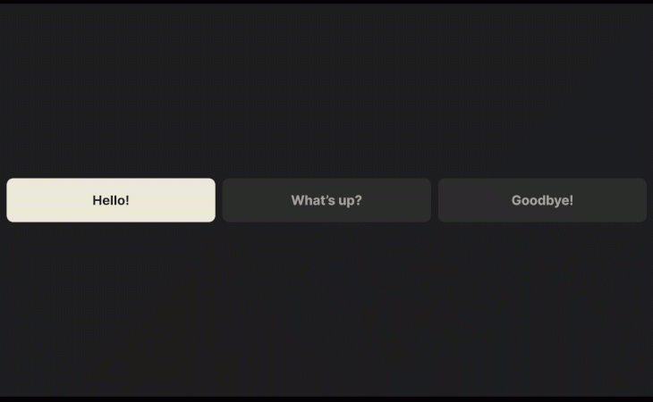
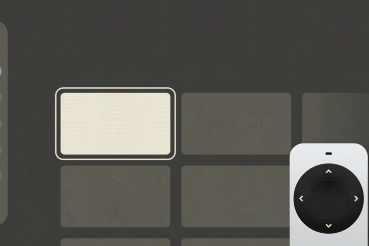
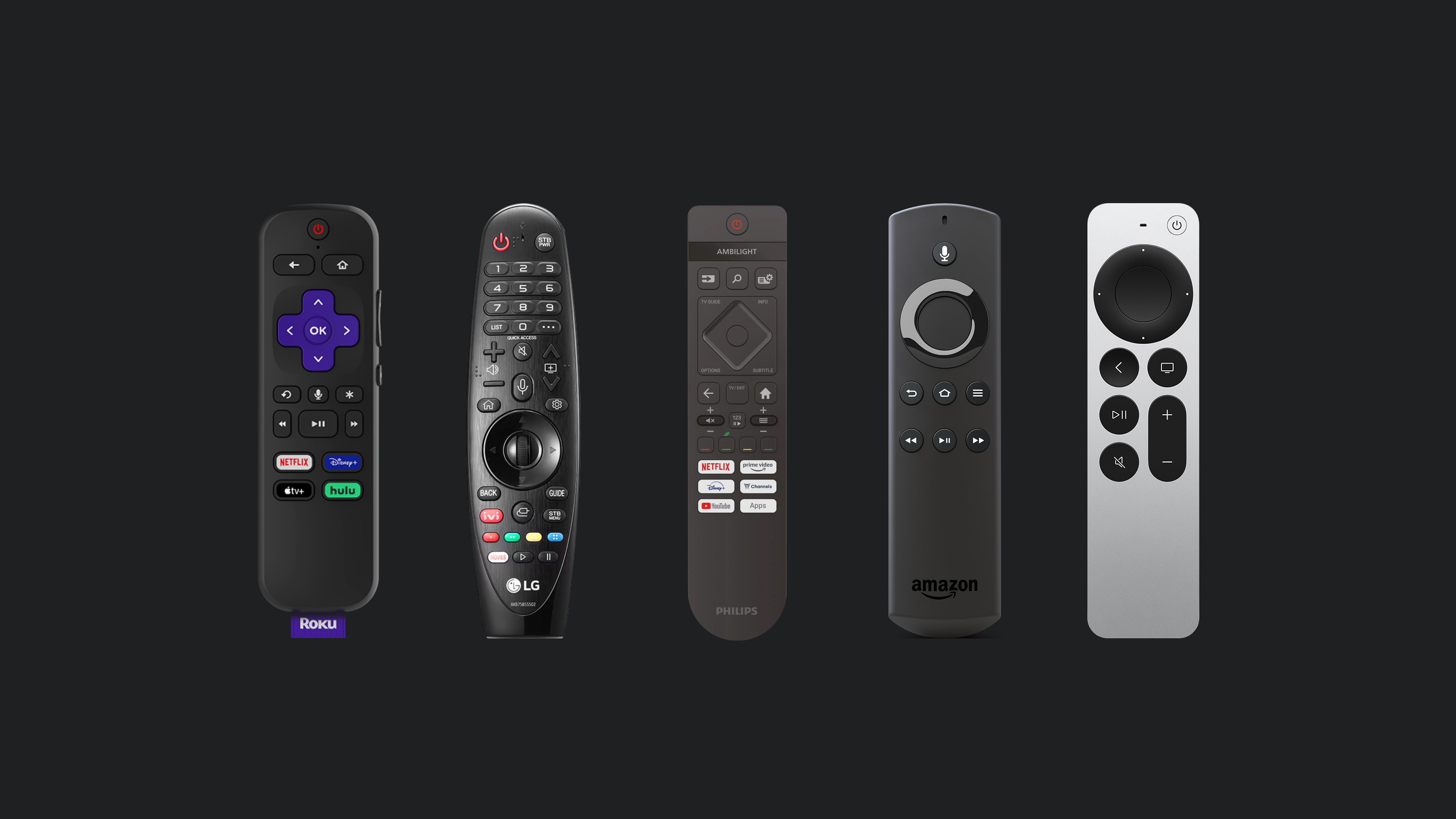
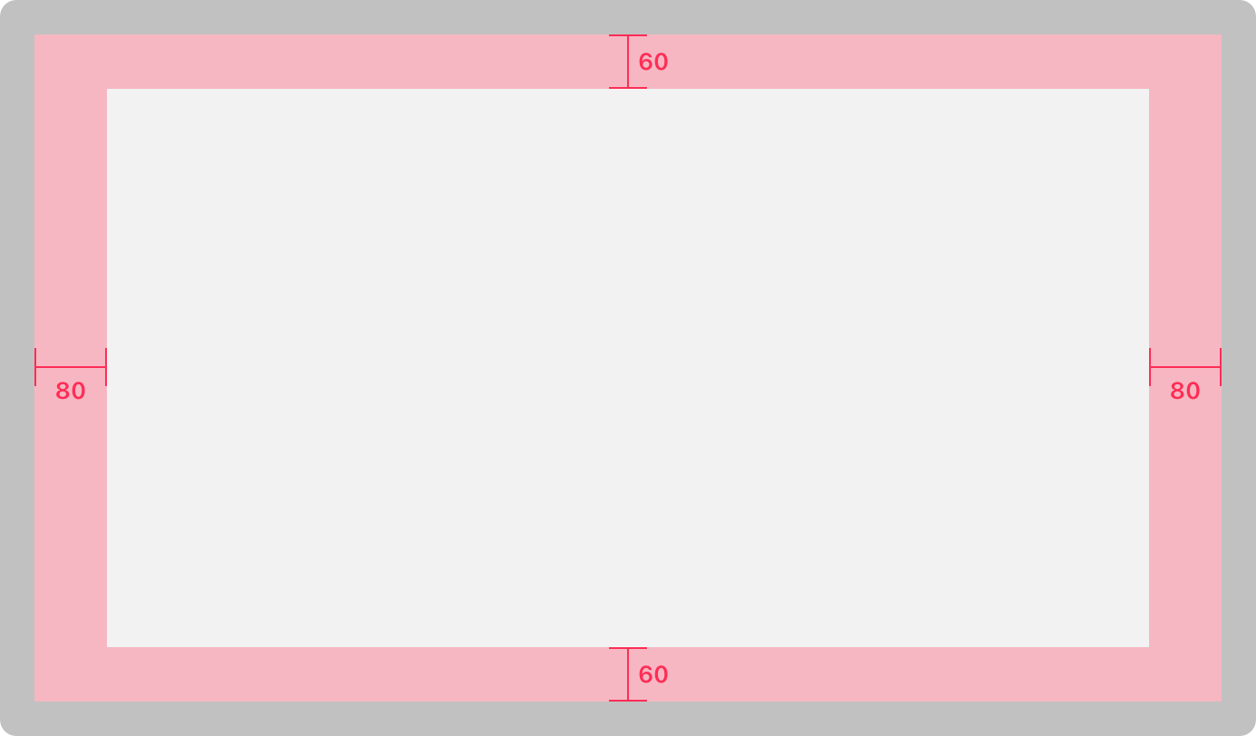
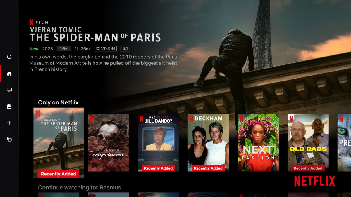
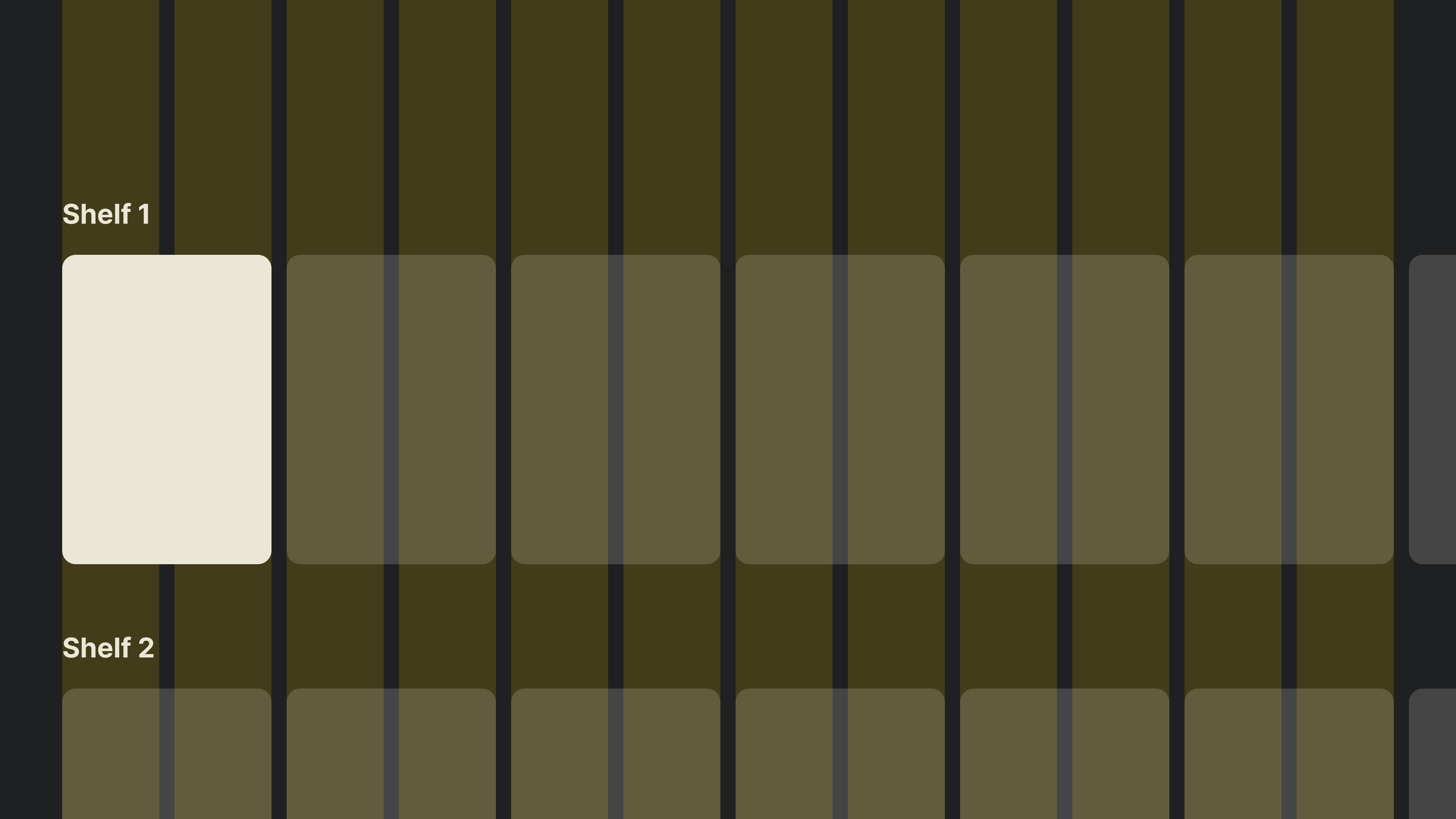
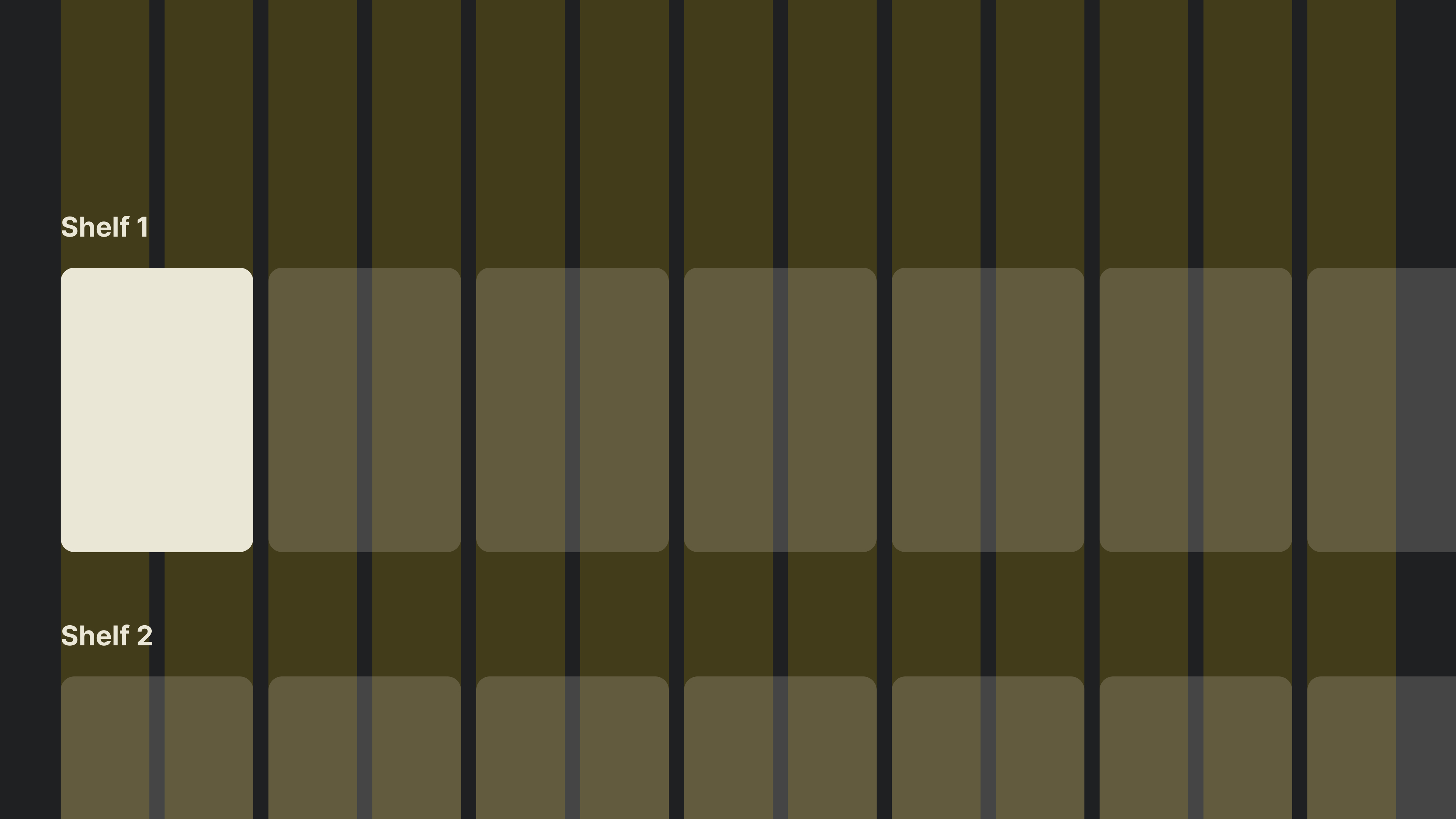
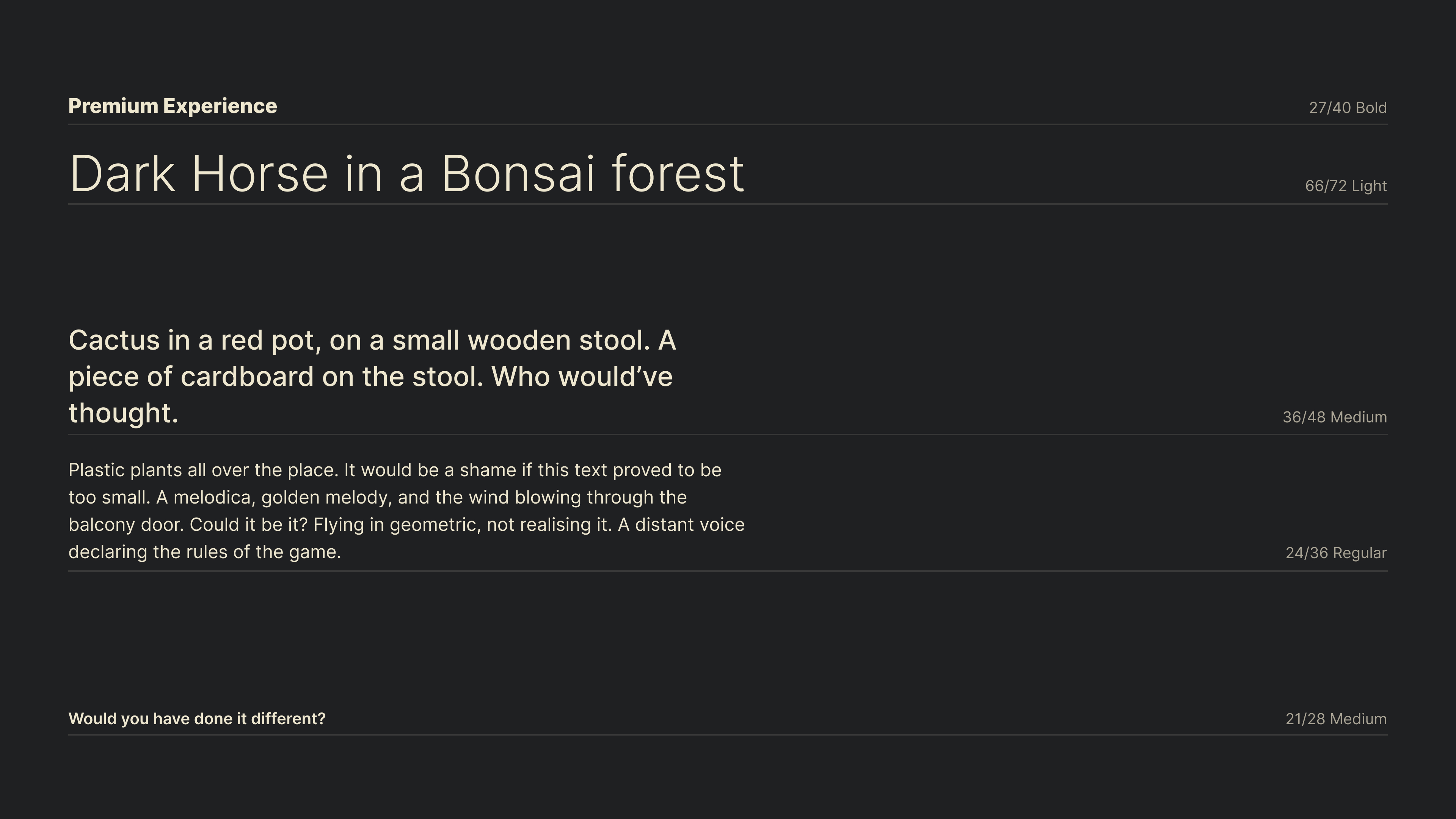
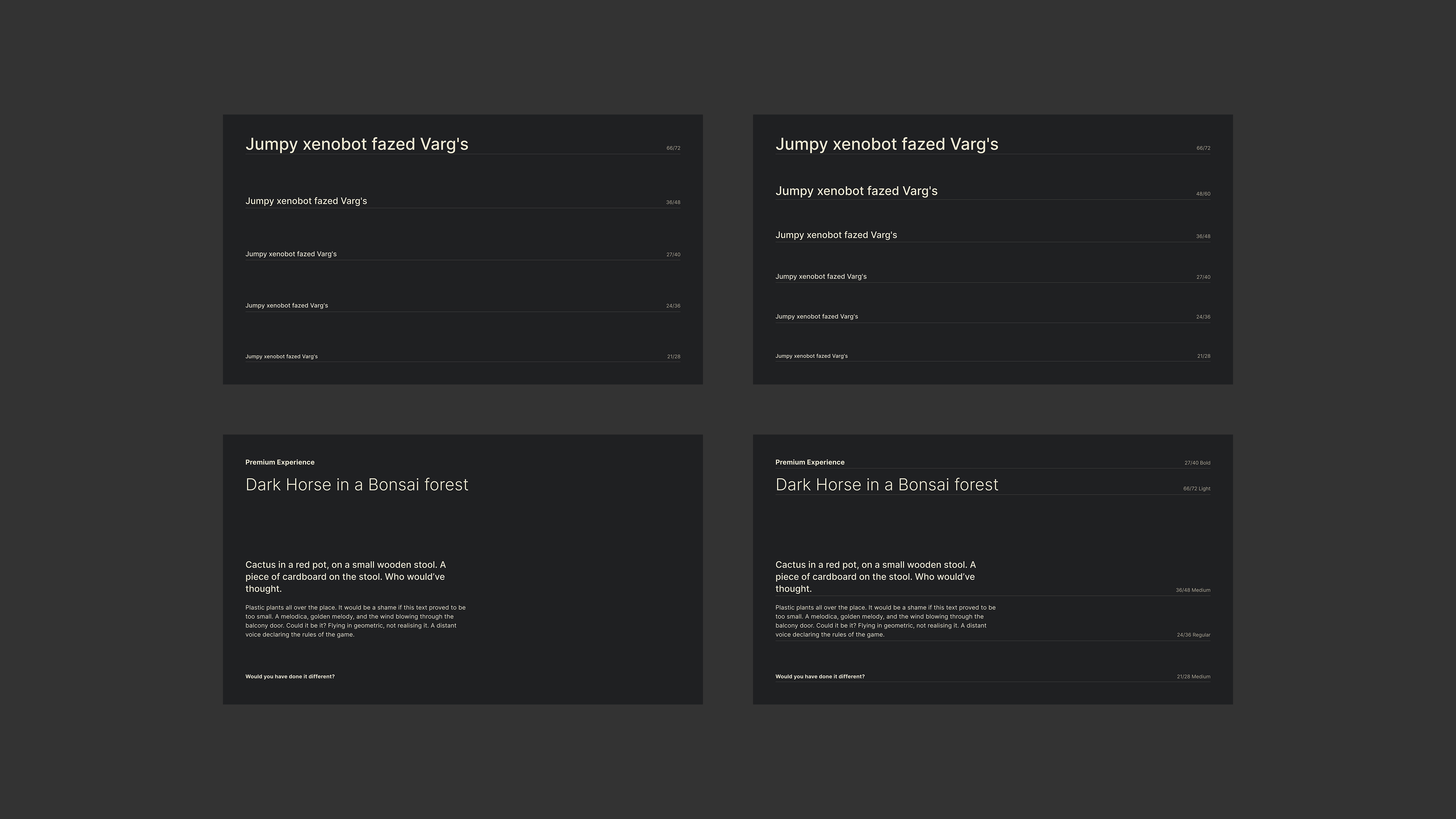
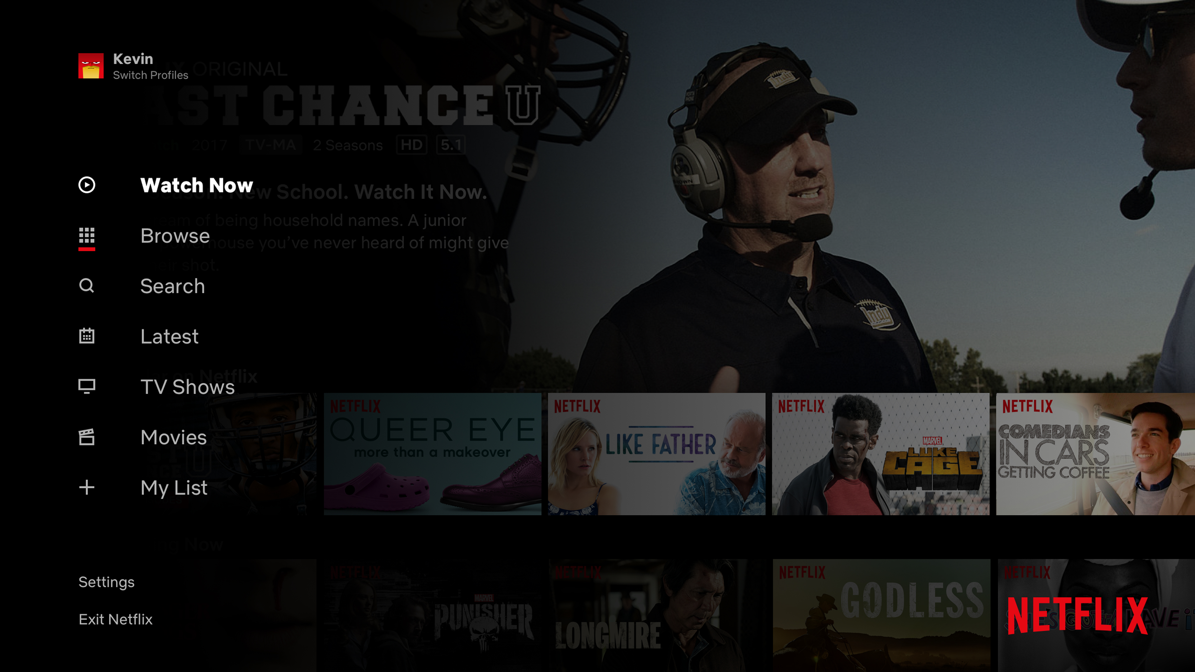
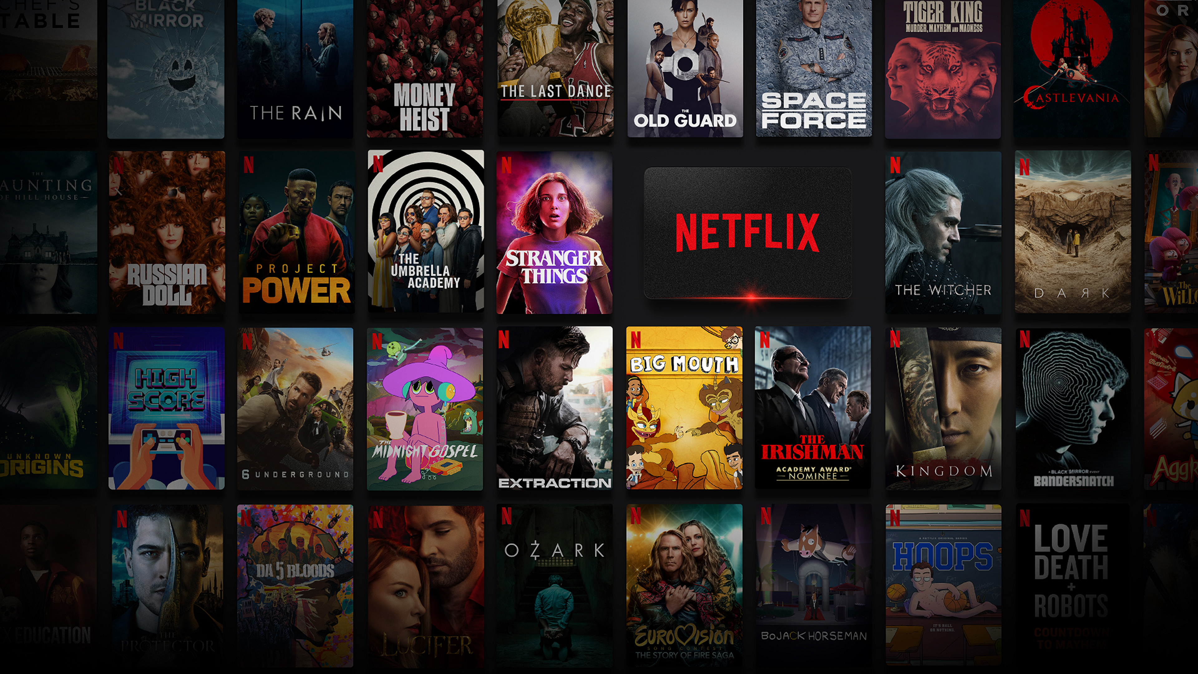
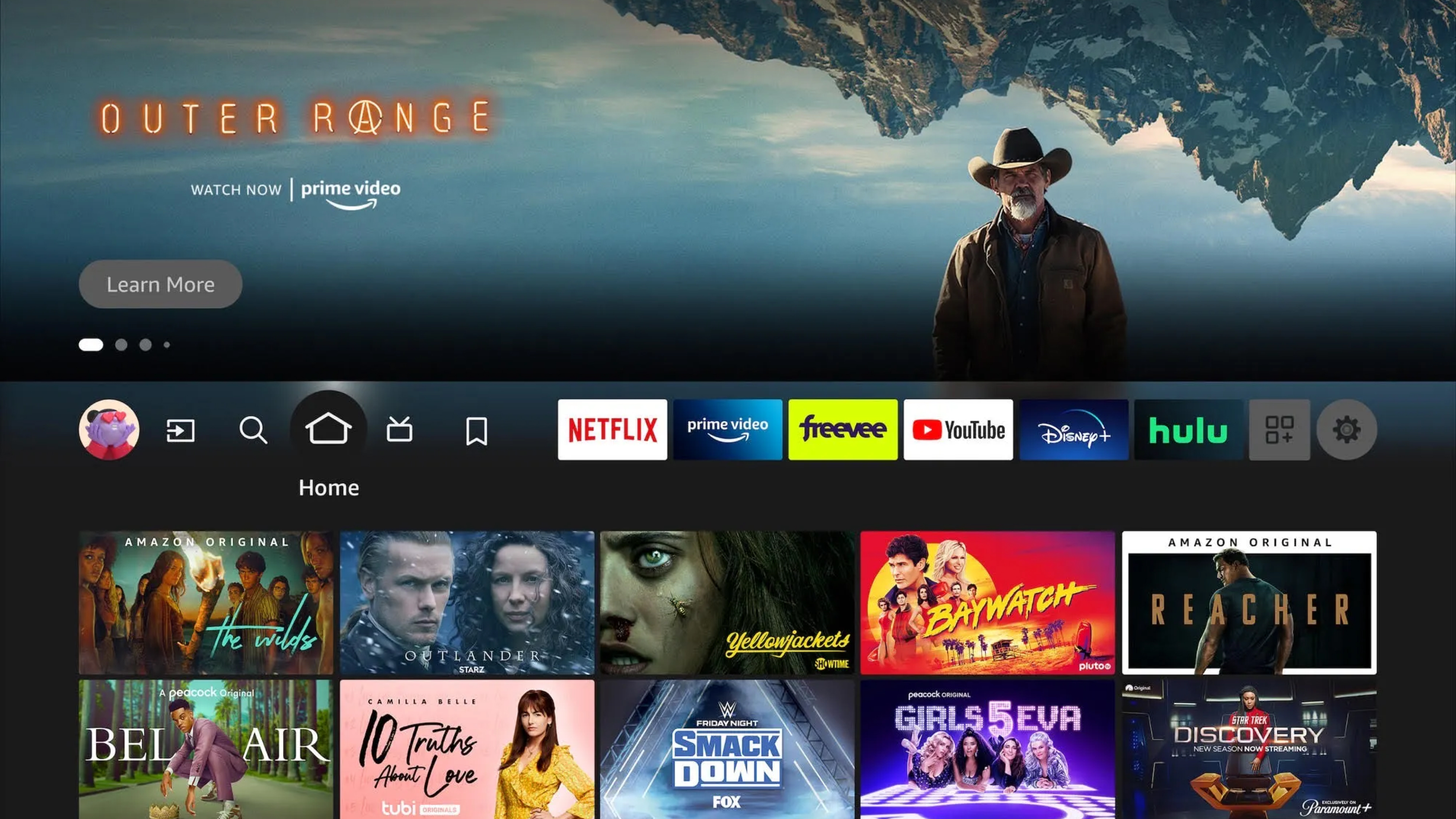
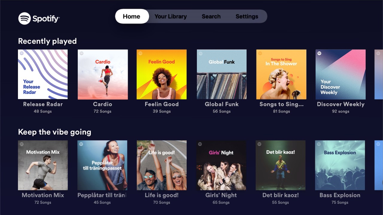
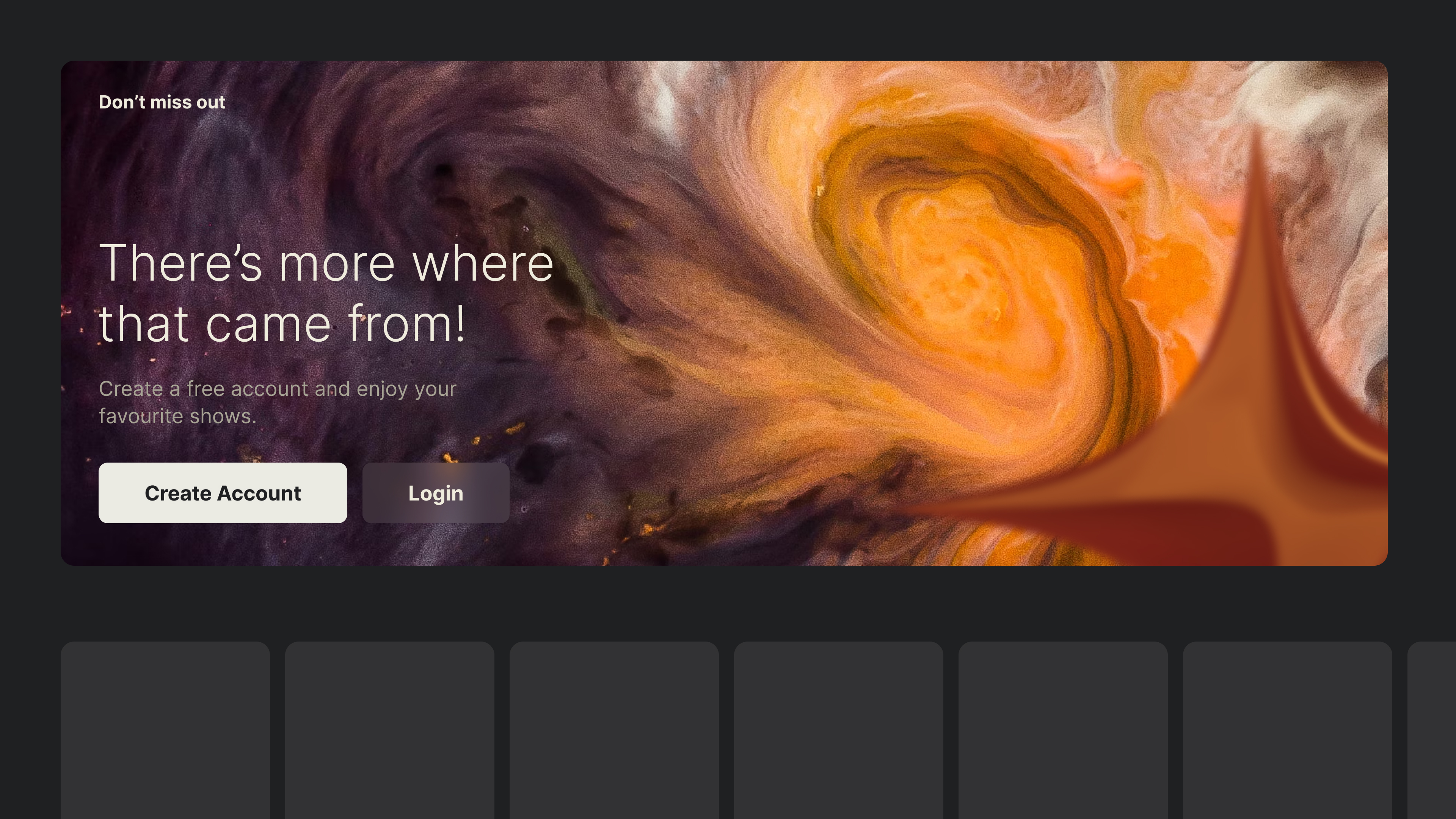
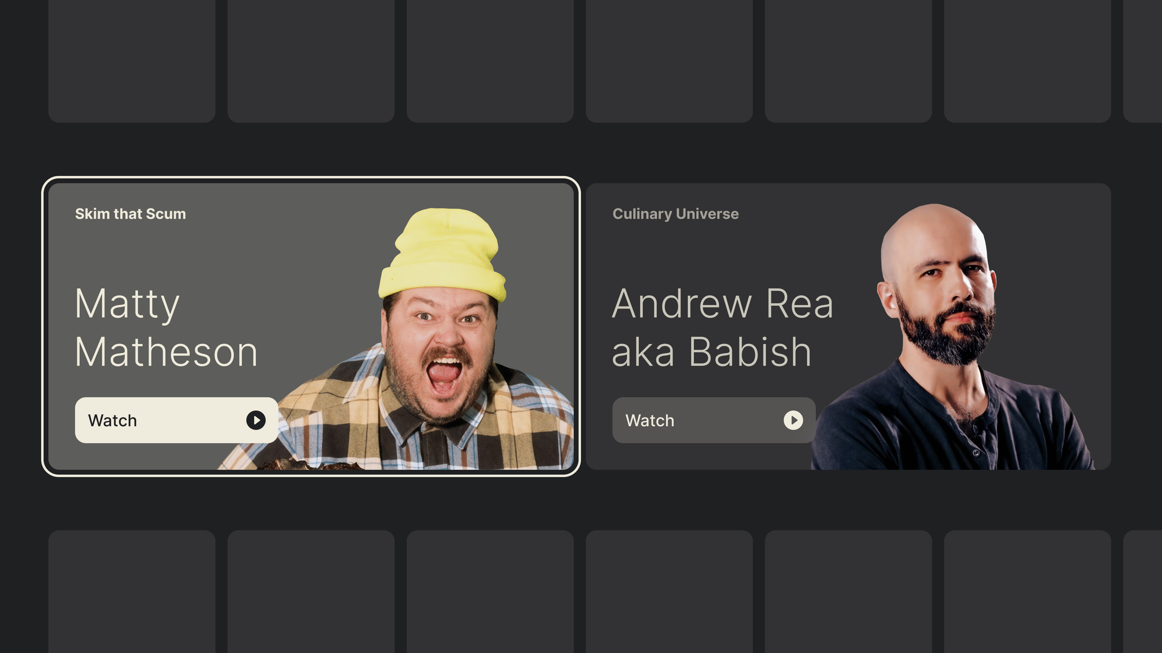
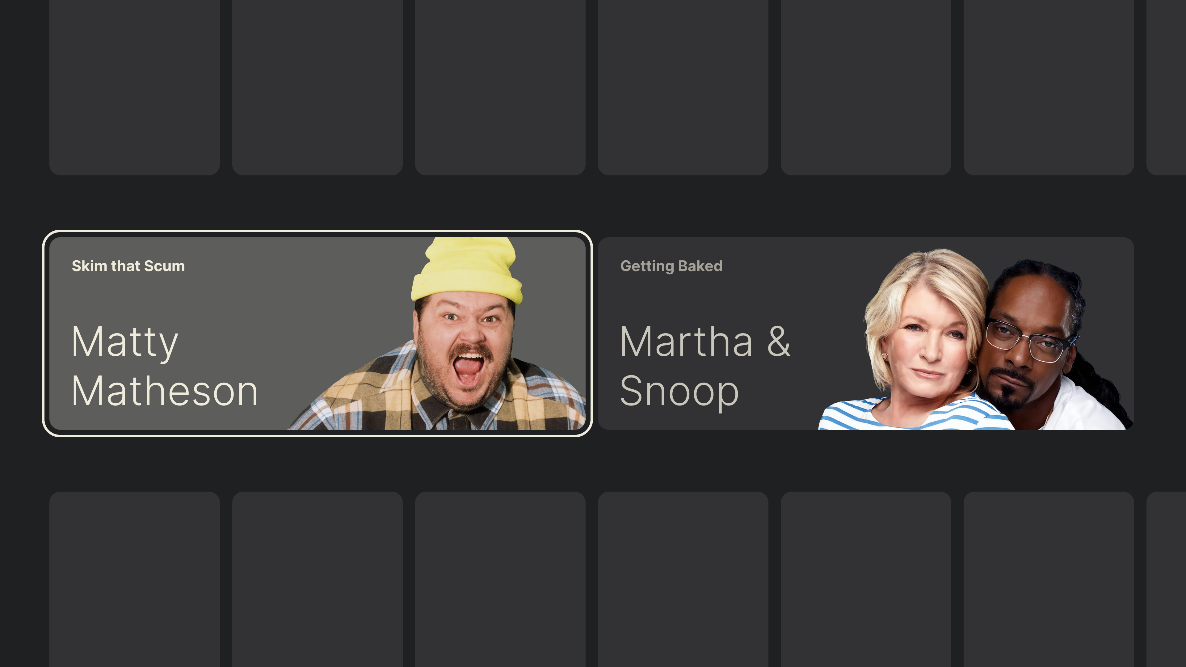
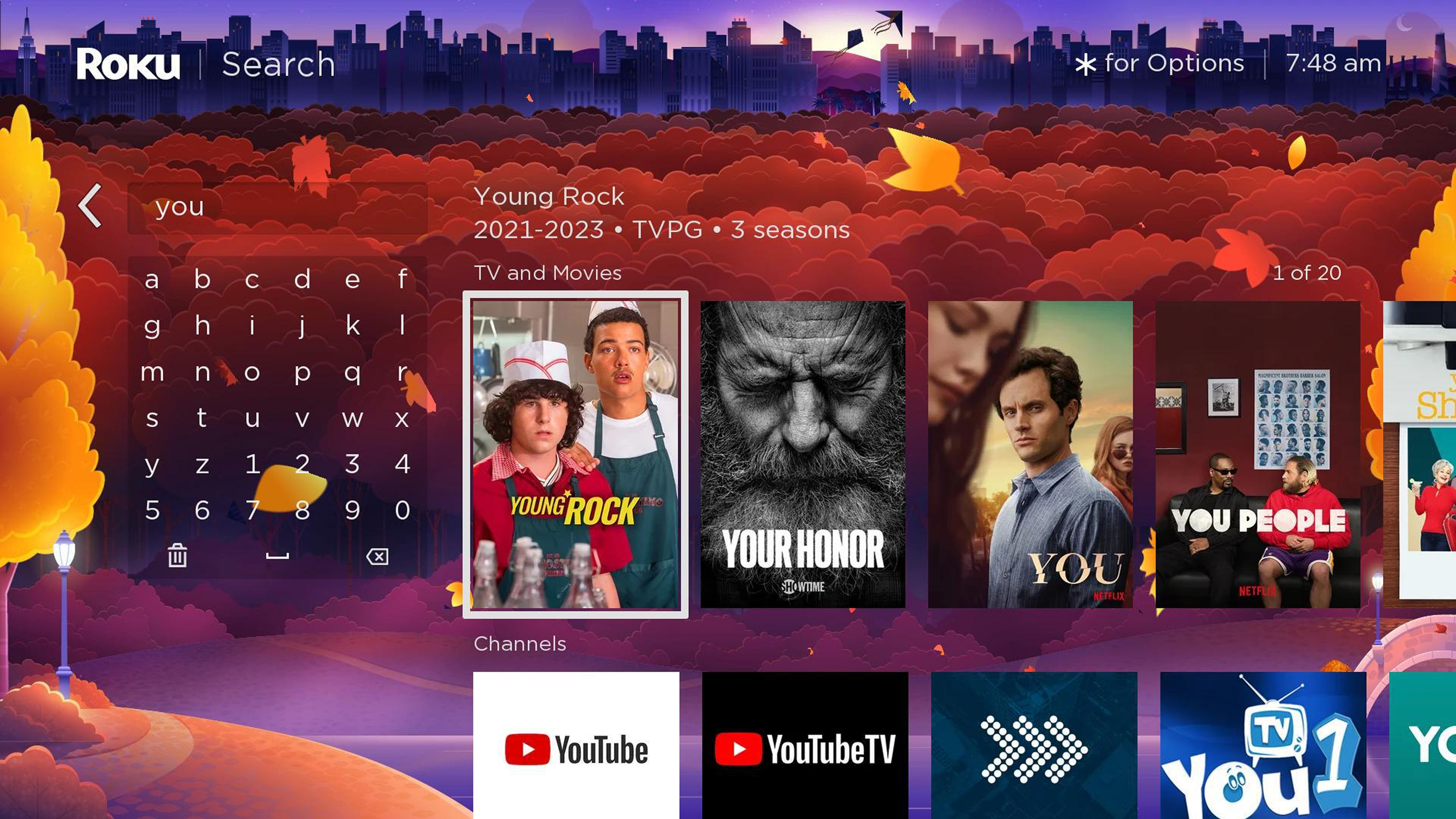
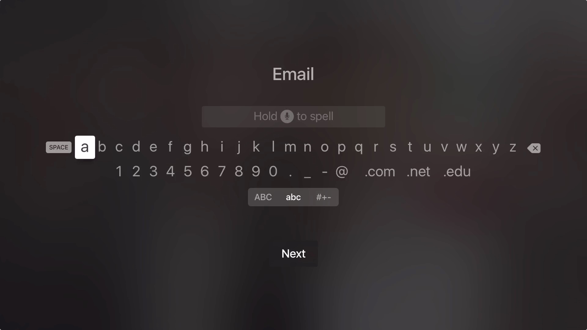
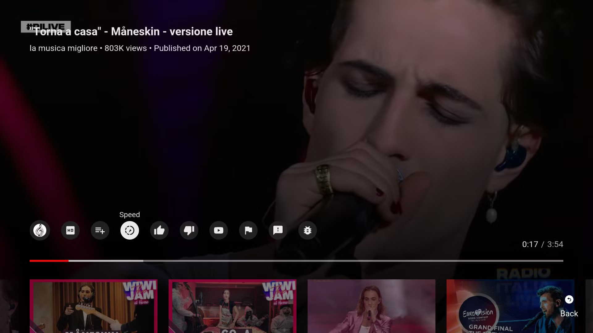
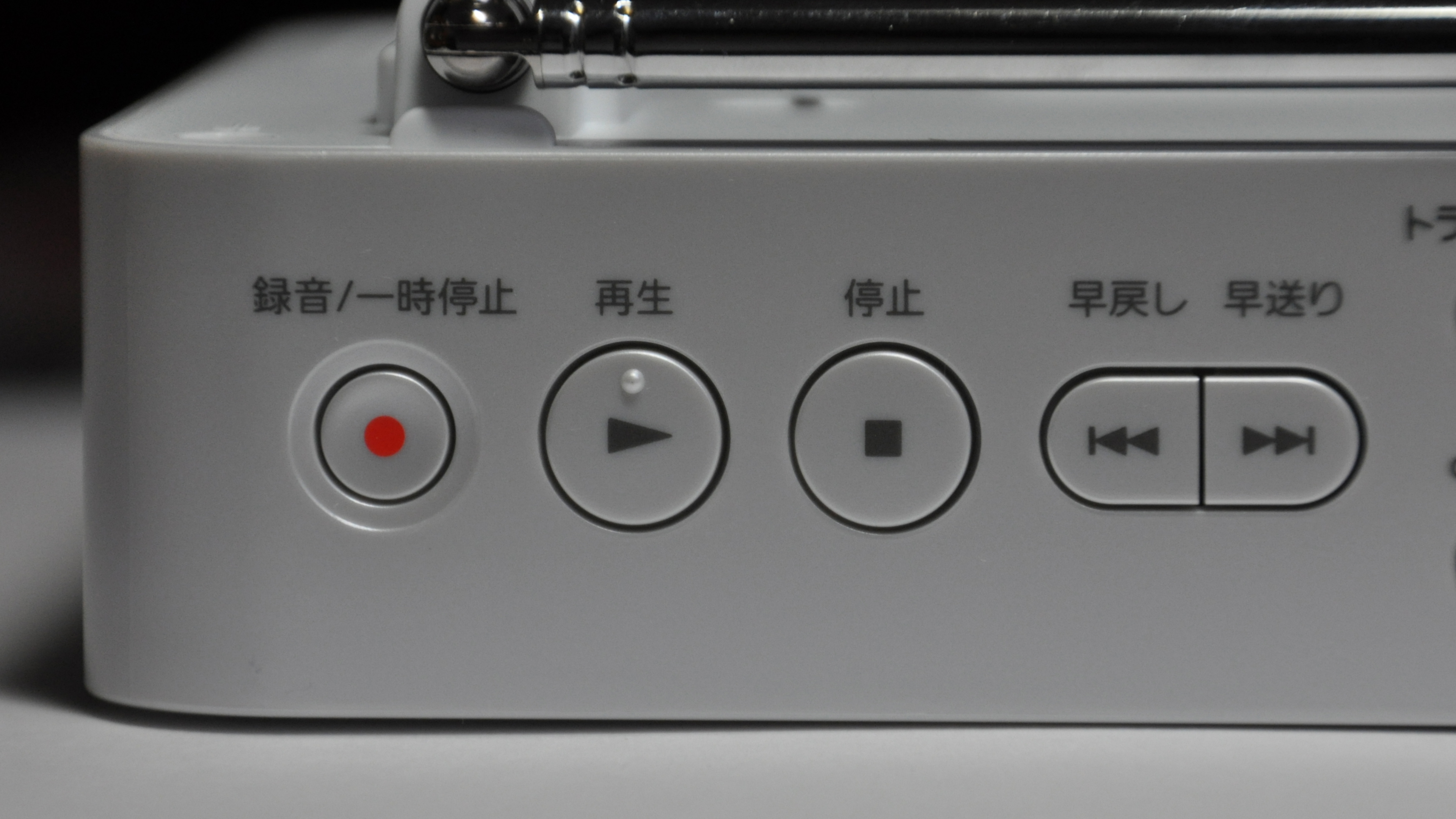
.jpg)
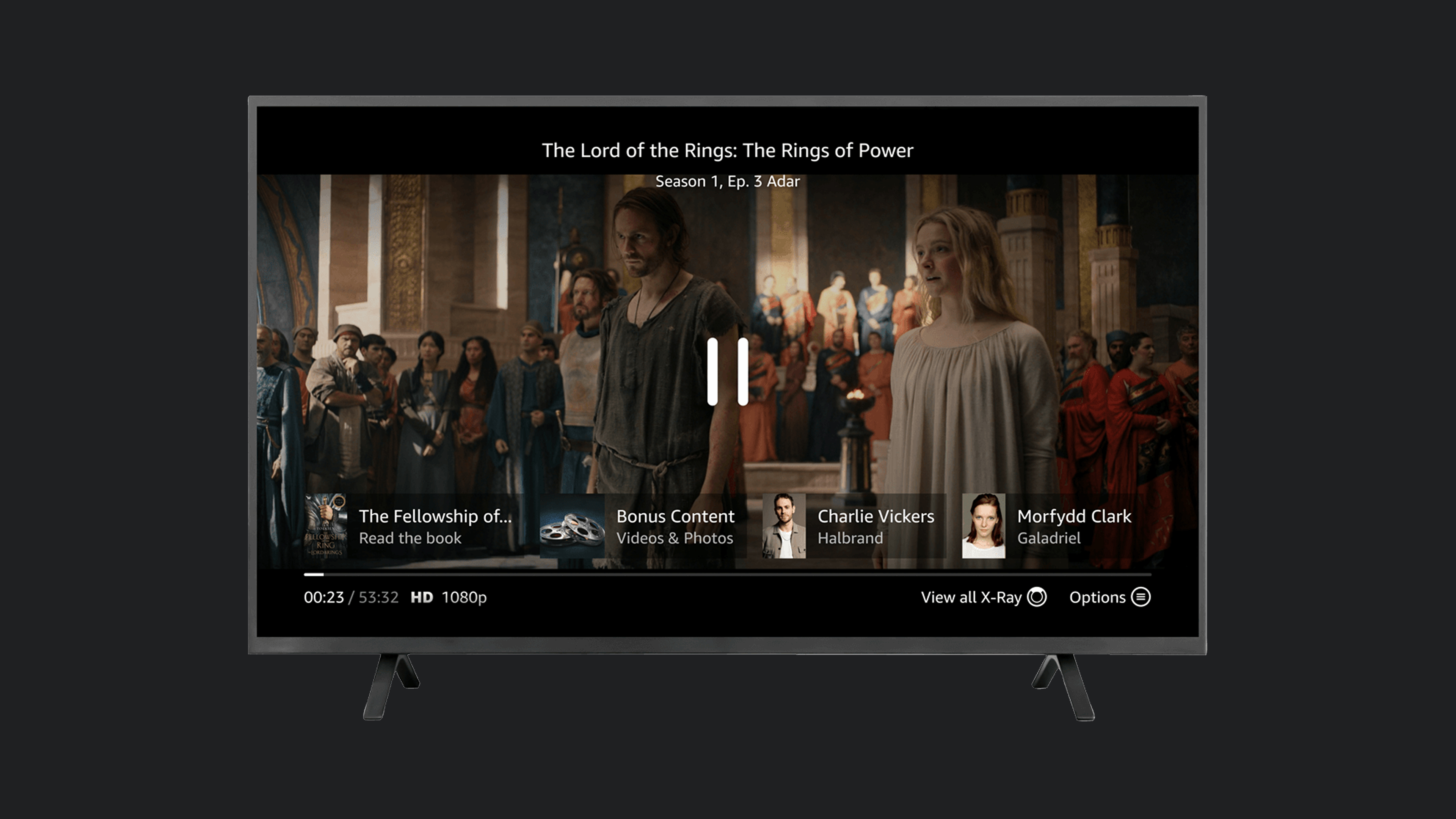
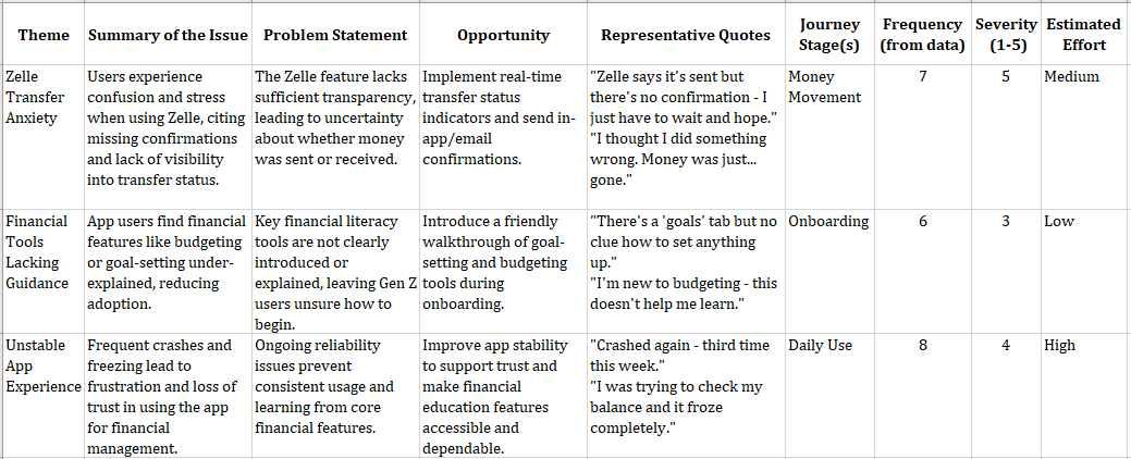
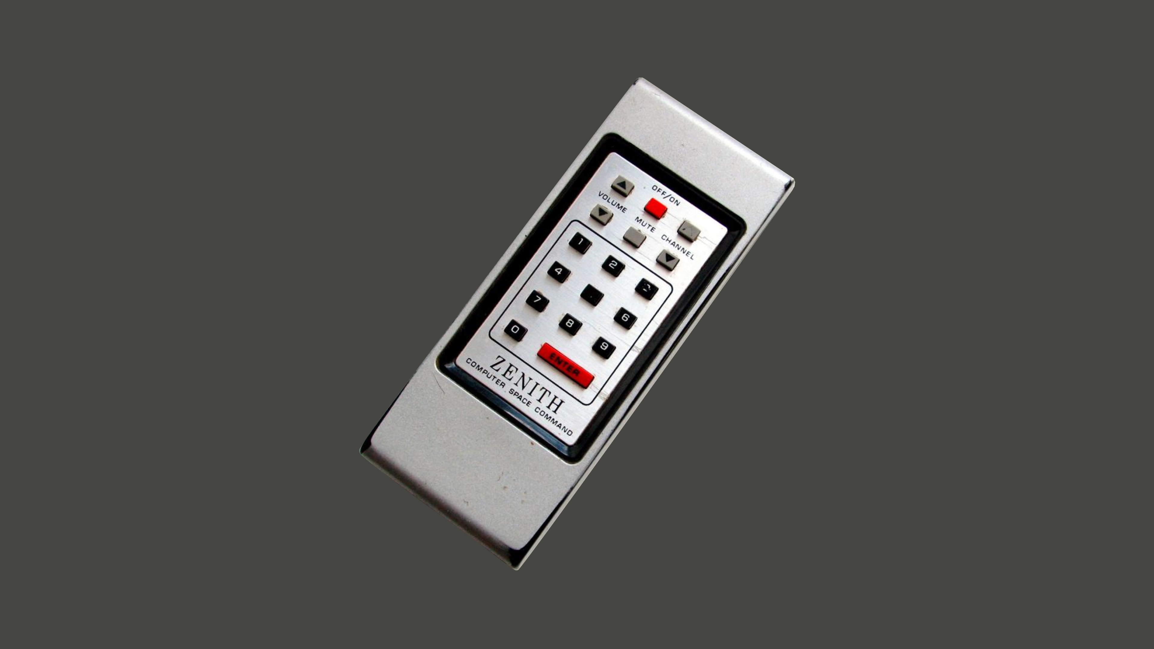
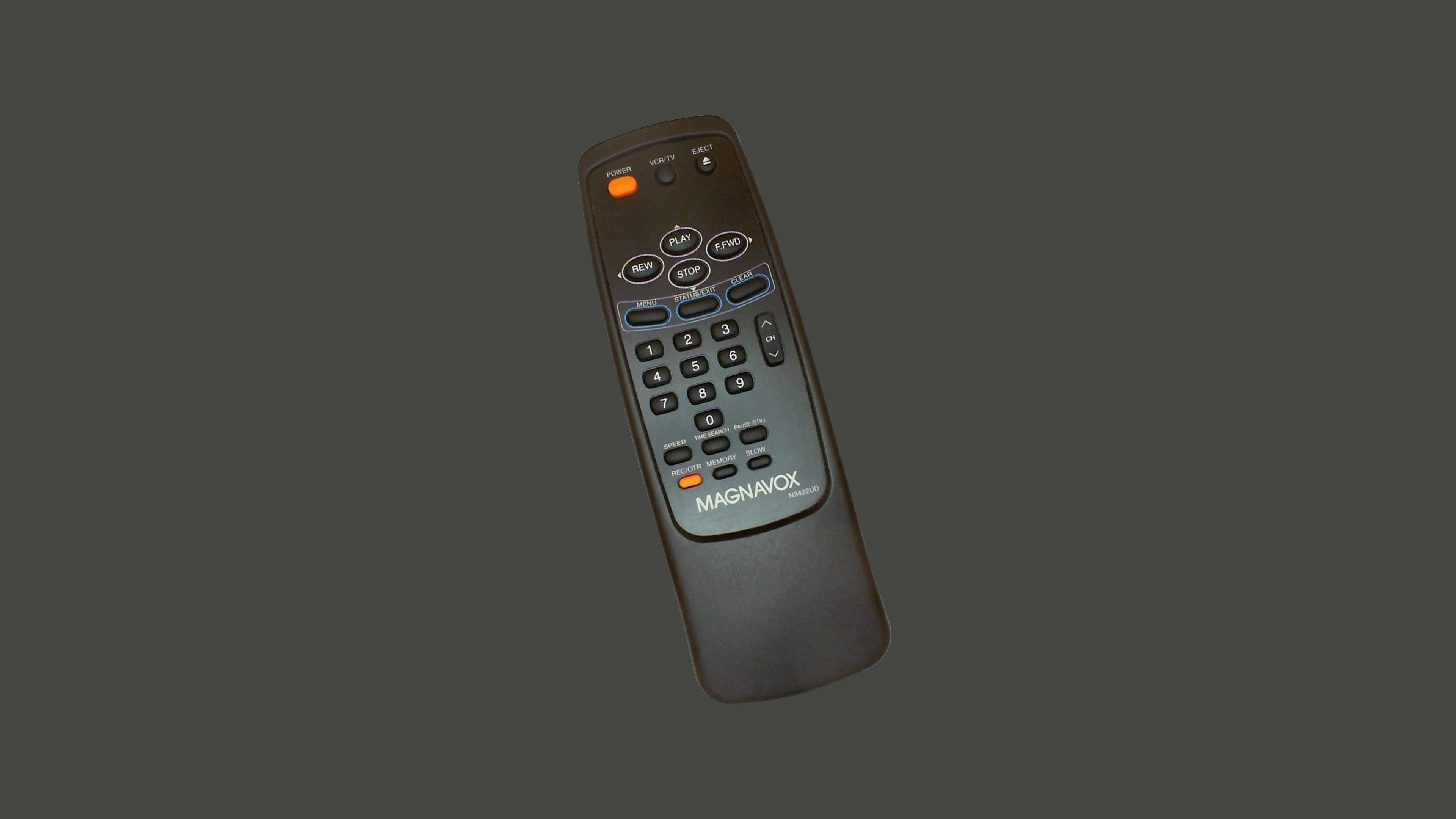
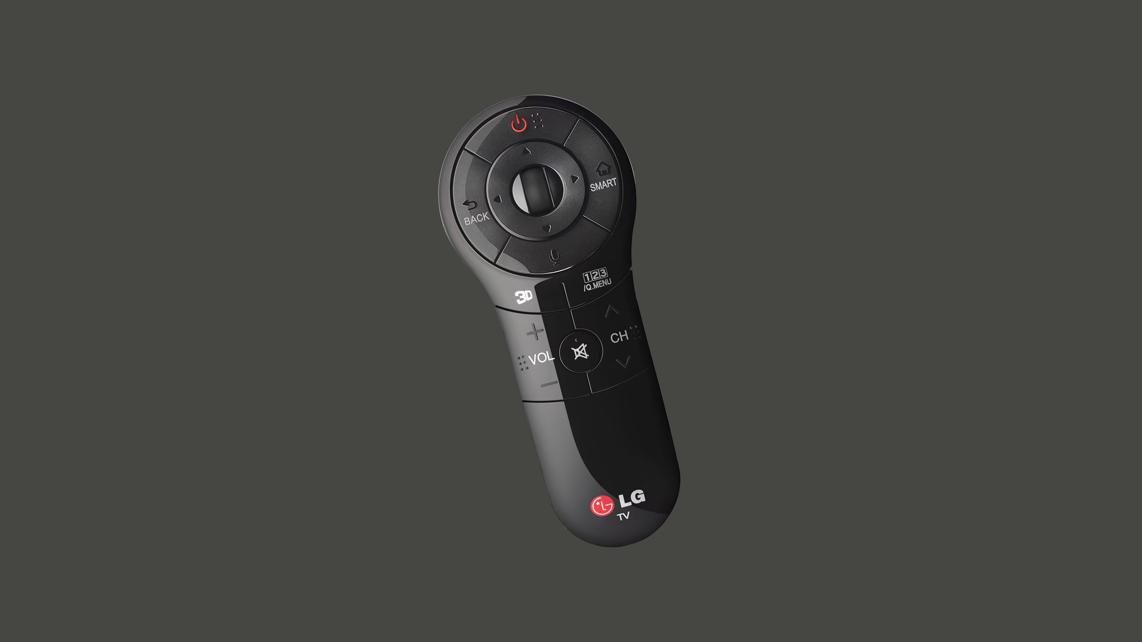
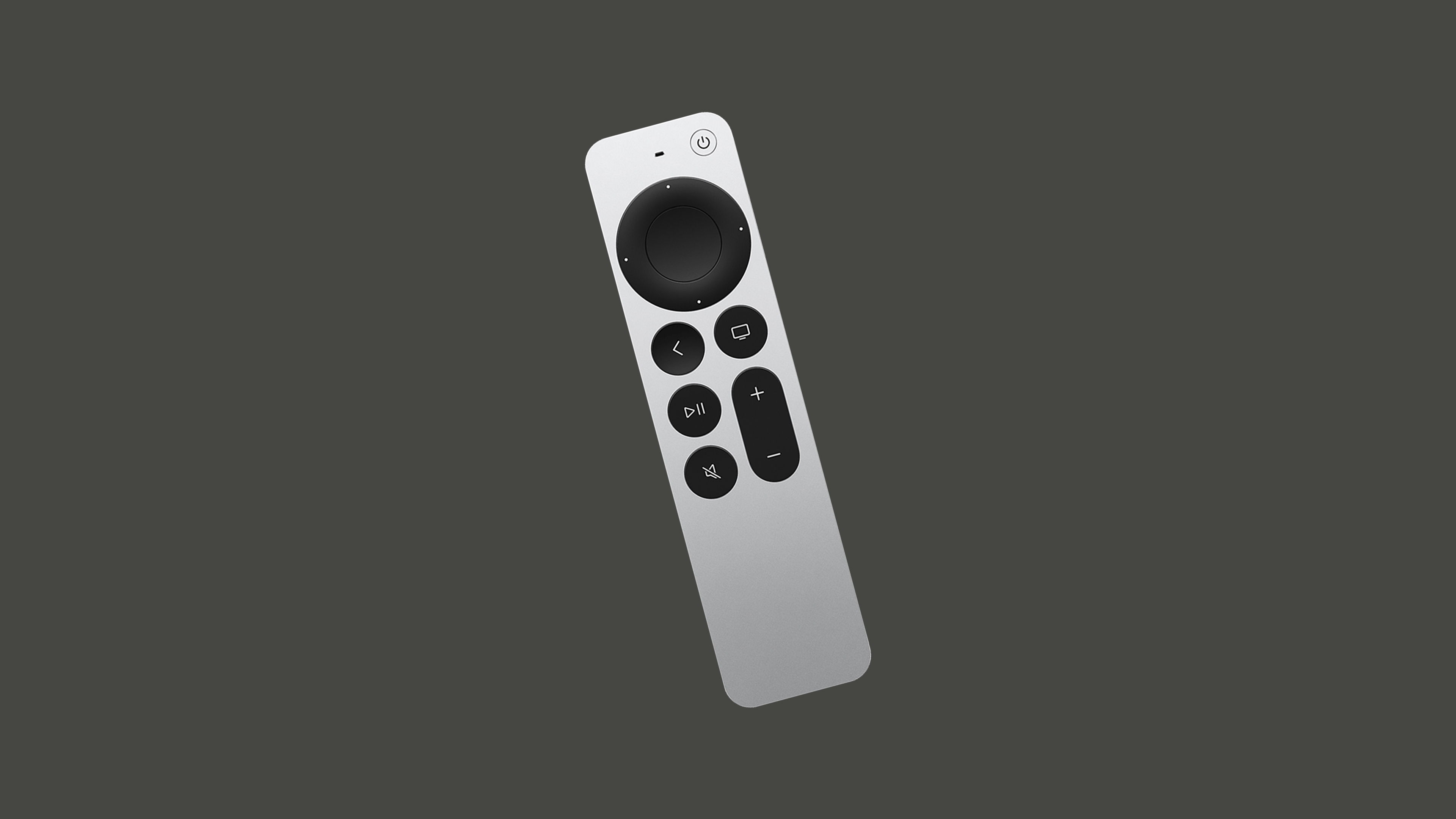
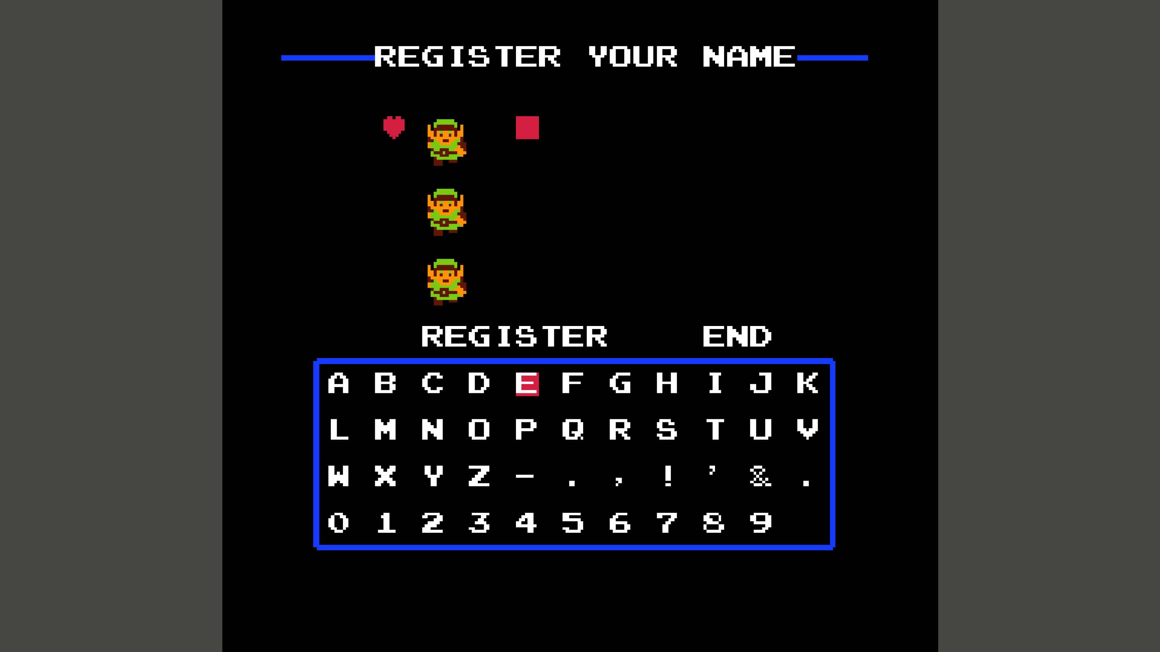
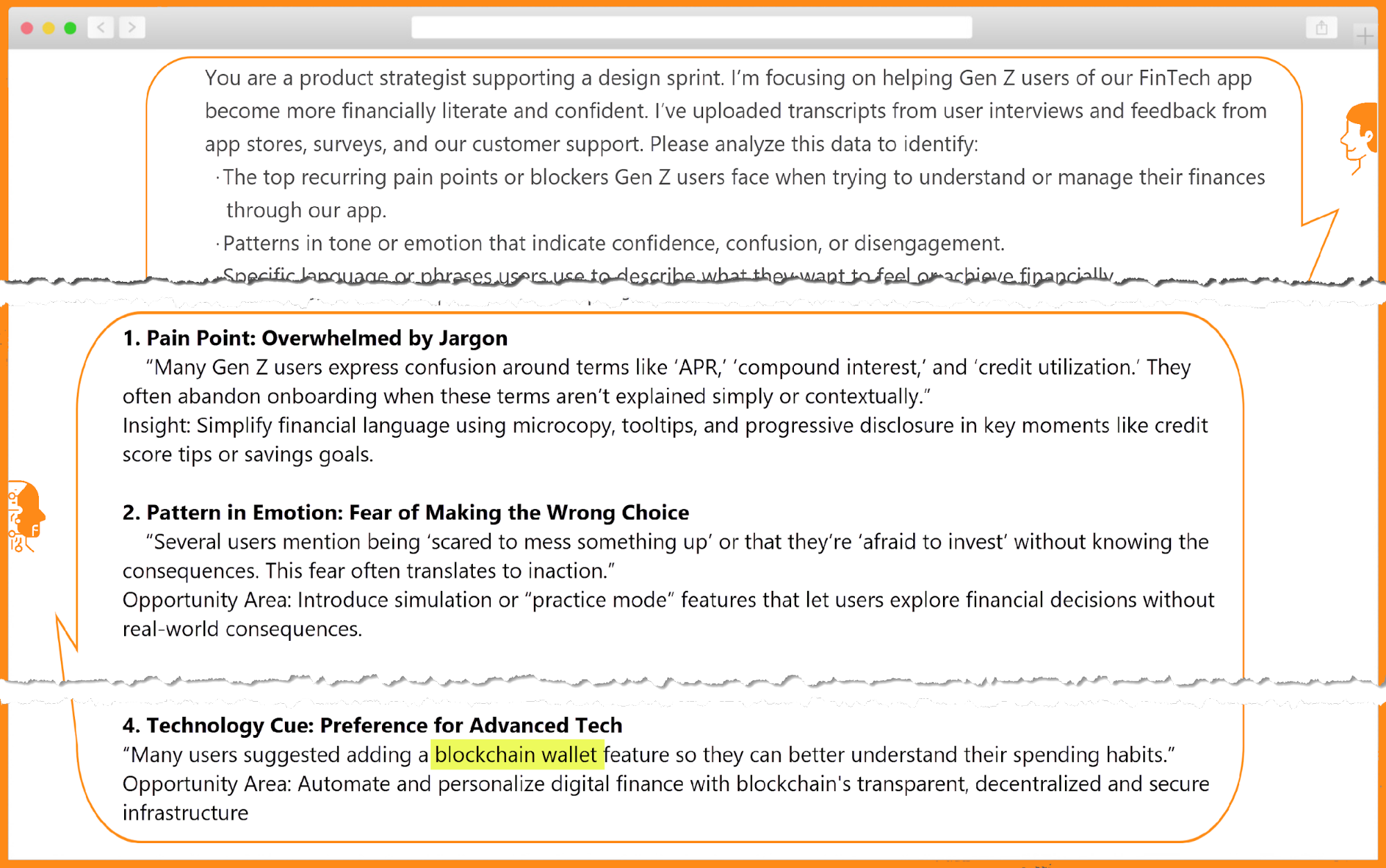
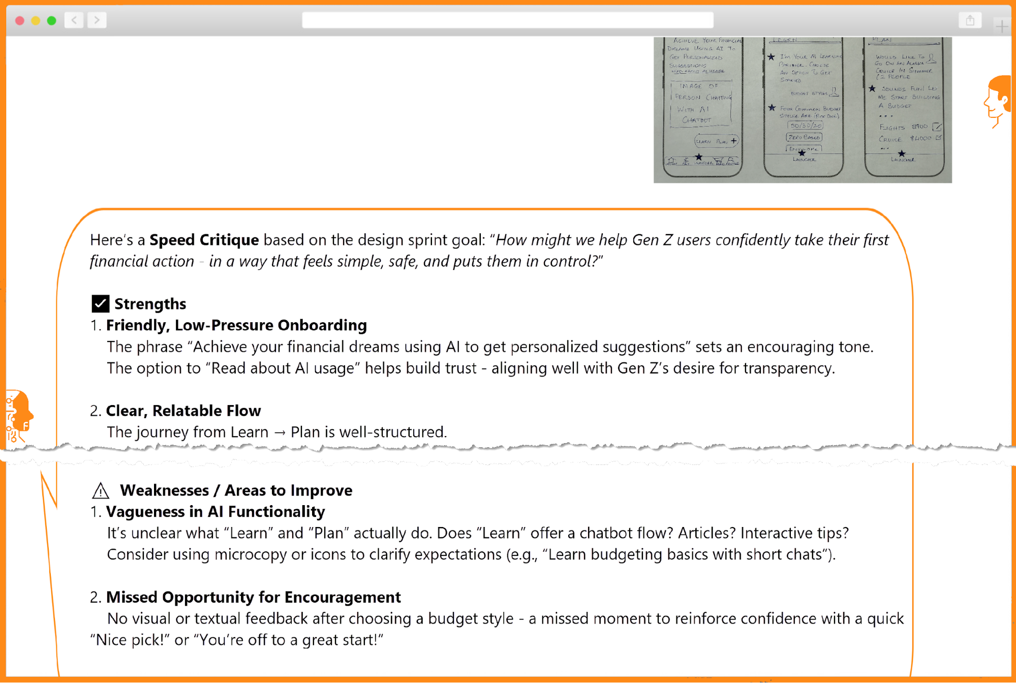
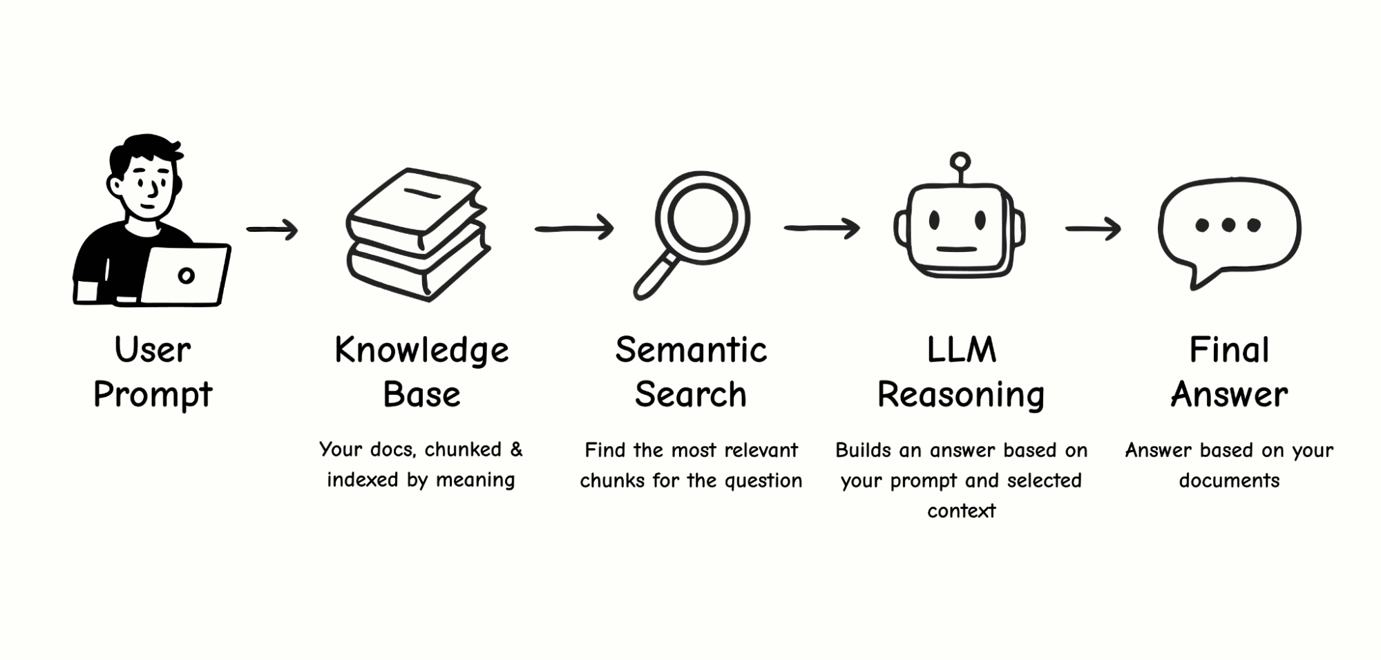
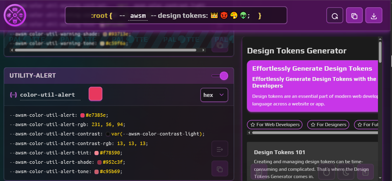
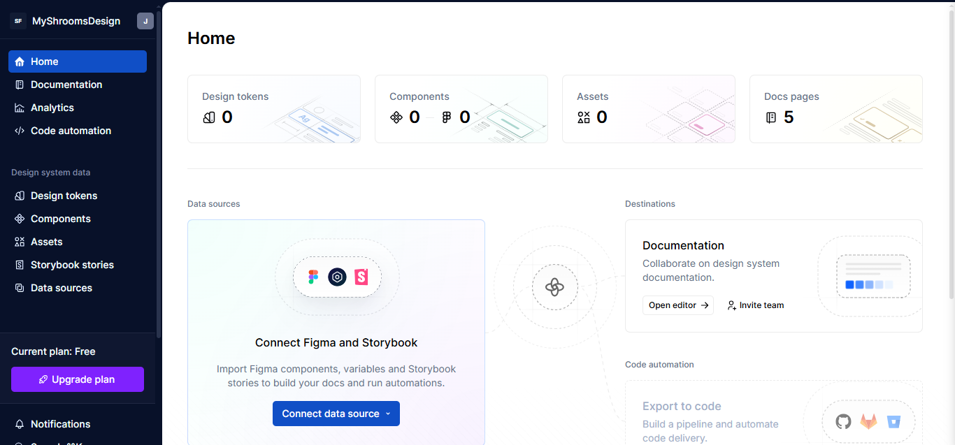
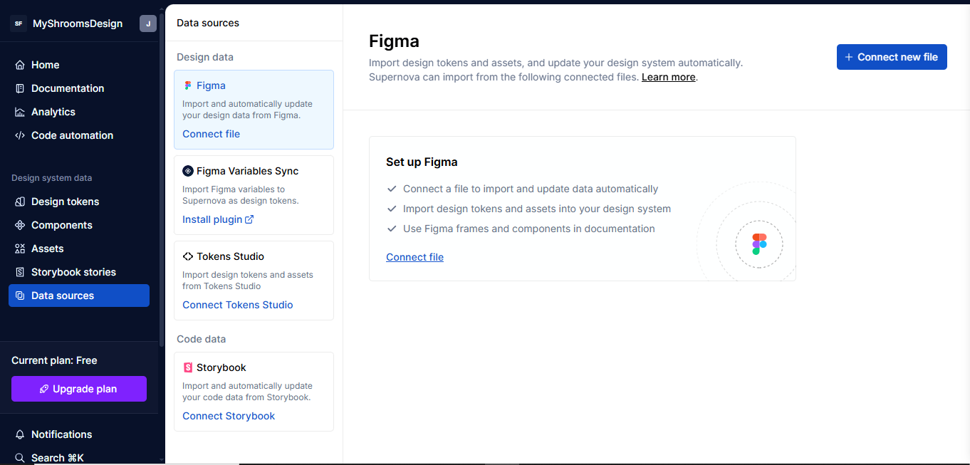
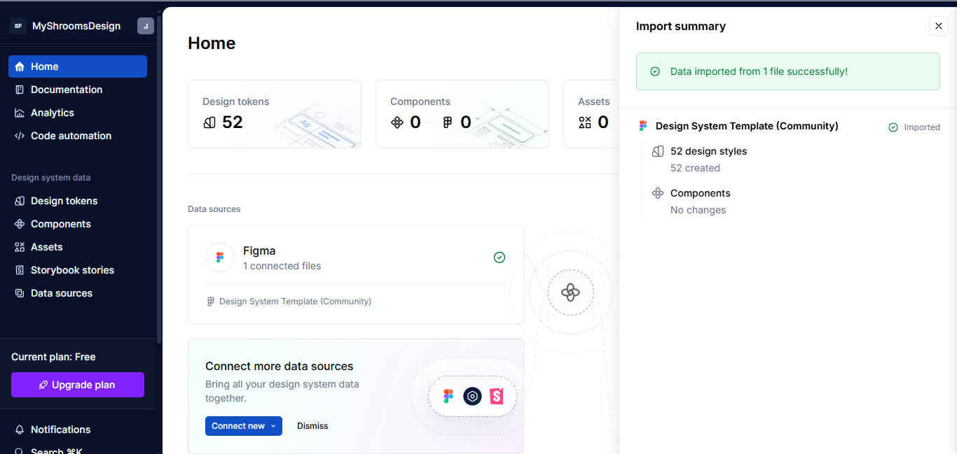
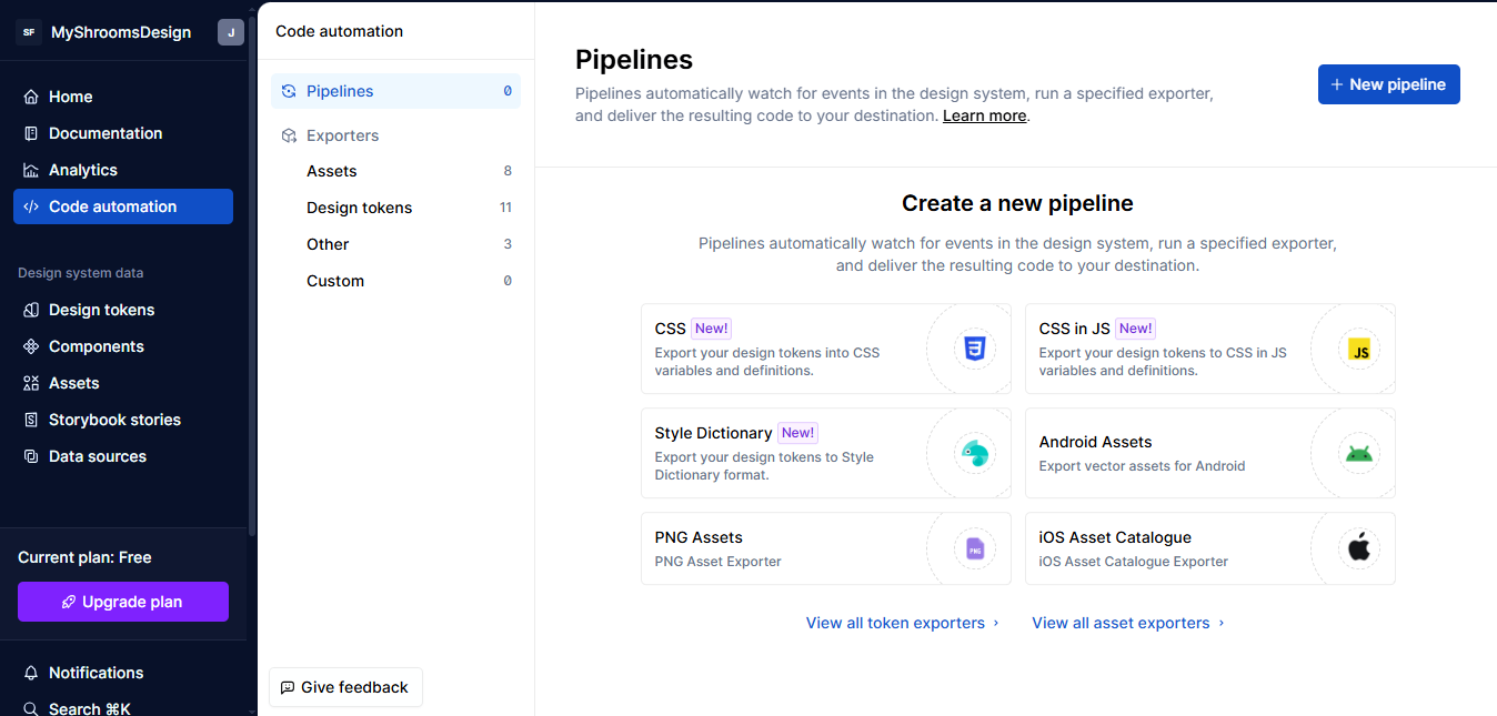
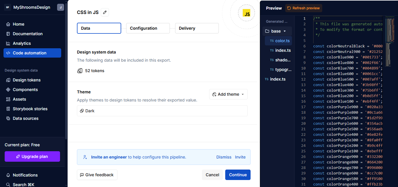
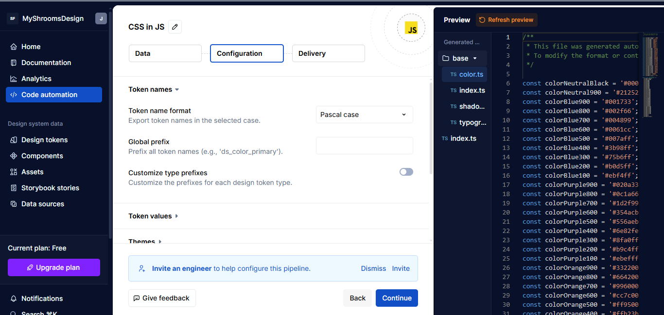
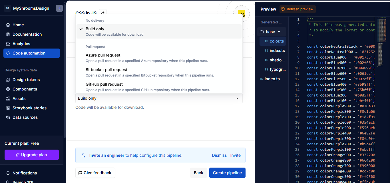